Space Between People
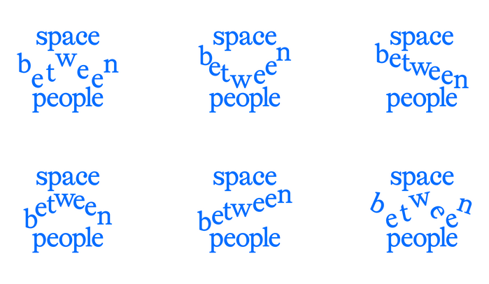
Hanna Noller. License: All Rights Reserved.


Space Between People is the practice of Hanna Noller, an architect and researcher working at the intersection of urban development, participation and design. The site presents her projects – from planning workshops in Hannover and Oldenburg to exhibitions, teaching and publications – alongside a short profile and contact page.
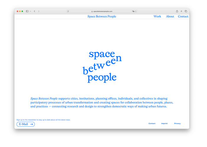
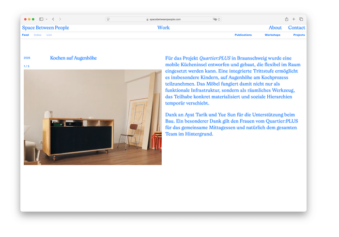
The typography does most of the work. Everything is set in a single blue on white, with Lingo Regular carrying the site’s voice: the stacked lowercase wordmark on the landing page, the running text on the About page, and the project index in the Work section, where year, title and category sit on ruled lines like a list in a catalogue. Lingo Italic marks names and collaborators inline. The compact captions, image counters and footer links are set in 365 Grotesk, whose neutral, slightly narrow forms stay out of the serif’s way.
A small detail: the navigation rearranges itself between pages, with the current section's name sliding to the centre of the header – the same words, re-set, rather than a highlight state.
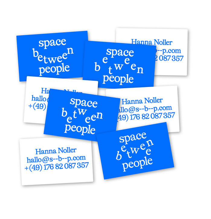
Hanna Noller. License: All Rights Reserved.
Source: www.spacebetweenpeople.com Hanna Noller. License: All Rights Reserved.
Source: www.spacebetweenpeople.com Hanna Noller. License: All Rights Reserved.
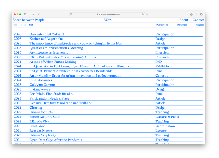
Source: www.spacebetweenpeople.com Hanna Noller. License: All Rights Reserved.
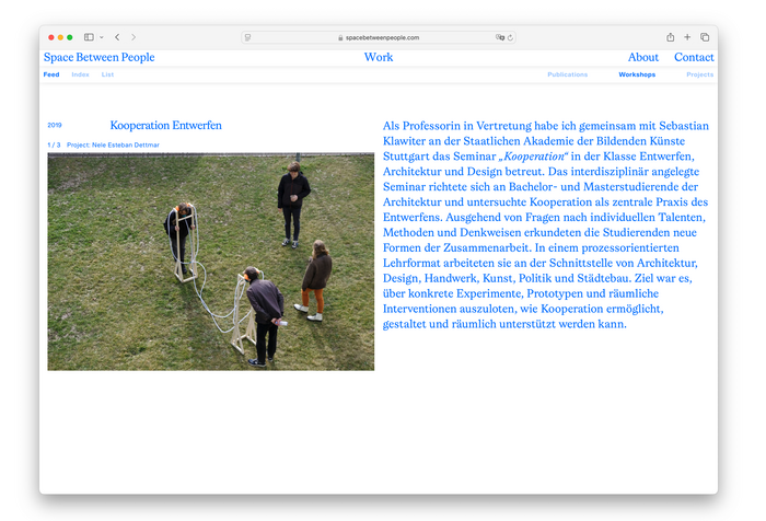
Source: www.spacebetweenpeople.com Hanna Noller. License: All Rights Reserved.
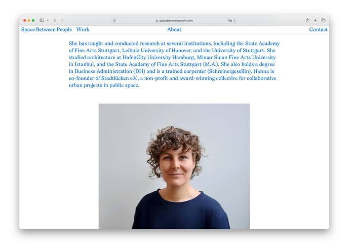
Source: www.spacebetweenpeople.com Hanna Noller. License: All Rights Reserved.
This post was originally published at Fonts In Use