Solworks
Relajaelcoco. License: All Rights Reserved.


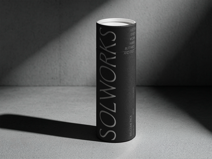
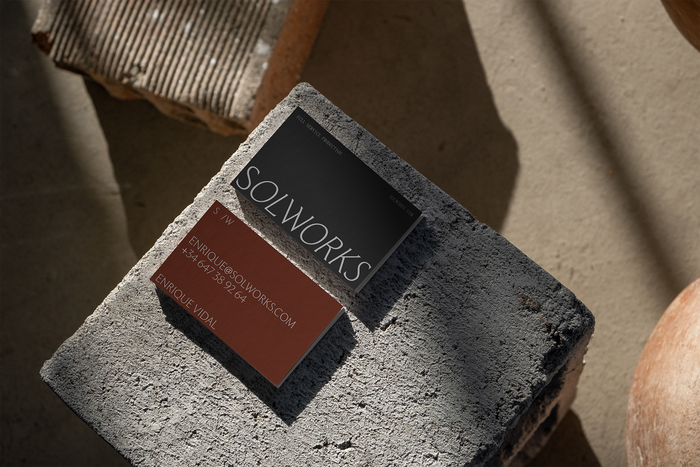
Solworks is a service and production company built to solve every problem a film or advertising shoot can run into. It works in a fast, voracious sector where competition is fierce – in services as much as in the visual language brands use to stand out.
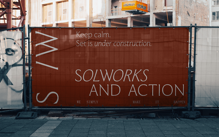
The whole identity grows from a single position: calm in the middle of the rush. Anyone who has been on set knows the feeling – nerves on edge, everything moving fast, no margin for error. Solworks is the steady thing you hold onto while it happens, and the typography is built to say exactly that.
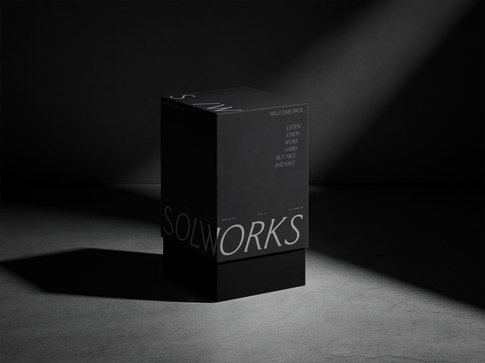
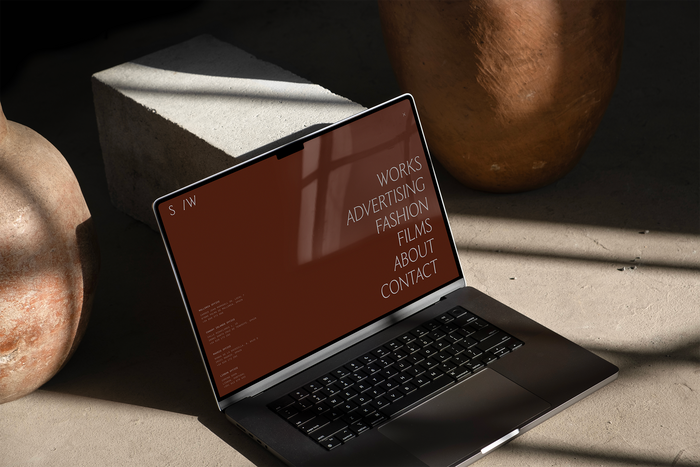
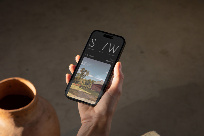
In the wordmark, the S and the W stay upright in Moulin Thin while the remaining letters lean into Moulin Thin Italic – two roman anchors holding still inside a run of motion. A simple, lasting device that turns the brand idea into a letterform, and the same play of upright against italic carries across the system, into typographic compositions like the website menu: order inside speed.
Moulin (Commercial Type) leads the voice. Its sculptural balance of thick and thin reads as elegance and composure – the quiet self-assurance of someone who already knows it’s all going to turn out fine – and it holds up in display as well as in running text.
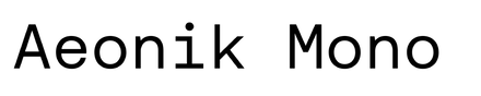
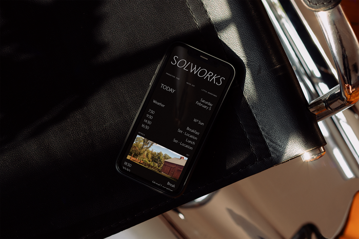
Aeonik Mono (CoType) is the counterpoint: a monospace used at small sizes for footnotes, captions and technical notes. It grounds Moulin’s refinement and voices the more technical, operational side of the work – large Moulin statements above, small Aeonik detail below.
The monospaced serif is Panama (The Temporary State).
Relajaelcoco. License: All Rights Reserved.
Relajaelcoco. License: All Rights Reserved.
Relajaelcoco. License: All Rights Reserved.
Relajaelcoco. License: All Rights Reserved.
Relajaelcoco. License: All Rights Reserved.
Relajaelcoco. License: All Rights Reserved.
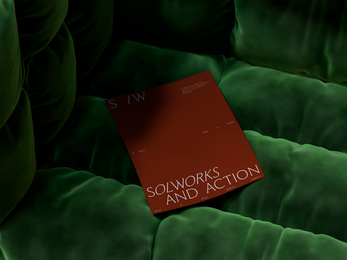
Relajaelcoco. License: All Rights Reserved.
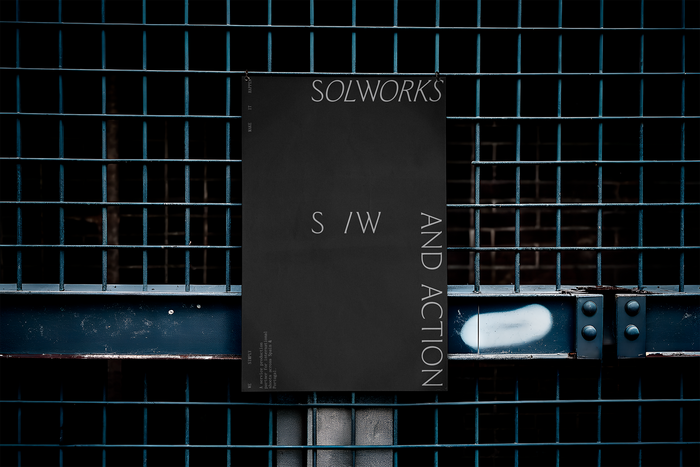
Source: relajaelcoco.com Relajaelcoco. License: All Rights Reserved.
This post was originally published at Fonts In Use