Simply Organic Single Origin
Published August 3, 2023
By FontsInUse
Contributed by Jonny Black

Source: ot.studio The Office of Ordinary Things. License: All Rights Reserved.


Source: ot.studio The Office of Ordinary Things. License: All Rights Reserved.
Source: ot.studio The Office of Ordinary Things. License: All Rights Reserved.
Source: ot.studio The Office of Ordinary Things. License: All Rights Reserved.
Source: ot.studio The Office of Ordinary Things. License: All Rights Reserved.

Source: ot.studio The Office of Ordinary Things. License: All Rights Reserved.
This post was originally published at Fonts In Use
Source: ot.studio The Office of Ordinary Things. License: All Rights Reserved.
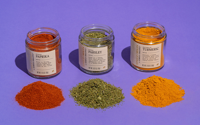
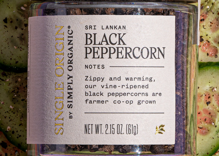
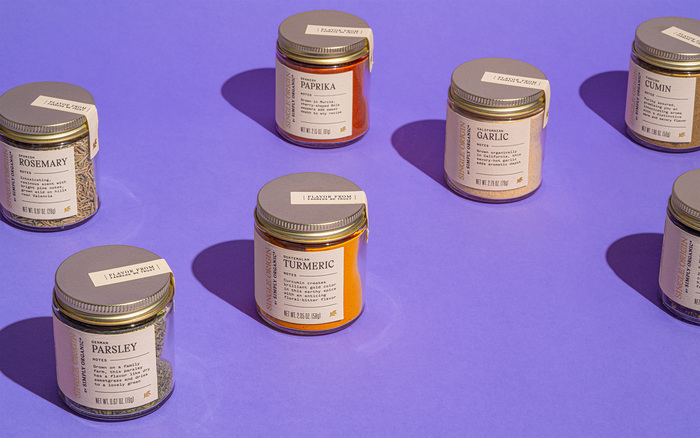
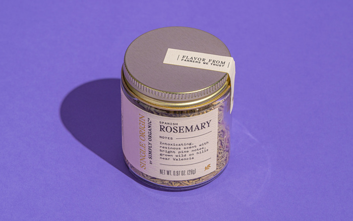
The design system for Simply Organic’s high-end spice line, Single Origin, draws inspiration from vintage apothecary labels. Simply Organic’s main brand recedes in the background and allows each spice’s distinct qualities to take center stage: the geographic origin, cultivation methods, and distinct potent flavor qualities.
To accomplish this, both the standard and condensed widths of Gza employed for their vintage-inspired qualities. Additionally, the monospaced cut of Founders Grotesk is utilized for its typewriter aesthetic. The declaration of weight is added in Tungsten Compressed.
Source: ot.studio The Office of Ordinary Things. License: All Rights Reserved.
Source: ot.studio The Office of Ordinary Things. License: All Rights Reserved.
Source: ot.studio The Office of Ordinary Things. License: All Rights Reserved.
Source: ot.studio The Office of Ordinary Things. License: All Rights Reserved.
Source: ot.studio The Office of Ordinary Things. License: All Rights Reserved.
This post was originally published at Fonts In Use
Read full story.
WRITTEN BY
FontsInUse
An independent archive of typography.