QuiteLike
Source: universalfavourite.com.au Universal Favourite. License: All Rights Reserved.


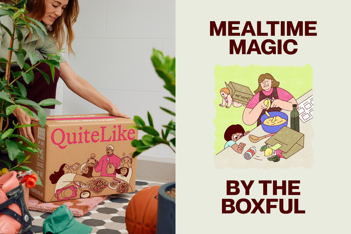
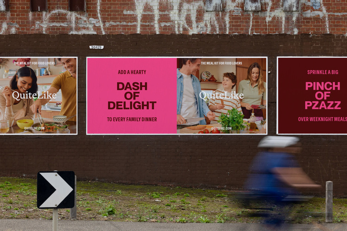
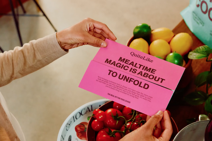
Universal Favourite partnered with QuiteLike who are on a mission to help Australians bite into a better meal kit. But this isn’t just about what's on the plate. QuiteLike is reimagining the category by turning mealtimes into meaningful, memorable moments—full of flavour, flexibility, and just a little pinch of pzazz.
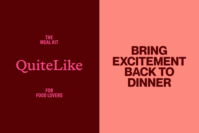
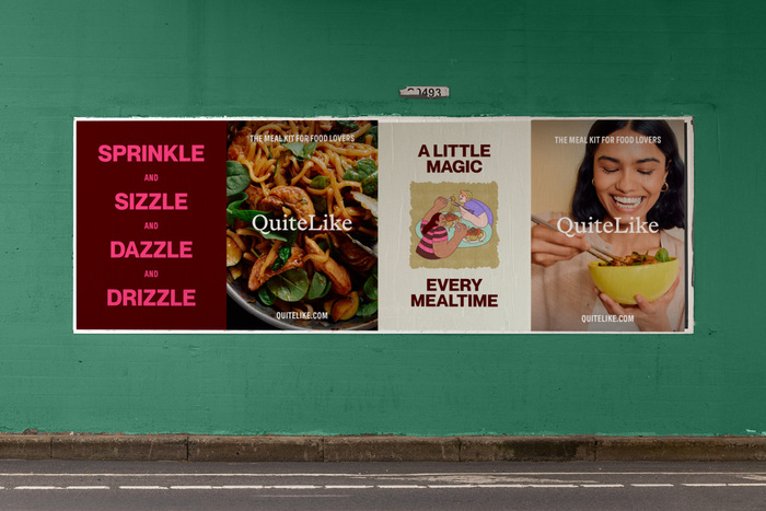
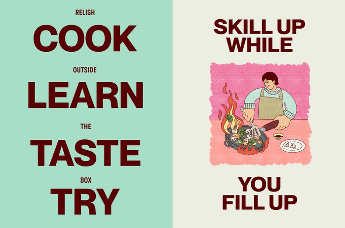
From brand strategy and tone of voice to visual identity, packaging and beyond, UF refreshed every element of the QuiteLike experience. The new brand identity captures the rhythm of cooking through warm photography, expressive illustrations, bold typography, and a punchy colour palette that balances foodie sophistication with playful zest.
QuiteLike’s typography system was built to flex between expressive and functional, premium and approachable. The core typefaces, Neue Montreal, Spezia, and Spezia Serif, work together to create dynamic and eyecatching hierarchy. Neue Montreal leads with bold, confident energy, bringing a contemporary edge to headlines. Spezia, used across serif and sans cuts, introduces warmth, clarity, and a subtle editorial feel.
Source: universalfavourite.com.au Universal Favourite. License: All Rights Reserved.
Source: universalfavourite.com.au Universal Favourite. License: All Rights Reserved.
Source: universalfavourite.com.au Universal Favourite. License: All Rights Reserved.
Source: universalfavourite.com.au Universal Favourite. License: All Rights Reserved.
Source: universalfavourite.com.au Universal Favourite. License: All Rights Reserved.
This post was originally published at Fonts In Use