Little Rot by Akwaeke Emezi
Source: www.faber.co.uk License: All Rights Reserved.
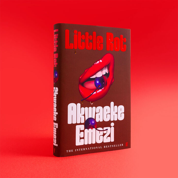
“The international bestseller” is added in caps from a Didot.


The raw, visceral energy of Akwaeke Emezi’s Little Rot finds a striking visual counterpart in the typeface Good Girl designed by Marion Bisserier. Set against a backdrop of intimacy, hunger, and defiance, the title design leans into the grotesque beauty of Emezi’s prose – unflinching, emotional, and gloriously corporeal.
Used for the cover treatment and supporting visual assets, Good Girl delivers sharp, sculptural forms that feel both confrontational and deliberately off-kilter. Its uneven rhythm and bold personality echo the themes of bodily transformation and emotional reckoning that run throughout the work.
Much like Little Rot itself, the typography refuses to be neat or easily digested. It’s typographic grit – loud, unapologetic, and perfectly aligned with Emezi’s fearless storytelling.
Source: www.faber.co.uk License: All Rights Reserved.
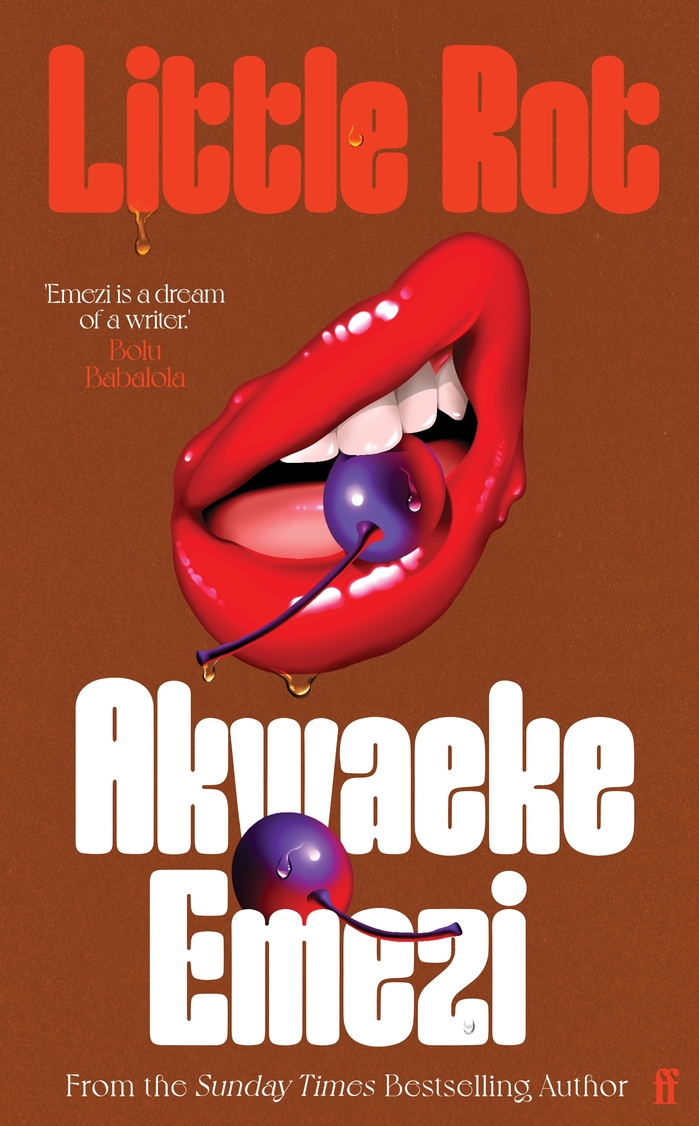
Front panel with a blurb by Bolu Babalola. Secondary type is in Voyage.

Source: www.faber.co.uk License: All Rights Reserved.
Audio book cover
This post was originally published at Fonts In Use