Marloe Watch Company
Published June 10, 2025
By FontsInUse
Contributed by Connary Fagen
Source: www.marloewatchcompany.com License: All Rights Reserved.

Source: www.marloewatchcompany.com License: All Rights Reserved.
Source: www.marloewatchcompany.com License: All Rights Reserved.
Source: www.marloewatchcompany.com License: All Rights Reserved.
Source: www.marloewatchcompany.com License: All Rights Reserved.
Source: www.marloewatchcompany.com License: All Rights Reserved.
Source: www.marloewatchcompany.com License: All Rights Reserved.
This post was originally published at Fonts In Use
Source: www.marloewatchcompany.com License: All Rights Reserved.
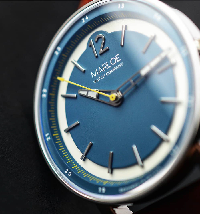
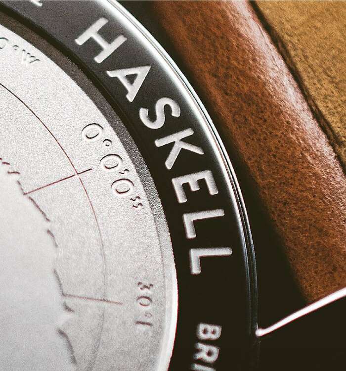
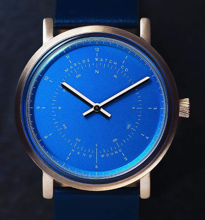
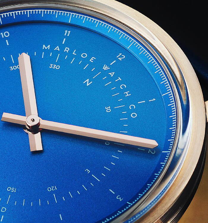
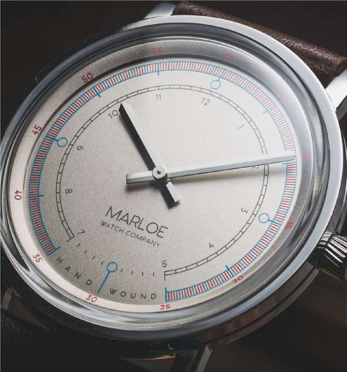
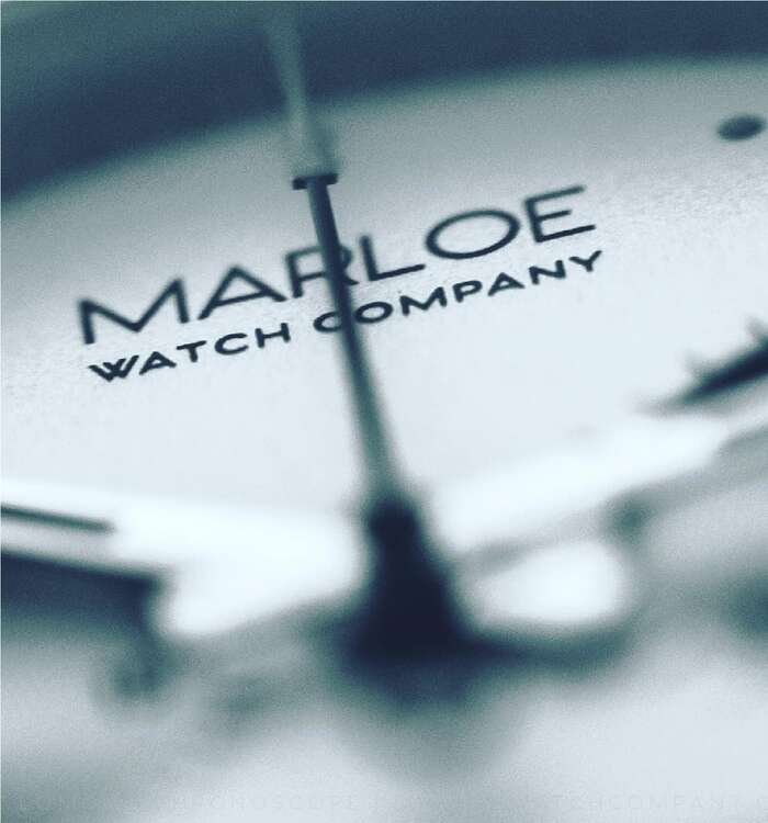
Typography in watch design is not merely about choosing a font — it’s about creating a cohesive and emotionally resonant visual language that aligns with the watch’s functional and aesthetic goals. Something Marloe Watch Company, the British mechanical watch design company, knows deeply well when choosing Venti CF for several of its timepieces as well as for the overall branding.
Venti CF, designed by Connary Fagen, is a modern geometric typeface featuring a lowercase style, giving it a classic and warm feel. The blend of modern and classic elements makes it perfect for the vintage vibe of Marloe’s products. The detail of the W glyph, with its distinctive crossed strokes, adds a unique and memorable touch to the brand.
Source: www.marloewatchcompany.com License: All Rights Reserved.
Source: www.marloewatchcompany.com License: All Rights Reserved.
Source: www.marloewatchcompany.com License: All Rights Reserved.
Source: www.marloewatchcompany.com License: All Rights Reserved.
Source: www.marloewatchcompany.com License: All Rights Reserved.
Source: www.marloewatchcompany.com License: All Rights Reserved.
This post was originally published at Fonts In Use
Read full story.
WRITTEN BY
FontsInUse
An independent archive of typography.
More from FontsInUse