Wild Harmony by Bart & Pieter
Published June 10, 2025
By FontsInUse
Contributed by bart kiggen
Keen. License: All Rights Reserved.

Keen. License: All Rights Reserved.
Keen. License: All Rights Reserved.
Keen. License: All Rights Reserved.
Keen. License: All Rights Reserved.
This post was originally published at Fonts In Use
Keen. License: All Rights Reserved.
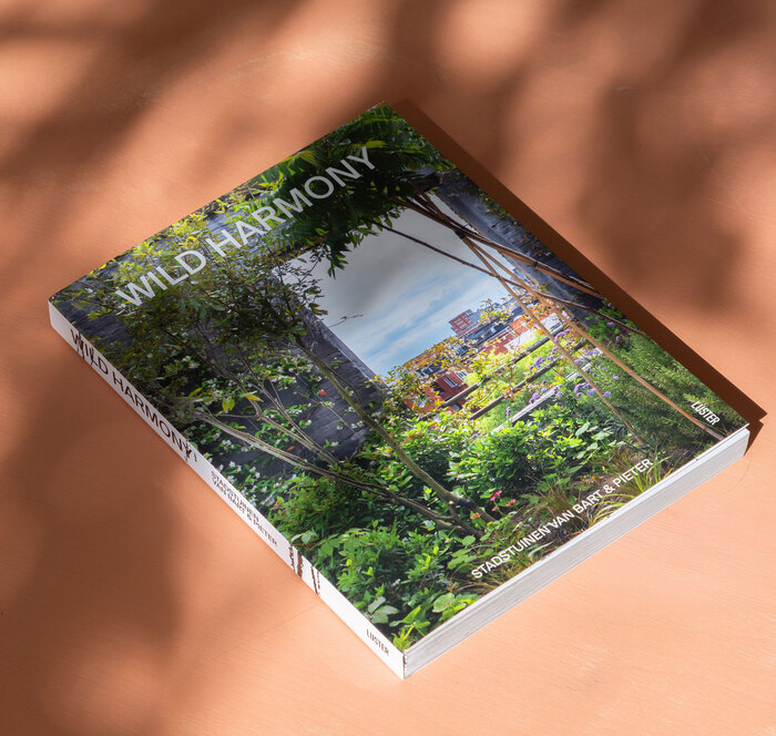
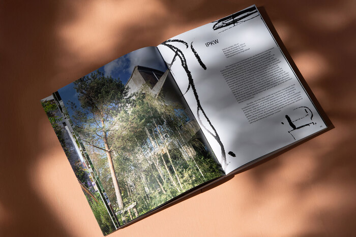
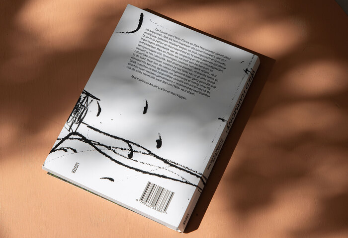
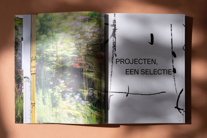
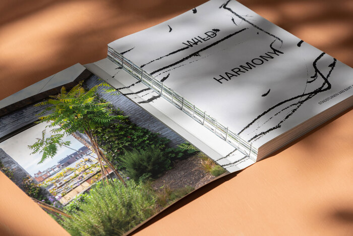
Wild Harmony is a magazine created by garden architects Bart & Pieter and published by Luster. We took the title Wild Harmony literally, using their sketches to build a raw, organic graphic system in a restrained black-and-white palette. The Swiss binding was chosen for its exposed spine, echoing the layered, intertwined quality of plants and grasses. Combined with the imagery, it creates a dense, tactile rhythm – a wild texture that mirrors the richness of their landscapes.
Keen. License: All Rights Reserved.
Keen. License: All Rights Reserved.
Keen. License: All Rights Reserved.
Keen. License: All Rights Reserved.
This post was originally published at Fonts In Use
Read full story.
WRITTEN BY
FontsInUse
An independent archive of typography.
More from FontsInUse