Poirier Coutansais visual identity
Source: www.instagram.com Photo: eschenlauer sinic. © eschenlauer sinic. License: All Rights Reserved.
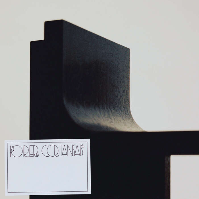
The identity for Poirier Coutansais establishes a dialogue between Art Deco and modern rationalism, between ornament and structure. Designed by eschenlauer sinic, it extends the philosophy of Victor Poirier Coutansais’s practice, where craft meets concept, and sensibility meets precision.
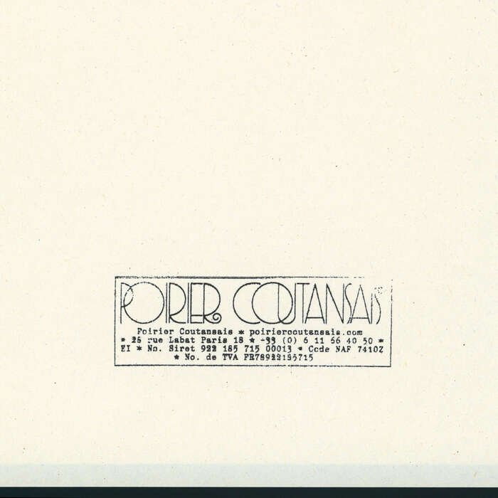
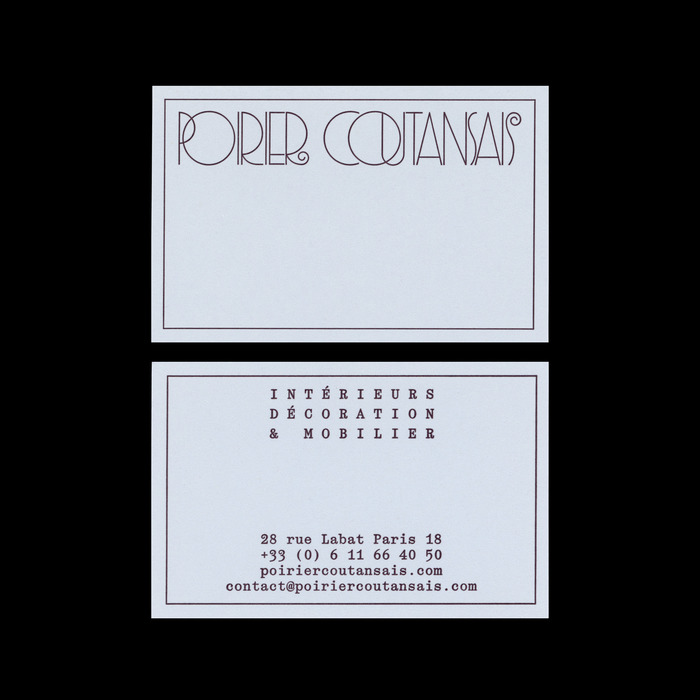
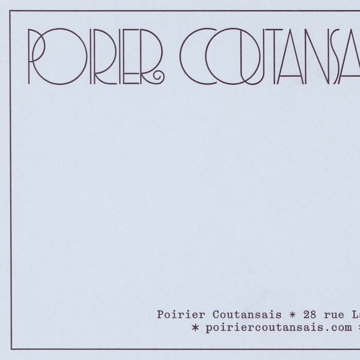
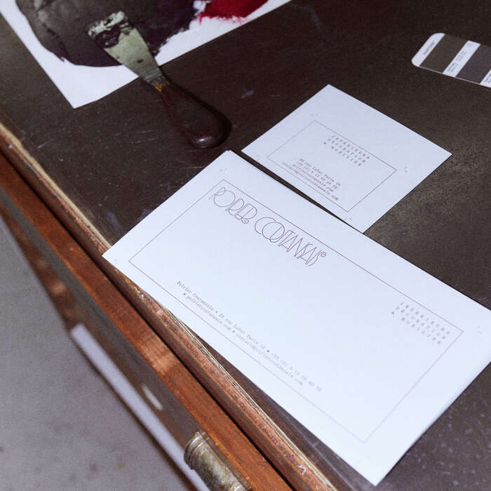
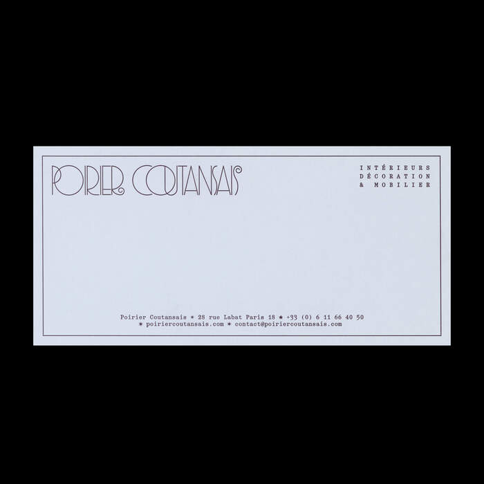
The wordmark follows an architectural approach to letter design. Loosely inspired by the decorative proportions of Gershwin, its construction recalls the spirit of Parisian Art Deco façades, where geometry became ornament. The rigid framework is balanced by more lyrical, almost calligraphic details reminiscent of hand-tooled metal or carved wood from the applied arts of that era.
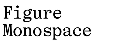
This is countered by the use of Figure Monospace, whose mechanical logic introduces a contemporary tension – a dialogue between the analog and the digital, the handmade and the systematic.
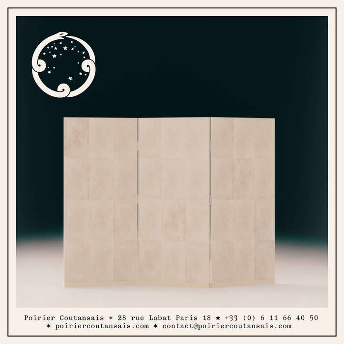
Around the logotype, a custom visual vocabulary was developed: frames, borders, and star-shaped symbols act as rhythmic markers throughout the system. Echoing the geometric motifs and gilded fillets of the period, these elements bring a sense of controlled fantasy. Each motif serves a functional purpose, merging hierarchy and decoration in the spirit of modernist applied arts, where structure becomes ornament.
The identity finds its balance in a form of inhabited precision, where the rigor of the line becomes a vehicle for emotion.
Source: www.instagram.com Photo: eschenlauer sinic. © eschenlauer sinic. License: All Rights Reserved.
Source: www.instagram.com Photo: eschenlauer sinic. © eschenlauer sinic. License: All Rights Reserved.
Source: www.instagram.com Photo: eschenlauer sinic. © eschenlauer sinic. License: All Rights Reserved.
Source: www.instagram.com Photo: eschenlauer sinic. © eschenlauer sinic. License: All Rights Reserved.
Source: www.instagram.com Photo: eschenlauer sinic. © eschenlauer sinic. License: All Rights Reserved.
Source: www.instagram.com Photo: eschenlauer sinic. © eschenlauer sinic. License: All Rights Reserved.

Source: www.instagram.com Photo: eschenlauer sinic. © eschenlauer sinic. License: All Rights Reserved.
This post was originally published at Fonts In Use