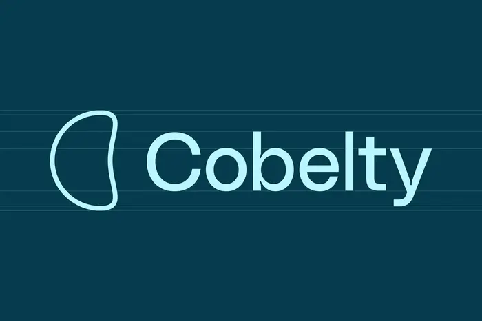
Cobelty

Source: notinparisnow.com Not In Paris Now. License: All Rights Reserved.

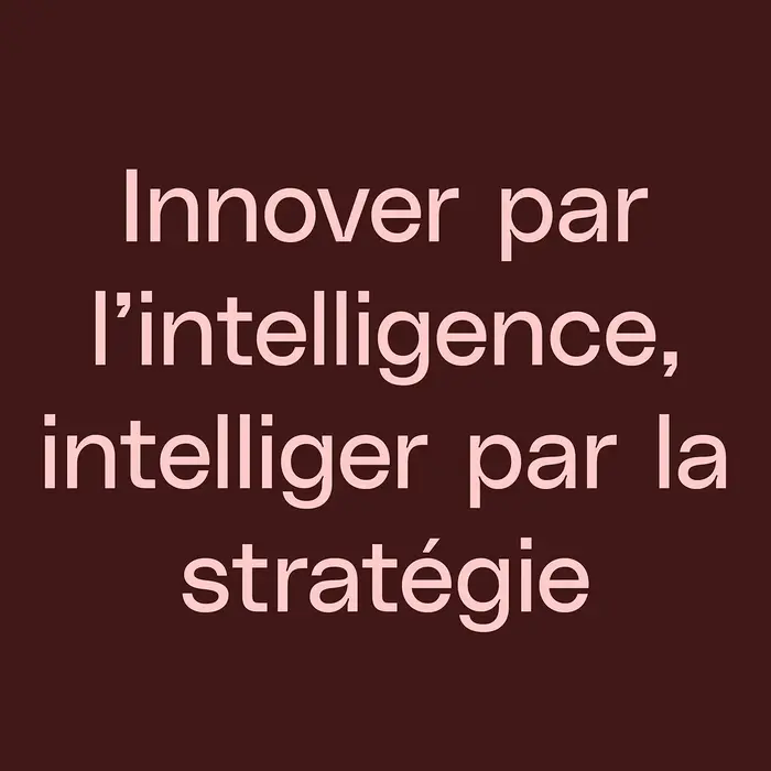
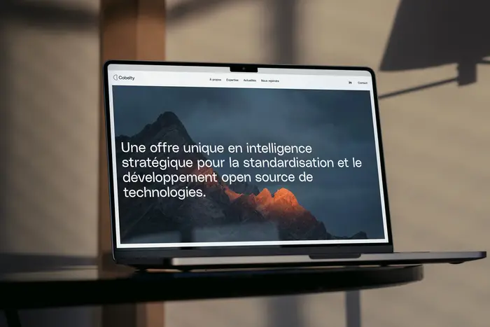
Cobelty is a consulting firm specializing in standardization, open source, and associated intellectual property. The challenge is to define a brand identity that is both innovative and reassuring in a highly codified corporate sector. It is necessary to highlight both the conceptual aspect of innovations and the serious, rigorous side of studying this field. We chose the name “Cobelty” which summarizes several concepts: cobalt, a natural metal widely used in digital technologies, and “belt,” thus affirming the reassuring and rigorous aspect of Cobelty’s expertise, whose offering consists in particular of securing the development ground for an innovation. Cobelty’s visual identity must be worthy of its unique and cutting-edge expertise.
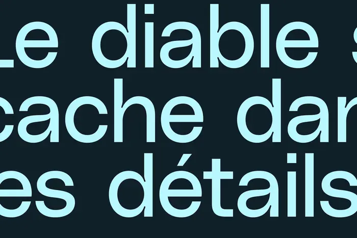
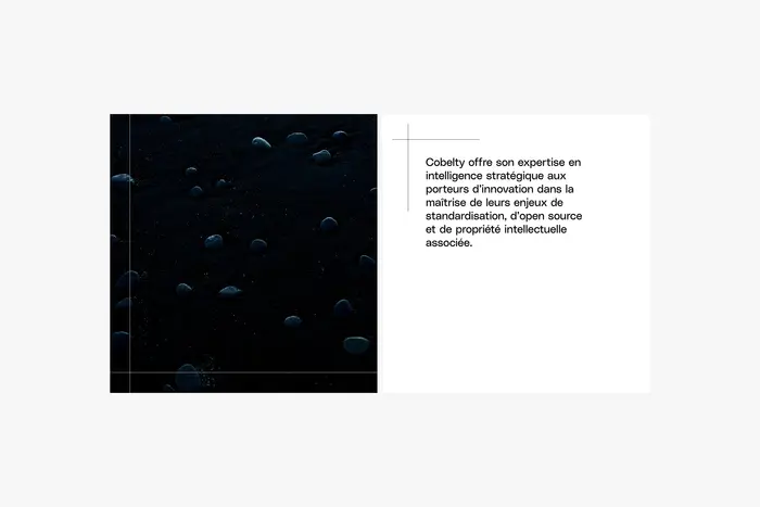
The neo-grotesque PolySans, detailed and avant-garde, is used for all textual elements. A color system derived from cobalt (blue) and pixels (red, green, blue) is used. The iconography is centered on the elements, the relationship to nature and force, immensity (mountain, wind, ice, ocean, rock) which allows to underline the awareness of the environmental challenges specific to current issues in terms of standardization and open source in the context of technological development.
Source: notinparisnow.com Not In Paris Now. License: All Rights Reserved.
Source: notinparisnow.com Not In Paris Now. License: All Rights Reserved.
Source: notinparisnow.com Not In Paris Now. License: All Rights Reserved.
Source: notinparisnow.com Not In Paris Now. License: All Rights Reserved.
Source: notinparisnow.com Not In Paris Now. License: All Rights Reserved.
This post was originally published at Fonts In Use