AMO Tequila
Published November 13, 2025
By FontsInUse
Contributed by Darden Studio
Source: www.instagram.com License: All Rights Reserved.


Source: amotequila.com License: All Rights Reserved.
Source: amotequila.com License: All Rights Reserved.
Source: www.instagram.com License: All Rights Reserved.
Source: amotequila.com License: All Rights Reserved.
Source: www.instagram.com License: All Rights Reserved.
Source: amotequila.com License: All Rights Reserved.
Source: www.instagram.com License: All Rights Reserved.
Source: amotequila.com License: All Rights Reserved.
This post was originally published at Fonts In Use
Source: www.instagram.com License: All Rights Reserved.
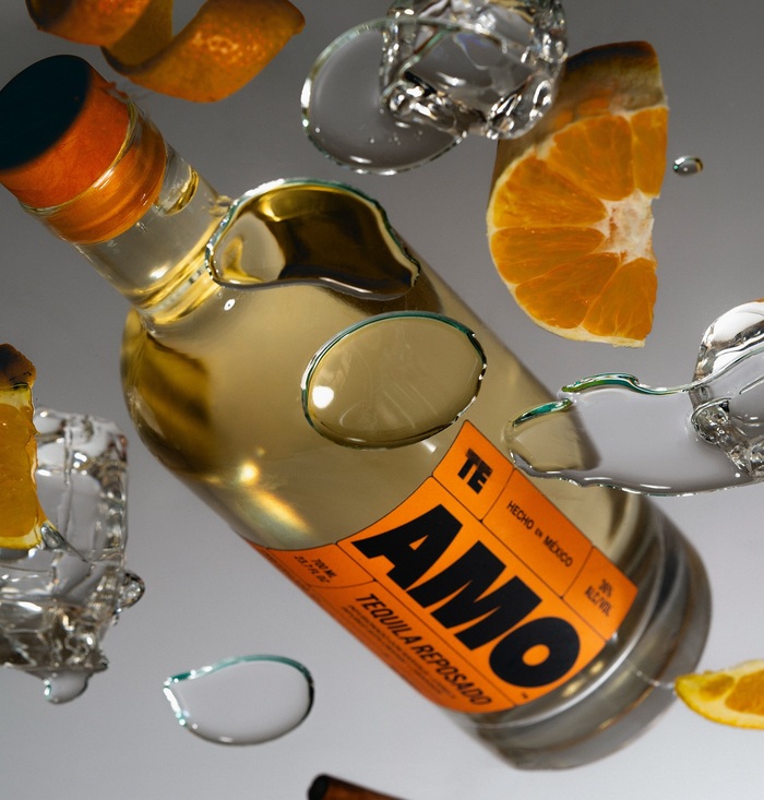
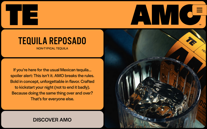
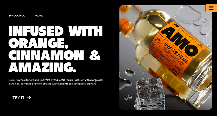
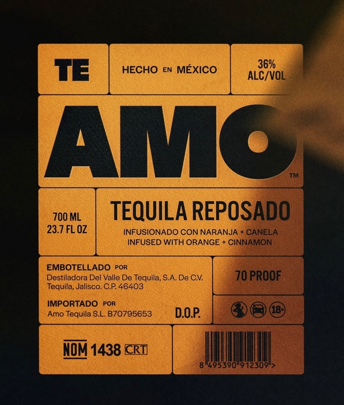
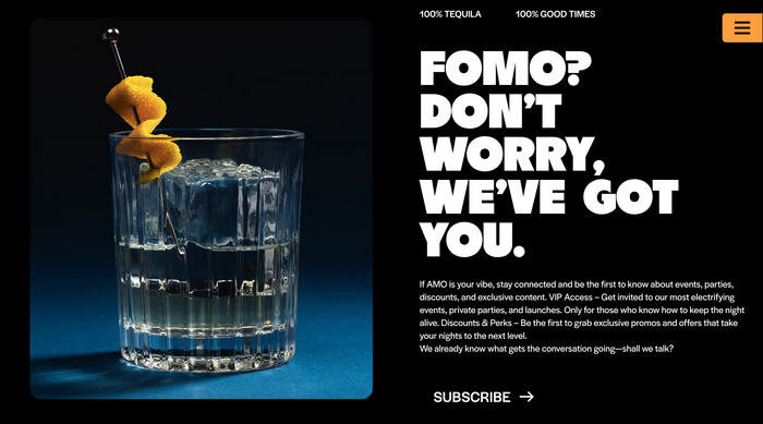
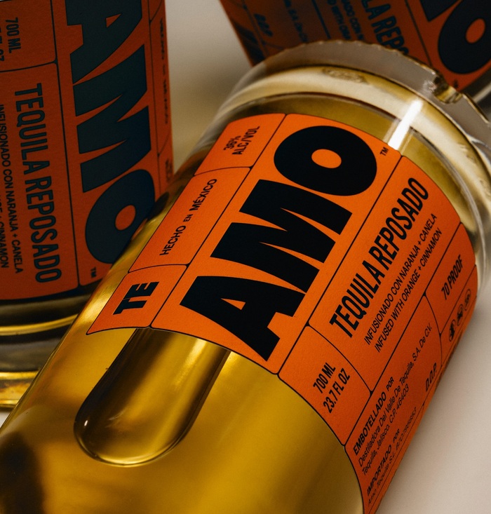
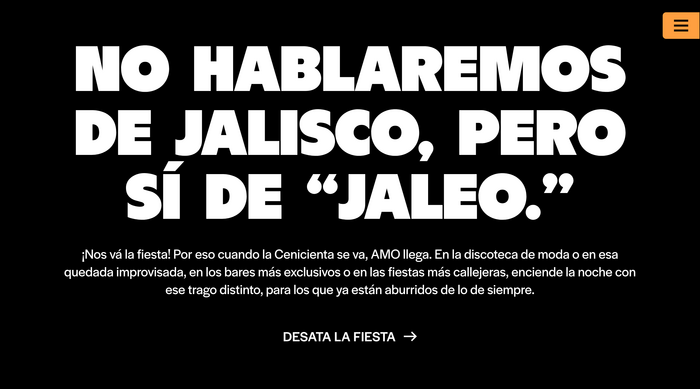
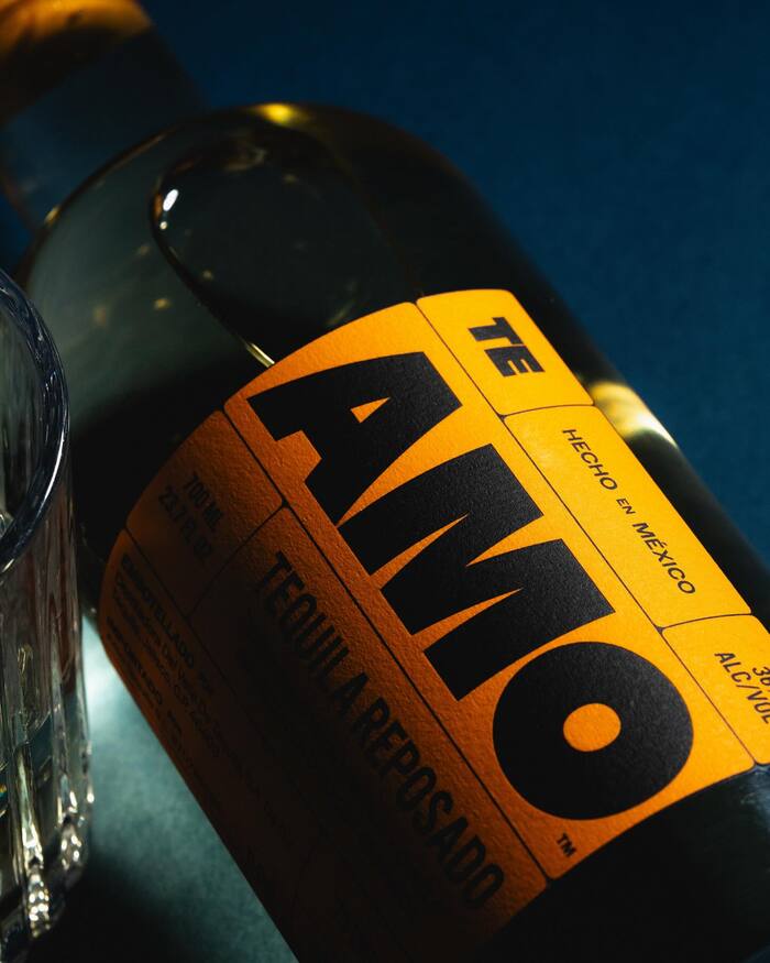
Brand design studio Hello Comrade created a type-centric identity for AMO Tequila. In a category so often dressed in ornament, this feels like a clear, confident pour.
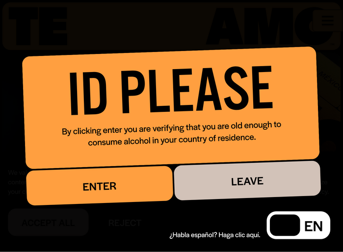
While logo and headings are in all-caps BN Dime, supported by Alternate Gothic, all body copy uses Halyard Display. Darden Studio’s sans serif features for text on the bottle labels and the website alike. There’s something special about seeing Halyard carry a brand like AMO Tequila, bold, front and center, without distraction.
Source: amotequila.com License: All Rights Reserved.
Source: amotequila.com License: All Rights Reserved.
Source: www.instagram.com License: All Rights Reserved.
Source: amotequila.com License: All Rights Reserved.
Source: www.instagram.com License: All Rights Reserved.
Source: amotequila.com License: All Rights Reserved.
Source: www.instagram.com License: All Rights Reserved.
Source: amotequila.com License: All Rights Reserved.
This post was originally published at Fonts In Use
Read full story.
WRITTEN BY
FontsInUse
An independent archive of typography.
More from FontsInUse