Hoopbus brand identity
Ben Loiz Studio. License: All Rights Reserved.


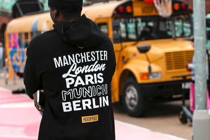
Hoopbus is a 501(c)(3) nonprofit rooted in the belief that basketball has the power to transform lives, build bridges, and uplift communities. Founded in Los Angeles in 2019, Hoopbus travels from local blocks to global cities, using the game to connect people through the universal language of basketball.
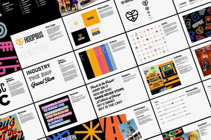
Ben Loiz Studio partnered with Hoopbus to create an identity system that reflects their mission and energy, translating seamlessly across their global fleet. From logo and color palette to social media and full-scale bus designs, the identity captures the heart of Hoopbus: love, peace, and basketball.
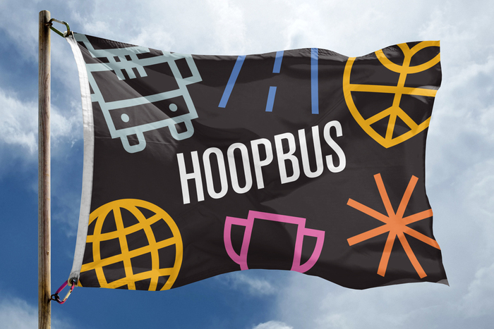
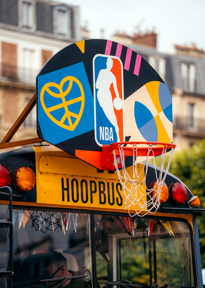
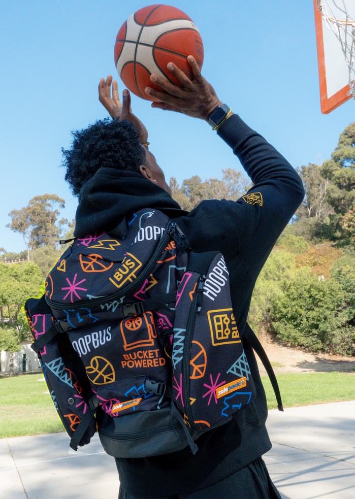
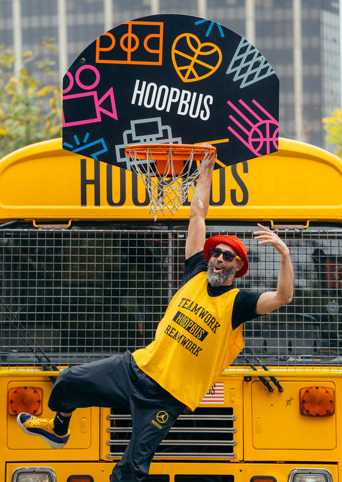
The Hoopbus identity is built around a simple yet powerful symbol – a heart, a peace sign, and a basketball – representing compassion, unity, and sport. Inspired by the classic American school bus, the bold black logotype nods to childhood nostalgia and lettering seen on buses that bring people together.
The color palette expands on this concept, featuring the vibrant yellow-orange of a school bus balanced with expressive supporting colors: pink, orange, blue, and teal. These hues give the identity flexibility while maintaining a strong, cohesive presence across print, digital, and environmental design.
To unify all elements, we introduced a set of brand icons and patterns that give the identity rhythm, dimension, and consistency without losing its expressive edge.
The two primary typefaces are Standard CT Medium Extra Condensed and Cina GEO. We use the former in our logotype – a bold, utilitarian typeface that evokes a collective nostalgia for childhood and learning, echoing the distinctive lettering found on American school buses. Cina GEO, designed by Michael Cina of Public Type, is a geo-sans typeface with a sturdy structure that balances clarity with subtle sophistication. Its clean simplicity brings to mind the handwriting practice sheets found in early classrooms – straightforward, structured, and easy to read.
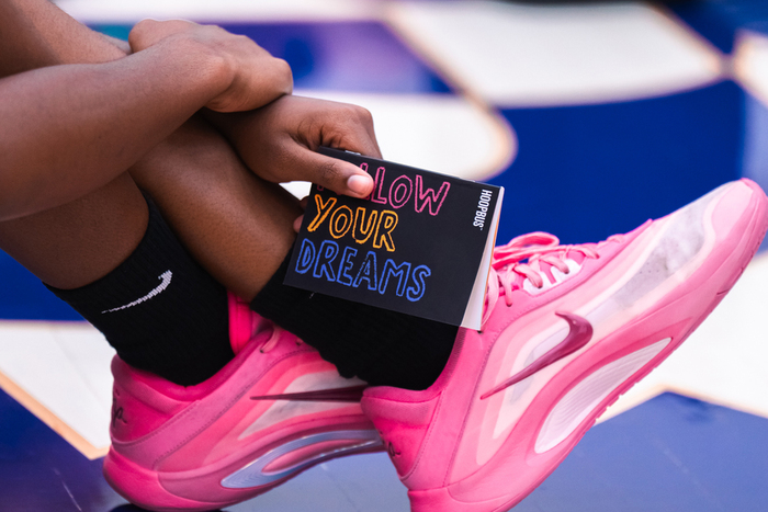
Along with the two primary fonts, we selected the secondary typefaces – Industry, a typeface that effortlessly transitions from a refined vintage aesthetic to the robust, industrial vibe of a school bus, Tuck Shop a hand-drawn display font that captures the playful feel of chalkboard markings, and Grand Slam is a retro-style font that captures the essence of classic athletic designs.
Ben Loiz Studio. License: All Rights Reserved.
Ben Loiz Studio. License: All Rights Reserved.
Ben Loiz Studio. License: All Rights Reserved.
Ben Loiz Studio. License: All Rights Reserved.
Ben Loiz Studio. License: All Rights Reserved.
Ben Loiz Studio. License: All Rights Reserved.
Ben Loiz Studio. License: All Rights Reserved.
This post was originally published at Fonts In Use