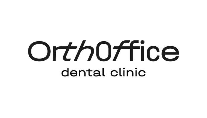
OrthOffice
Source: holystick.design Holystick. License: All Rights Reserved.

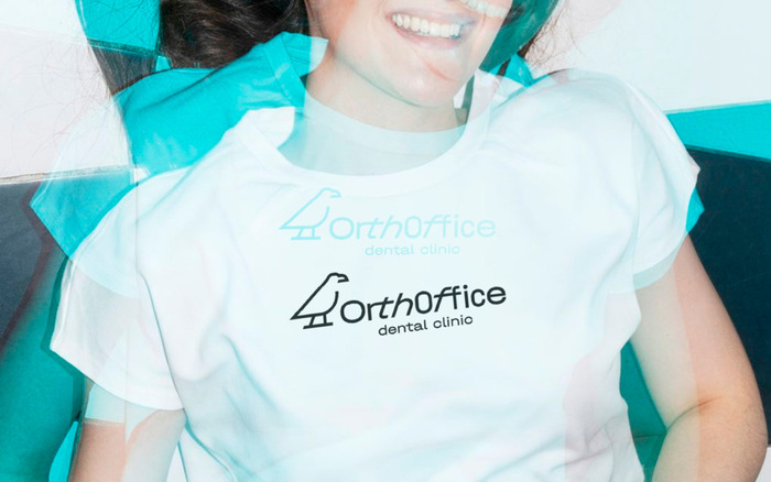
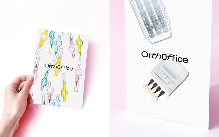
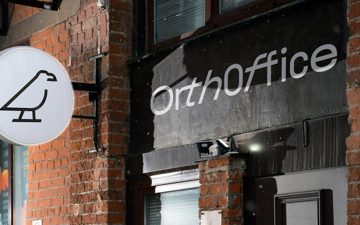
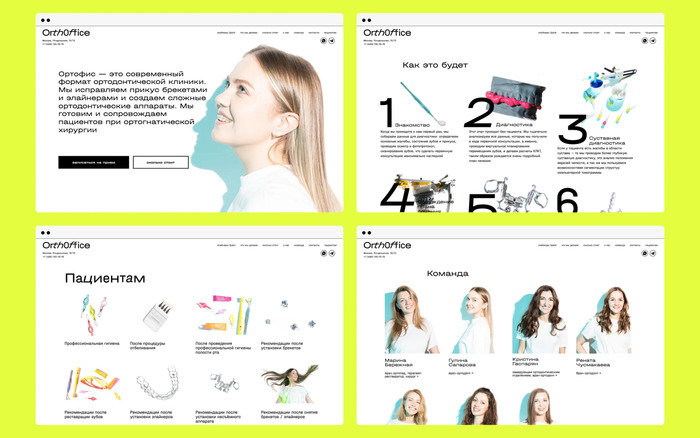
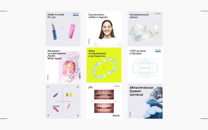
When developing the visual identity for the Moscow-based dental clinic OrthOffice (Ортофис), Holystick took a contemporary approach, departing from the traditional look often associated with medical environments. The aim was to create a clear, professional appearance that remains approachable and relevant to the practice's predominantly young patients.
The team selected the Halvar typeface for the typography. The slanted technical construction of the letterforms suggest precision and efficiency, aligning with the clinic’s professional character. Halvar Breitschrift was used for display and headlines, bringing a fresh, modern tone to the visual language. Meanwhile, Halvar Mittelschrift served as the text typeface, ensuring readability and consistency across applications. The Halvar typeface was also a practical choice due to its comprehensive Latin and Cyrillic support, making it well-suited for a bilingual identity system.
In the logo, Holystick played with the SuperSlanted style of Halvar to create a wordmark that conveys a sense of movement and direction. Overall, the typographic system proves a balance between contemporary expression and clarity, demonstrating how design can support aesthetic and functional needs in a healthcare context.
Source: holystick.design Holystick. License: All Rights Reserved.
Source: holystick.design Holystick. License: All Rights Reserved.
Source: holystick.design Holystick. License: All Rights Reserved.

Source: holystick.design Holystick. License: All Rights Reserved.
Source: holystick.design Holystick. License: All Rights Reserved.

Source: holystick.design Holystick. License: All Rights Reserved.
Source: holystick.design Holystick. License: All Rights Reserved.
This post was originally published at Fonts In Use