ORO
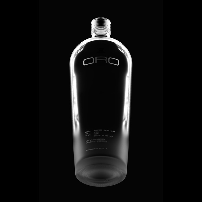
Source: www.instagram.com License: All Rights Reserved.

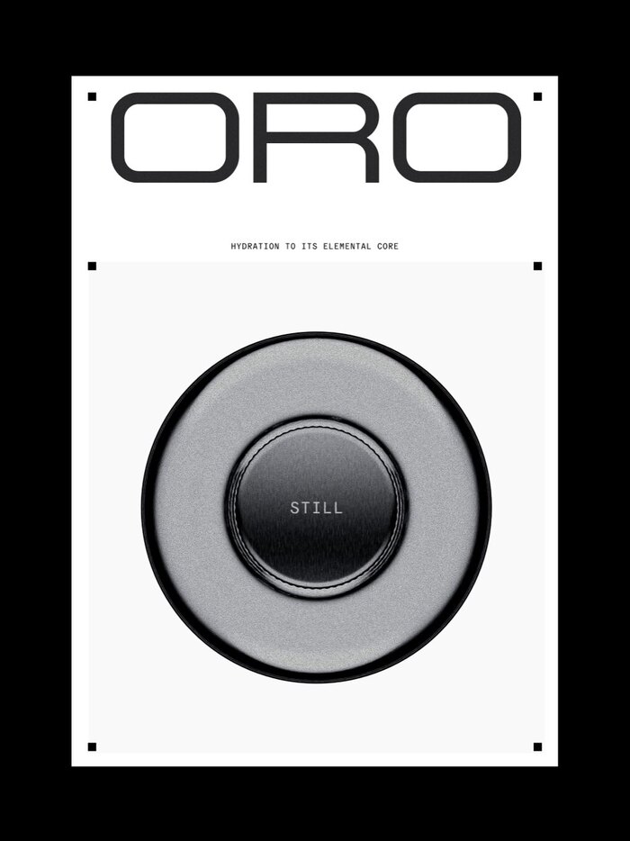
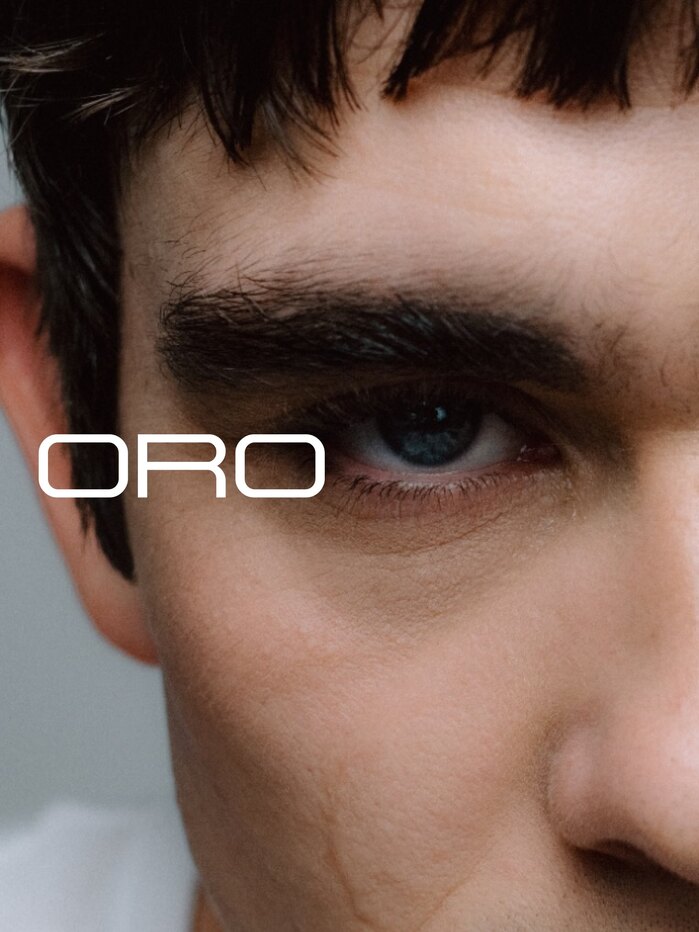
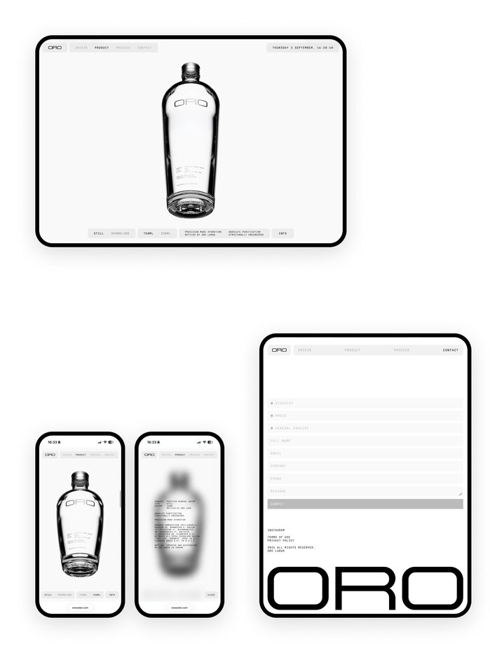
ORO is a Jordanian water brand built around precision and consistency. Unlike natural water, whose mineral composition varies depending on geology, season and weather, ORO draws water from an aquifer around 400 metres underground, purifies it to a neutral baseline, then reintroduces minerals in controlled amounts. Two Times Elliott developed the brand from the ground up, including strategy, naming, verbal and visual identity, packaging and digital.
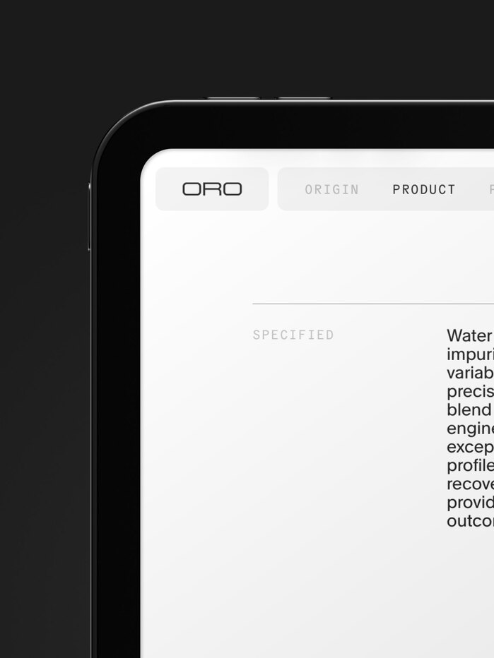
The identity is centred around the idea of “engineered beyond nature” and a precise, technical visual language. As Two Times Elliott explains, “the type is set like a spec sheet”, reflecting the same sense of control and precision as the product itself.
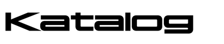
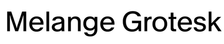
Katalog (Edito) is used in a customised version for the ORO wordmark, developed to fit the identity and its engineered approach. KMR Melange Grotesk (kimera) and General Grotesque Mono (General Type Studio) are used alongside it for headlines and brand messaging.
Art direction and identity by Two Times Elliott. Development by No Plans, with renders by Scott Russell and Raw.
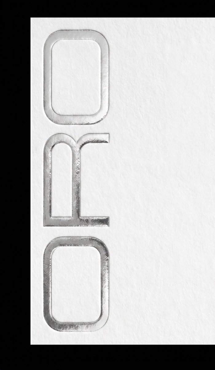
Source: www.instagram.com License: All Rights Reserved.

Source: www.instagram.com License: All Rights Reserved.
Source: www.instagram.com License: All Rights Reserved.
Source: www.instagram.com License: All Rights Reserved.
Source: www.instagram.com License: All Rights Reserved.
Source: www.instagram.com License: All Rights Reserved.
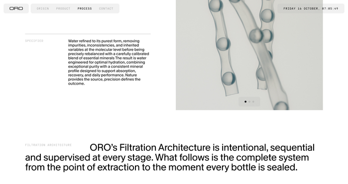
Source: www.orowater.com License: All Rights Reserved.
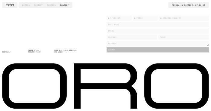
Source: www.orowater.com License: All Rights Reserved.
This post was originally published at Fonts In Use