Olympikus
Published May 6, 2026
By FontsInUse
Contributed by EDITO
Source: www.instagram.com Olympikus. License: All Rights Reserved.
Source: www.instagram.com Olympikus. License: All Rights Reserved.
Source: www.instagram.com Olympikus. License: All Rights Reserved.
Source: www.instagram.com Olympikus. License: All Rights Reserved.
Source: www.instagram.com Olympikus. License: All Rights Reserved.
Source: www.instagram.com Olympikus. License: All Rights Reserved.
This post was originally published at Fonts In Use
Source: www.instagram.com Olympikus. License: All Rights Reserved.
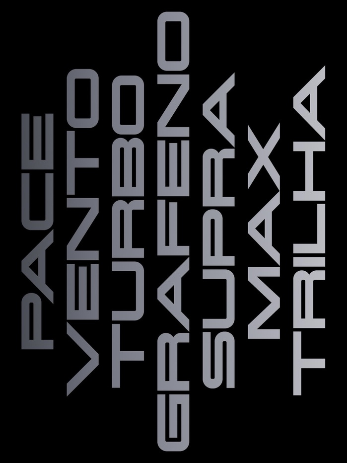
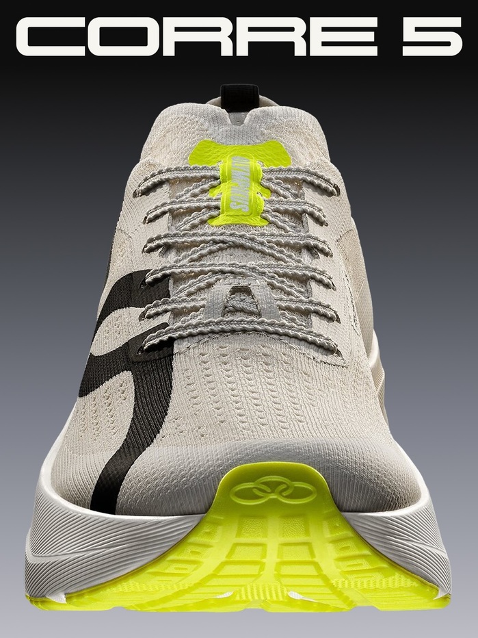
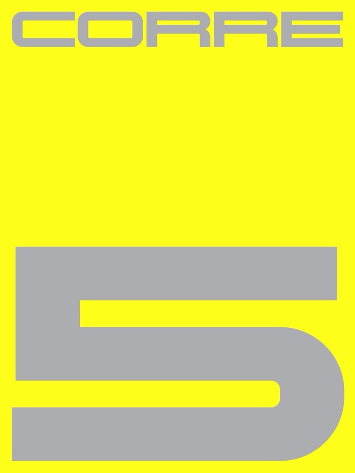
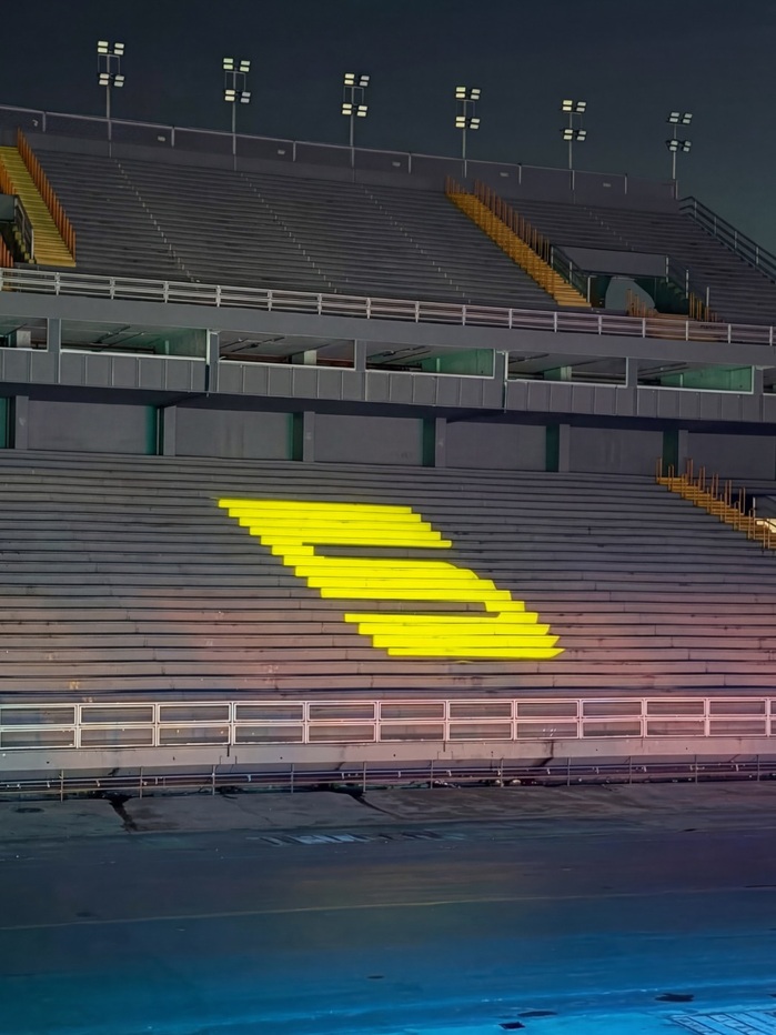
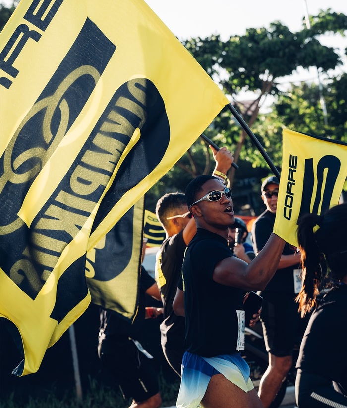
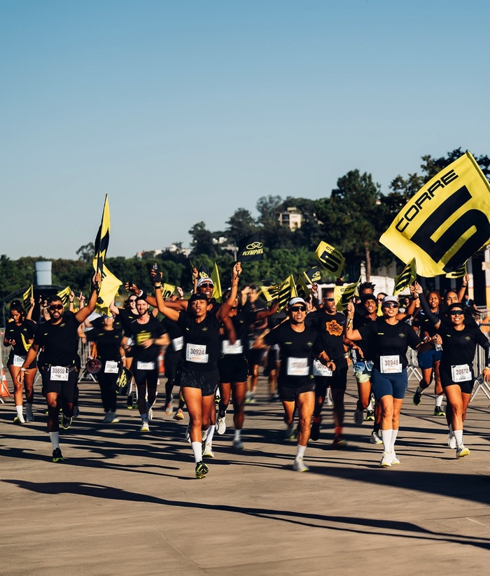
Porto Rocha developed an evolution of the brand identity for Olympikus, introduced alongside the release of its CORRE 5 footwear line. Katalog Bold (Edito) is used throughout the system as the primary typeface, establishing a compact, assertive typographic voice.
The design studio describes the project as follows:
A new era of running begins for Olympikus. Alongside a bold brand identity evolution, Olympikus unveils its latest innovation: CORRE 5.
Proud to celebrate over six years of partnership and to witness Olympikus’ meteoric rise as Brazil’s leading and most beloved running brand.
Source: www.instagram.com Olympikus. License: All Rights Reserved.
Source: www.instagram.com Olympikus. License: All Rights Reserved.
Source: www.instagram.com Olympikus. License: All Rights Reserved.
Source: www.instagram.com Olympikus. License: All Rights Reserved.
Source: www.instagram.com Olympikus. License: All Rights Reserved.
This post was originally published at Fonts In Use
Read full story.
WRITTEN BY
FontsInUse
An independent archive of typography.