Wazdan
Source: www.thirdwhat.com Third What. License: All Rights Reserved.
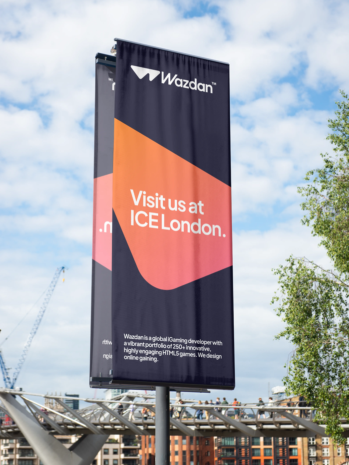
Wazdan is one of the top global developers of online casino games. The award-winning company is a leader in the industry, employing over 200 specialists and engineers, and releasing more than 40 titles annually for over 1,500 partners worldwide.
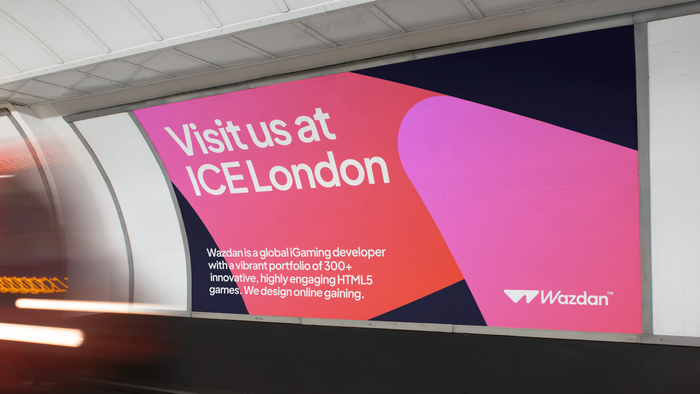
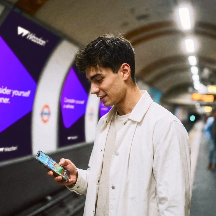
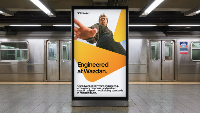
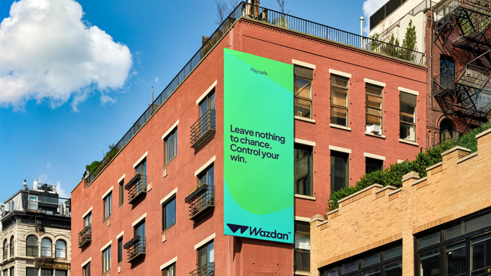
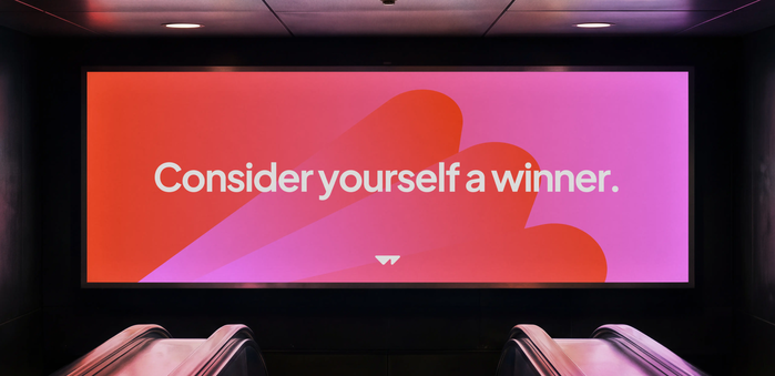
Instead of relying on typical playful casino tropes, we decided to focus heavily on B2B communication and the Wazdan’s technical specialisation. This approach allowed us to enhance the company’s expert image and boost its legitimacy. Additionally, we introduced the tagline ‘Online Gaining’, which encapsulates the key messaging of the industry, setting the client’s competitors far behind in terms of the quality of marketing communication.
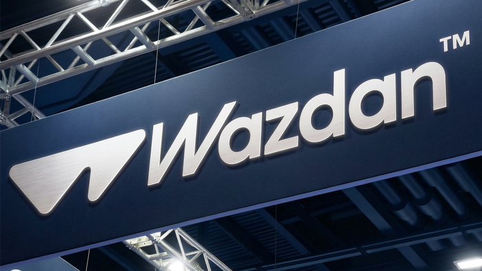
To introduce a rebrand that authentically represents the client, we first needed to understand them. We built a strong partnership and became part of the Wazdan family. This relationship allowed us to grasp the nuances of how the company operates and what its priorities are. The visual identity focused mainly on specialisation, games, playfulness, and technology. The logo was refined from its previous version, where the triangles were separate. We merged them to symbolise the unity of Wazdan’s team. The verbal identity centred on presenting unique strengths, attitudes, and values. While the key messaging focuses on gains, the company adopts a non-cynical approach, valuing both business partners and players.
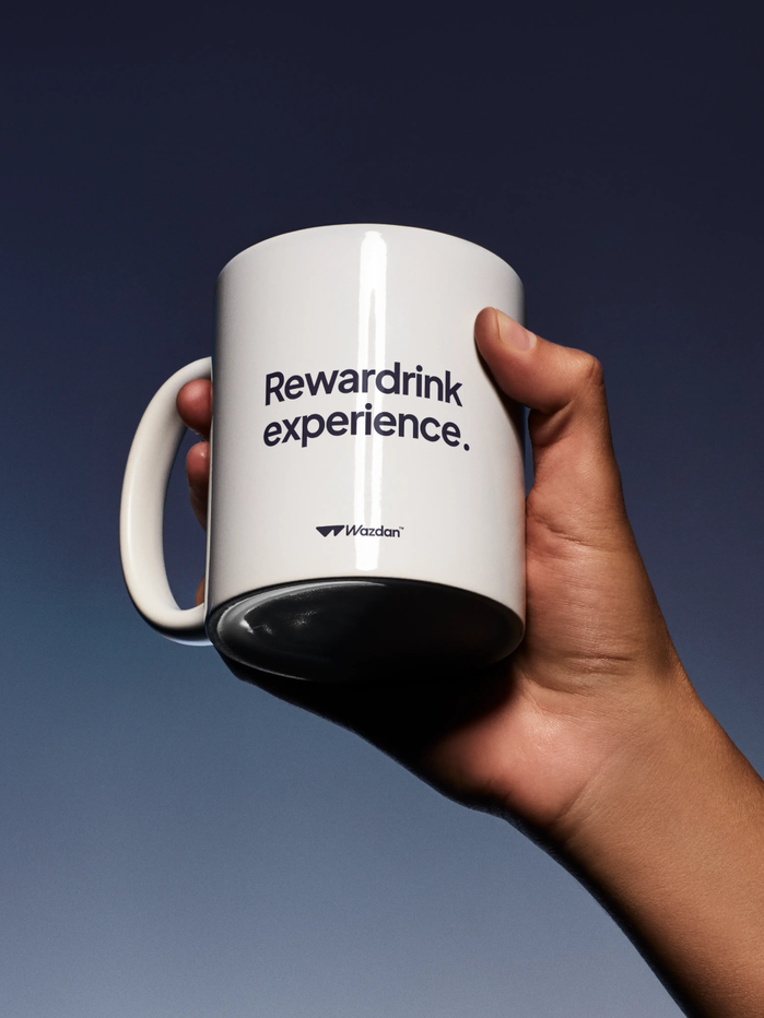
Work on visual and verbal architecture involved over 1.5 years of analysis and refinement. The iGaming industry is known for its extremely vibrant imagery and extravagant loot piñatas. This presents a challenge when designing a more subdued, informative, and structured brand communication. Continuing with game aesthetics for the sake of coherence was not an option. Instead, we had to adapt the existing products to new templates for websites and collateral materials. We utilised gradients as a flexible tool to complement the vibrancy of the games and solutions offered. The text architecture focuses on user comfort and maximising the accessibility of key information.
The brand font, Wazdan Sans, is a fork of Plus Jakarta Sans.
Source: www.thirdwhat.com Third What. License: All Rights Reserved.
Source: www.thirdwhat.com Third What. License: All Rights Reserved.

Source: www.thirdwhat.com Third What. License: All Rights Reserved.
Source: www.thirdwhat.com Third What. License: All Rights Reserved.
Source: www.thirdwhat.com Third What. License: All Rights Reserved.
Source: www.thirdwhat.com Third What. License: All Rights Reserved.
Source: www.thirdwhat.com Third What. License: All Rights Reserved.
Source: www.thirdwhat.com Third What. License: All Rights Reserved.
This post was originally published at Fonts In Use