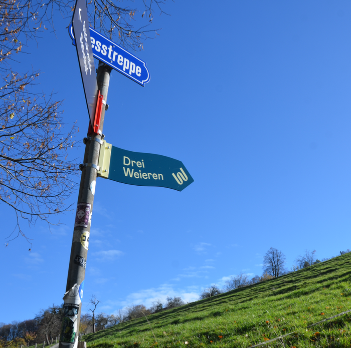
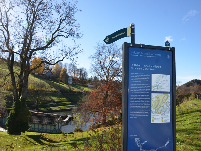
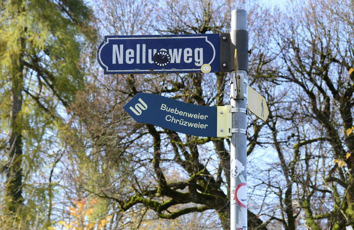
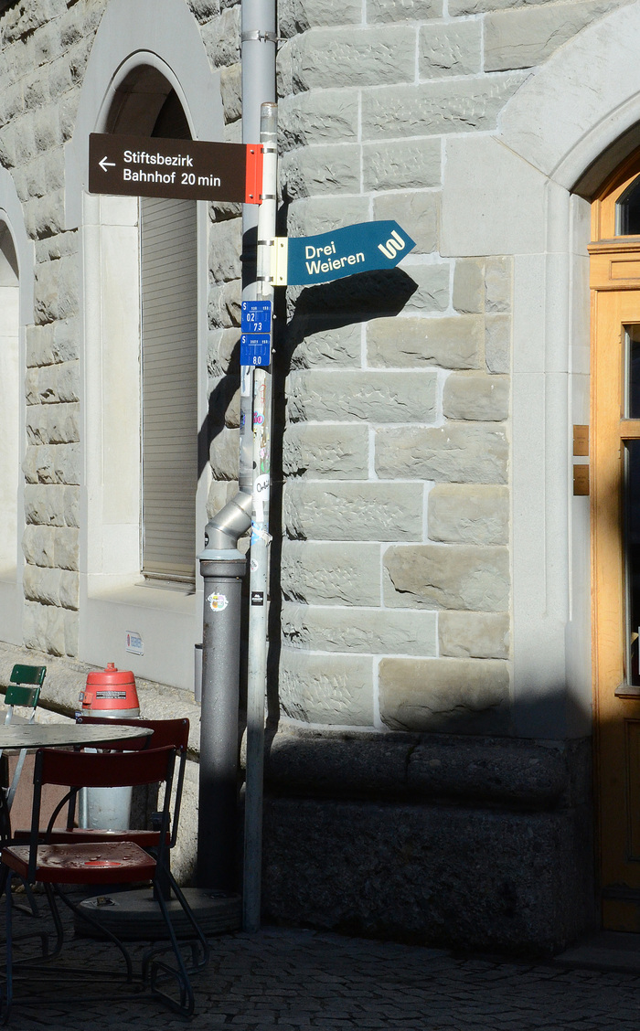
Drei Weieren branding and wayfinding

Source: studio-mi.ch Studio mi. License: All Rights Reserved.

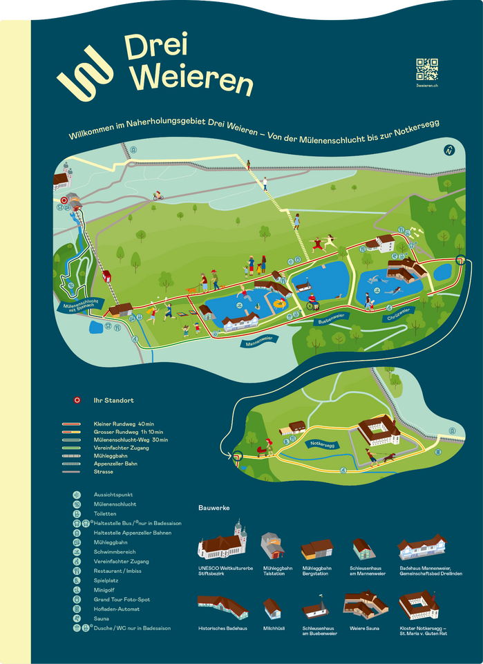
The Drei Weieren (“Three Ponds”) are definitely a favourite spot for the people of St.Gallen. The visitors to the neighbouring tourist highlight and UNESCO World Heritage Site, the Abbey District, are the ones who are least aware of the splendour of the local recreation area. As part of the tourism development concept, a separate brand identity and wayfinding system is to be introduced to strengthen the presence of the area, enhance it in a gentle manner and make existing attractions more visible.
Studio mi developed a solution that is both striking and in keeping with the characteristics of the area: the concise combination of 3 and W in the brand identity sets the tone for the visual language. Curved signposts and overview maps, as well as welcome banners, reflect the omnipresent movement in the topography, the walkers and swimmers, as well as the dominant element of water.
Source: studio-mi.ch Studio mi. License: All Rights Reserved.
Source: studio-mi.ch Studio mi. License: All Rights Reserved.
Source: studio-mi.ch Studio mi. License: All Rights Reserved.
Source: studio-mi.ch Studio mi. License: All Rights Reserved.
Source: studio-mi.ch Studio mi. License: All Rights Reserved.
Map for Drei Weieren
This post was originally published at Fonts In Use