Bodkin Studio website
Source: www.bodkin.studio Bodkin Studio. License: All Rights Reserved.

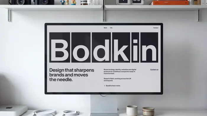
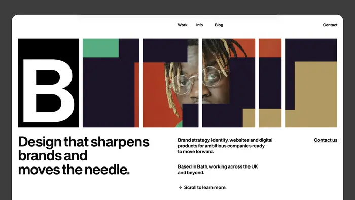
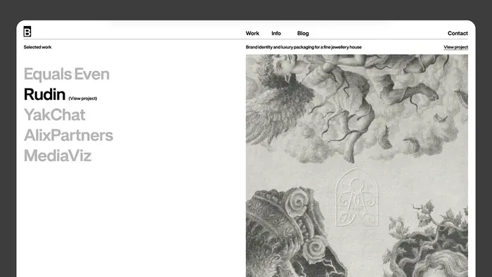
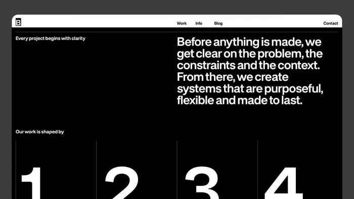
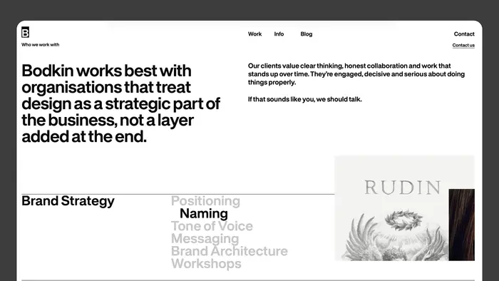
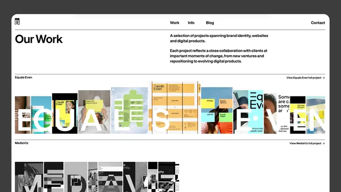
When Bodkin Studio redesigned their website, they pivoted from a purely visual exercise to a mission of clarity and accessibility. Moving away from a site that prioritized “intrigue” over function, they sought a typographic language that could communicate their expertise in digital products and user journeys with absolute transparency. My typeface FH Dfaalt was selected as the foundational element of this new identity, bridging the gap between high-end craft and genuine usability.
The collaboration highlights how FH Dfaalt functions as more than just an aesthetic choice; its modernist structure and sharp legibility support Bodkin’s commitment to an efficient, non-alienating user experience. By utilizing the font’s systematic weights, the new site successfully translates complex service offerings into a clear, accessible narrative. Seeing FH Dfaalt empower a studio that values “doing the job” over mere polish perfectly reflects the utilitarian yet sophisticated spirit I intended for this typeface.
Source: www.bodkin.studio Bodkin Studio. License: All Rights Reserved.
Source: www.bodkin.studio License: All Rights Reserved.
Source: www.bodkin.studio License: All Rights Reserved.
Source: www.bodkin.studio License: All Rights Reserved.
Source: www.bodkin.studio License: All Rights Reserved.
This post was originally published at Fonts In Use