Office des Vins Vaudois – Guide de Dégustation

Source: t-o.studio ToStudio. License: All Rights Reserved.

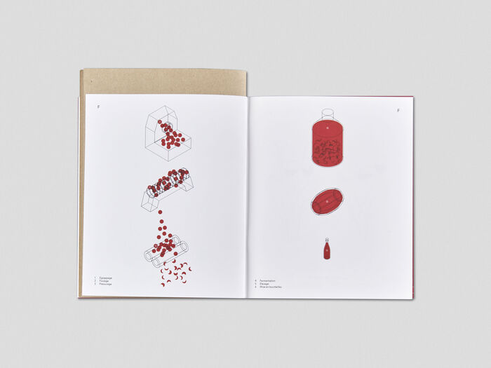
The Office des Vins Vaudois is responsible for promoting wines produced in the canton of Vaud, in Switzerland. The publication shown here is a wine tasting guide that traces the main stages in the development of viticulture, introduces to the wine-growing regions, describes the available grapes varieties, and explains the different stages of wine production. Building on this foundational knowledge, the publication then offers a step-by-step guide to wine tasting.
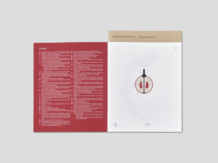
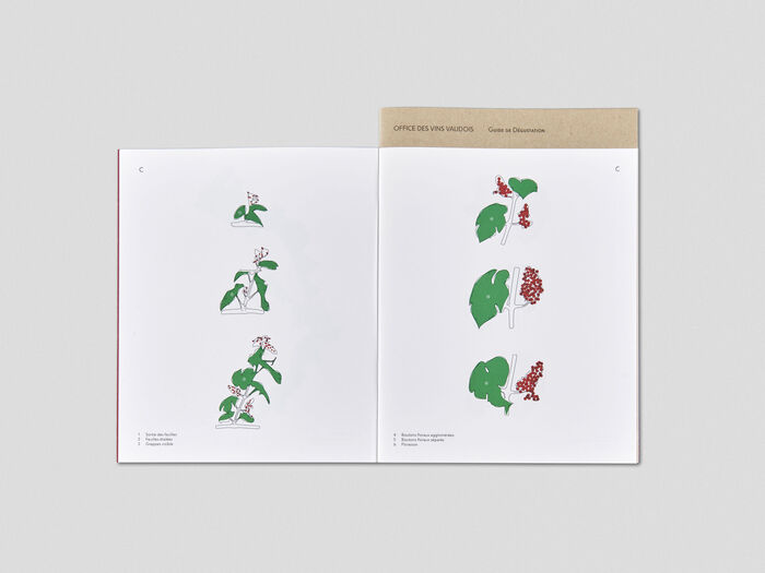
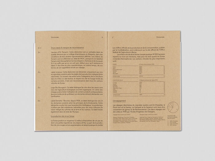
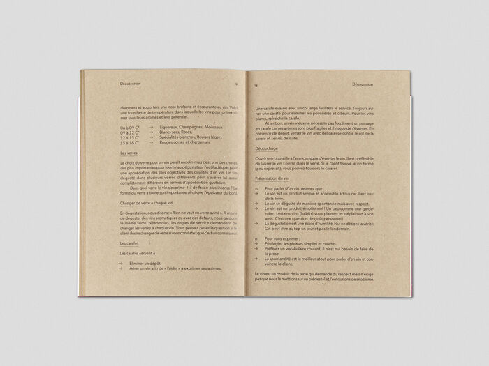
The publication is structured with the colors of a wine bottle: red for the wine and beige for the cork. The content is organized in two main sections: color illustrations on white outer pages and black text on beige inner pages that extend upward. Set in ToTemper, the text composition features multiple levels of hierarchy: from captions for the illustrations in the outer section to body text in the inner section, including tables and diagrams. ToTemper offers a nuanced alternative to geometric letterforms without sacrificing graphical impact: the difference between ascenders and lowercases preservers the legibility of the words while the letter shapes still produce a geometric rhythm. The font’s extended character set allows for graphic details such as circled numbers in the illustrations and small caps in the section headings.
Source: t-o.studio ToStudio. License: All Rights Reserved.
Source: t-o.studio ToStudio. License: All Rights Reserved.
Source: t-o.studio ToStudio. License: All Rights Reserved.
Source: t-o.studio ToStudio. License: All Rights Reserved.
Source: t-o.studio ToStudio. License: All Rights Reserved.
This post was originally published at Fonts In Use