De Bruyn Architecten visual identity and website
Published October 5, 2026
By FontsInUse
Contributed by Fran Van de Velde

Source: wearesuperset.be Superset. License: All Rights Reserved.



Source: wearesuperset.be Superset. License: All Rights Reserved.
Source: wearesuperset.be Superset. License: All Rights Reserved.
Source: wearesuperset.be Superset. License: All Rights Reserved.
Source: wearesuperset.be Superset. License: All Rights Reserved.
Source: wearesuperset.be Superset. License: All Rights Reserved.
This post was originally published at Fonts In Use
Source: wearesuperset.be Superset. License: All Rights Reserved.
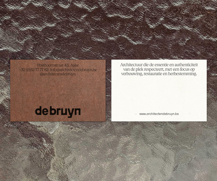
De Bruyn Architecten is a Belgian architecture studio with a long history rooted in craftsmanship, making and restoration. For the studio’s new visual identity, Superset developed a contemporary system that builds on this heritage without becoming nostalgic.
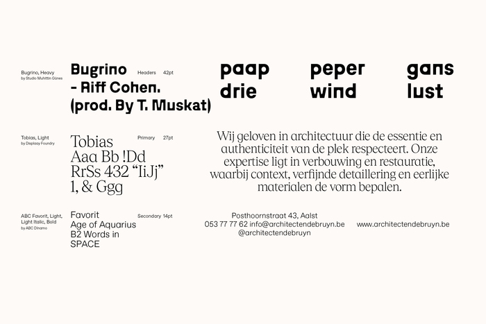
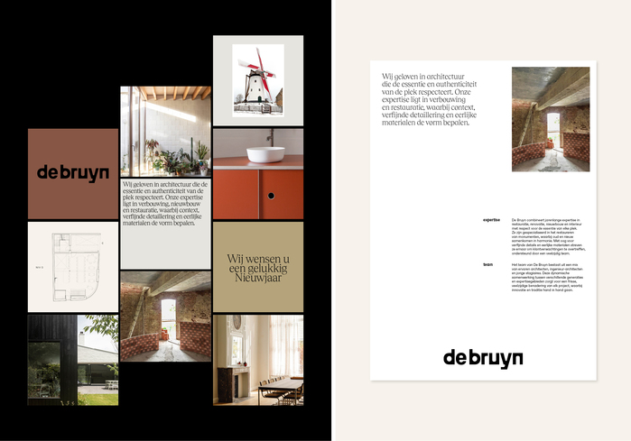
Typography plays a central role in the identity. Tobias and Bugrino are combined to create a balance between a more refined, traditional character and a sharper contemporary voice. ABC Favorit is used as a secondary typeface for smaller texts, adding a more geometric and architectural tone.
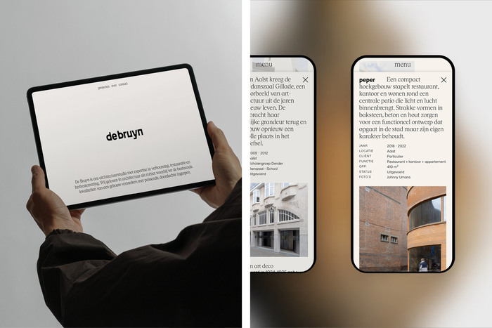
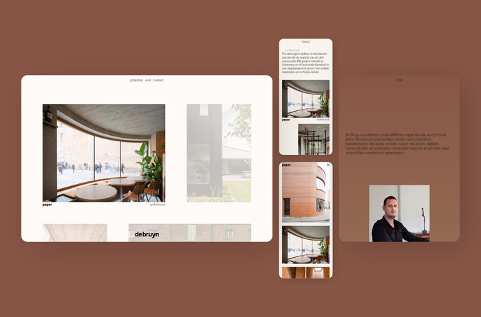
The typefaces are applied across the identity, including the wordmark, stationery, printed matter, social media and website.
Source: wearesuperset.be Superset. License: All Rights Reserved.
Source: wearesuperset.be Superset. License: All Rights Reserved.
Source: wearesuperset.be Superset. License: All Rights Reserved.
Source: wearesuperset.be Superset. License: All Rights Reserved.
Source: wearesuperset.be Superset. License: All Rights Reserved.
This post was originally published at Fonts In Use
Read full story.
WRITTEN BY
FontsInUse
An independent archive of typography.
More from FontsInUse