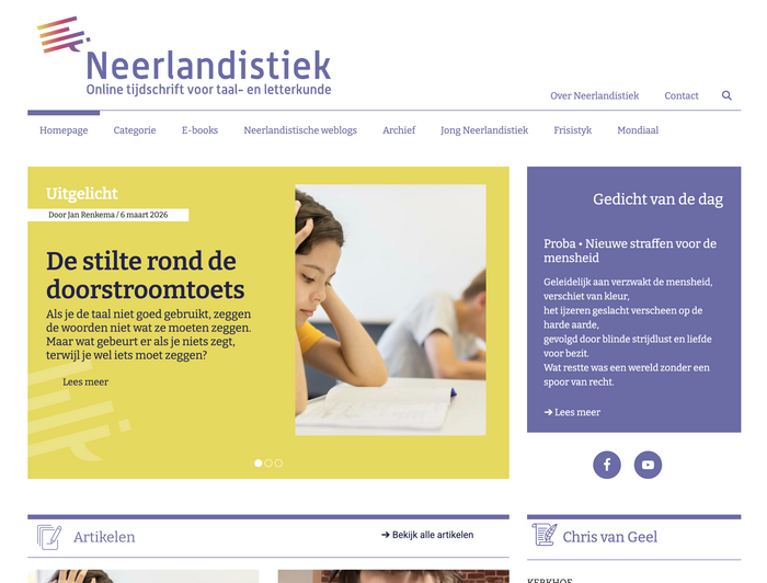
Neerlandistiek
Source: neerlandistiek.nl License: All Rights Reserved.


Neerlandistiek is an online journal for Dutch language and literature. It was first called Neder-L and has existed under the name Neerlandistiek from 2016 on. It was also in that year that their logo was introduced. The initial version had a colour gradient that extended over both the icon and the letters. The version shown above has been in use since March 2021.
I don’t really remember noticing the initial version of the logo. But ever since they have switched to the new version, in which the letters are more clearly readable due to the absence of a gradient on them, I have been wondering about the typeface that was used to create it. Judging by the fact that it took me so long to finally solve that riddle, I was apparently not that intrigued after all – but I did not forget about it either.
I tried using various font identification services (such as WhatFontIs or the font identifier by Identifont), but they only produced a partial match: Alwyn New by Chris Dickinson. Some letters matched well, some matched poorly, others did not match at all. I think that I settled for ‘Maybe they modified the letters for the logo’ when I first tried to identify the typeface, and then I adjourned the case for another year or two.
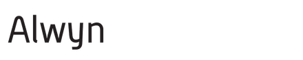
It was only very recently that I picked up on the second part of the typeface name that was the result of my first attempt at identification: New. If there is Alwyn New, there must be Alwyn (Old), too, right? Well, yes, there is.
Alwyn was the first version of a typeface that was released in 2007 by the Identikal Foundry. Here is the archived FontShop listing of the font family. Apart from that, not too many digital traces of it remain: There are one, two, three, four, five, six pictures on Flickr, uploaded by Chris Dickinson, that show the font in use as the (former) corporate typeface of a housing corporation in Amsterdam, which came into existence in 2008.
And when you compare the letters of Alwyn to those in the logo of Neerlandistiek, they match perfectly. Mystery unraveled – eventually, after almost five years.
Source: neerlandistiek.nl License: All Rights Reserved.
As of 2026, the fonts used on the website are Bitter and Roboto.
This post was originally published at Fonts In Use