Evercoat Auto Body Repair
Source: www.hyperquake.com Photo: Brian Simons. License: All Rights Reserved.

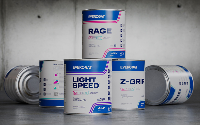
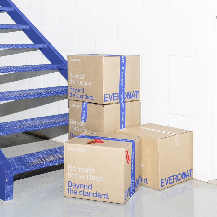
As a category leader in automotive surface repair, Evercoat’s sprawling portfolio had created a chaotic brand. Hyperquake consolidated the architecture into a tighter, more intuitive structure and streamlined the visual identity through a refreshed packaging system. The transformation was accelerated by a strategic marketing plan powered by social and influencer-led content, performance-driven initiatives, and updated traditional collateral. Together, we brought clarity to complexity—ushering in a more cohesive era for the Evercoat brand.
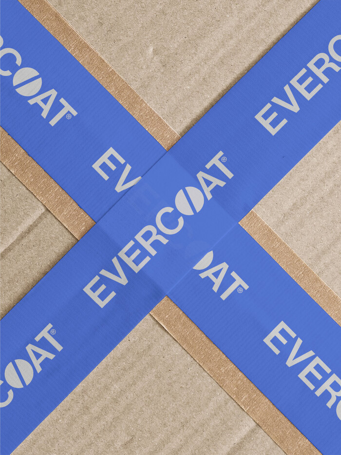
Set in all uppercase, the modified logotype uses Neue Montreal Medium, a versatile grotesque font that felt right at home in the auto body repair industry for its hard working and understated qualities. The custom O is based on the catalyzation process—the precise filler-to-hardener ratio that activates the product. We refined the mark to highlight this signature detail and reinforce its leadership in the category.
To complement the logo, the packaging system combines multiple weights of Neue Montreal and Transducer—each bringing a strong and no-nonsense vibe to the collateral. Transducer provides strong category cues that was inspired by vintage car ads and livery and speaks to Evercoat’s heritage. Neue Montreal becomes the straightforward, utility font that allows for important detail information to be clearly communicated.
Source: www.hyperquake.com Photo: Brian Simons. License: All Rights Reserved.
Source: www.hyperquake.com Photo: Brian Simons. License: All Rights Reserved.
Source: www.hyperquake.com Photo: Brian Simons. License: All Rights Reserved.
Source: www.hyperquake.com Photo: Brian Simons. License: All Rights Reserved.
Source: www.hyperquake.com Photo: Brian Simons. License: All Rights Reserved.
This post was originally published at Fonts In Use