TARB
Source: www.instagram.com Hour Minute Seconds. License: All Rights Reserved.


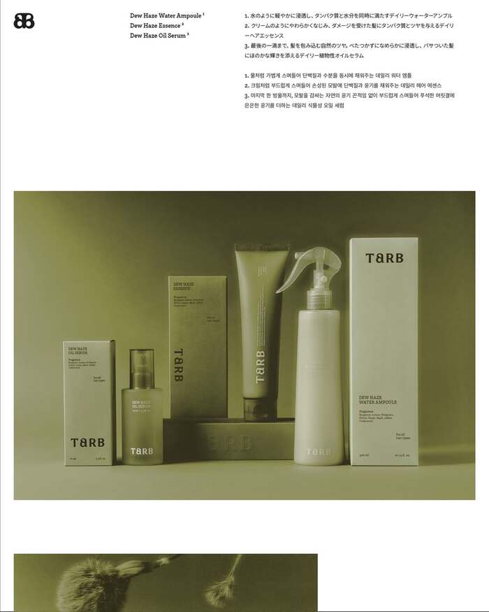
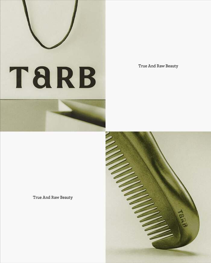
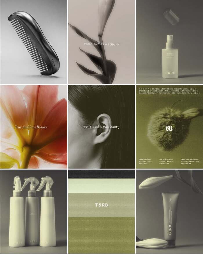
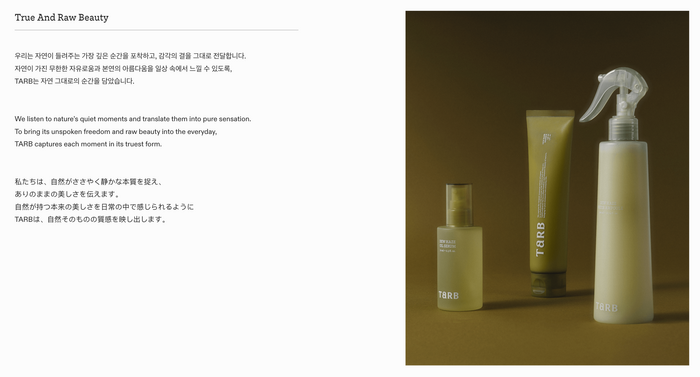
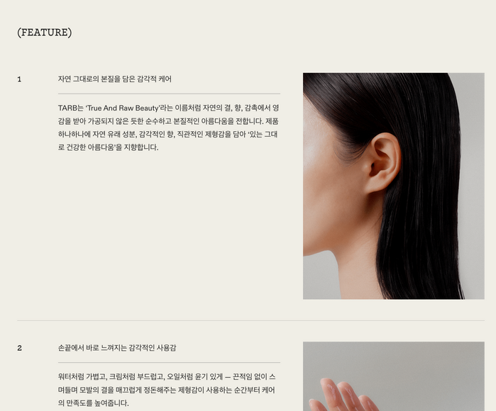
We developed the brand identity for TARB, a new hair care brand. Guided by the philosophy of “True And Raw Beauty,” this project explored how to translate nature’s pure, primal beauty into a refined and deliberate language.
With both the Korean and Japanese markets in mind, we sought an aesthetic closer to attitude than visual excess. The direction began with the texture of Eastern minimalism and the quiet discipline of Zen.
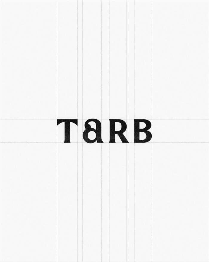
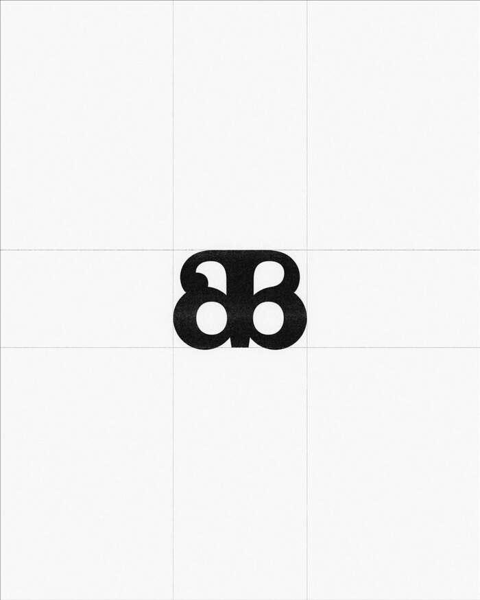
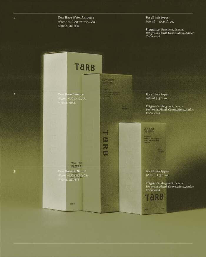
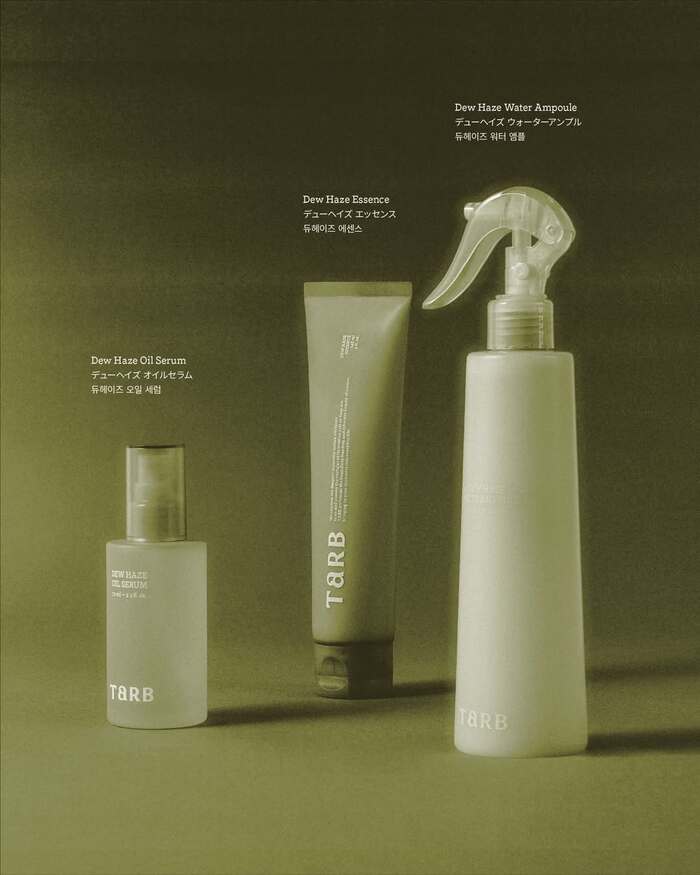
We stripped away unnecessary ornamentation and built the packaging with restrained colors and generous negative space. The logo, too, takes its cues from natural forms rather than artificial expression.
To ensure beauty in its raw state is conveyed without exaggeration, we carried the brand’s core values consistently across its visual language and overall spatial experience.
The logo is custom drawn. Nordvest is the brand’s primary typeface, used for headings. On the packaging designs, it’s paired with Arno Italic. The website additionally uses ABC Diatype (English), Sandoll GothicNeo (Korean), and PingFang (Japanese).
Source: www.instagram.com Hour Minute Seconds. License: All Rights Reserved.
Source: www.instagram.com Hour Minute Seconds. License: All Rights Reserved.
Source: www.instagram.com Hour Minute Seconds. License: All Rights Reserved.
Source: www.instagram.com Hour Minute Seconds. License: All Rights Reserved.
Source: www.instagram.com Hour Minute Seconds. License: All Rights Reserved.
Source: www.instagram.com Hour Minute Seconds. License: All Rights Reserved.
Source: tarb.co.kr License: All Rights Reserved.
Source: tarb.co.kr License: All Rights Reserved.
This post was originally published at Fonts In Use