Your Computer magazine
Source: archive.org License: All Rights Reserved.
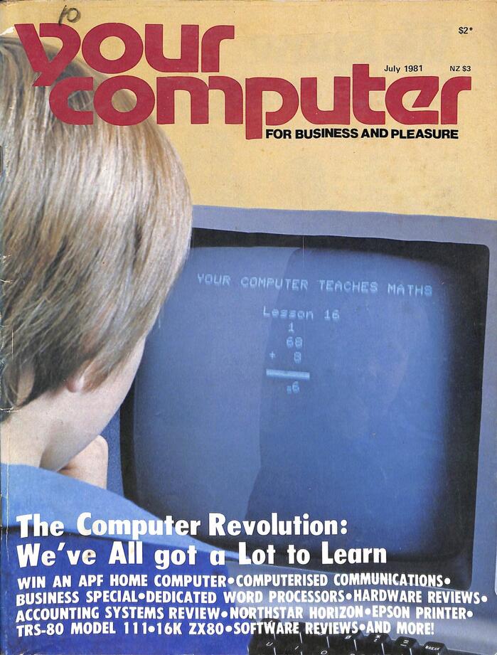
Issue no. 2 from July 1981. The white text at the bottom is a yet unidentified typeface similar to Futura Extra Bold Condensed. I wonder if it’s related to Heraldus.


Motter Tektura is the logo typeface for Your Computer. The Australian monthly home computing magazine “for business and pleasure” ran from May/June 1981 to May/June 1997. From 1977 to 1984, Othmar Motter’s typeface was also used for the logo of the Apple Computer Inc., likewise in all-lowercase letters.
Initially edited by Les Bell and published by the White House Publishing Group under licence from Motorword Pty Ltd., Your Computer was typeset by Hughes Phototype, Mosman. and printed by The Lithgo Centre, Waterloo. Barry Brady served as the magazine’s first art director. In 1982, he was superseded by Michelle Mabbott. Rolf Hagenmaier filled this role in 1993.
By 1994, the logo had been redrawn (almost) beyond recognition.
You can browse many digitized issues in the Internet Archive.
Source: archive.org License: All Rights Reserved.
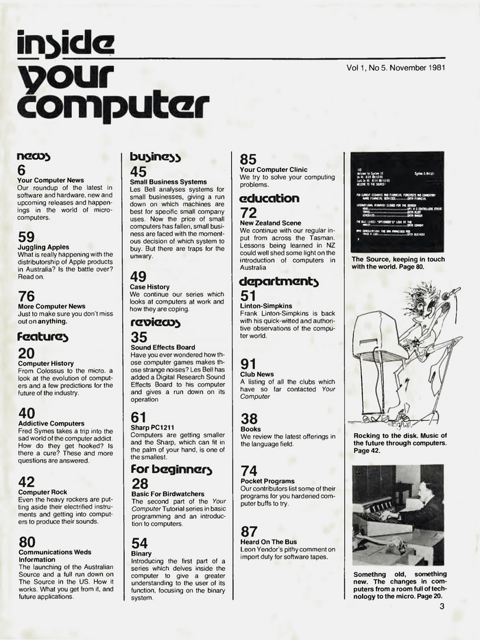
Motter Tektura was also used as headline typeface on interior pages. Here’s the table of contents from no. 5, November 1981.
Source: archive.org License: All Rights Reserved.
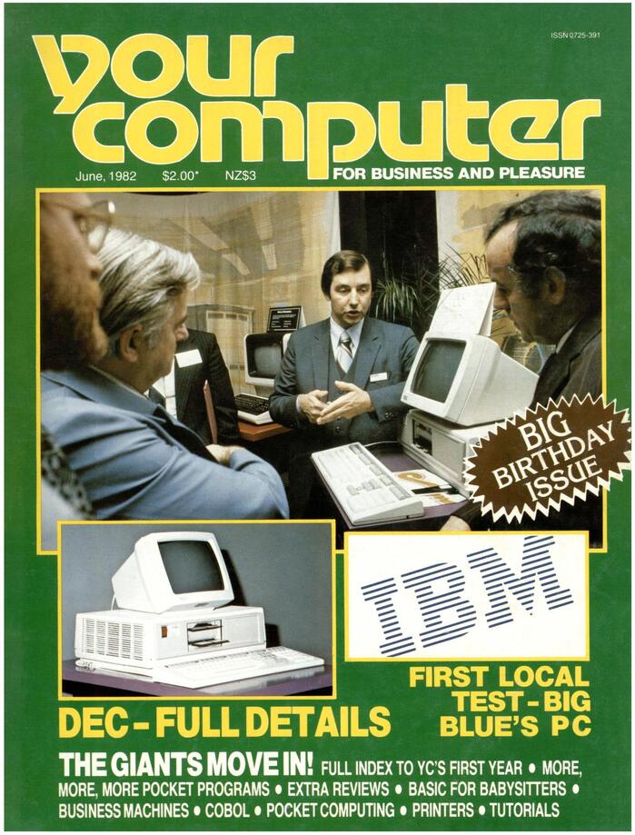
June 1982, with ITC Korinna in a starburst for the “Big Birthday Issue”. The logo got a contour.
Source: archive.org License: All Rights Reserved.
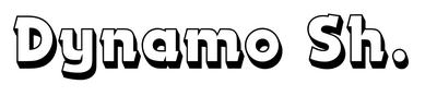
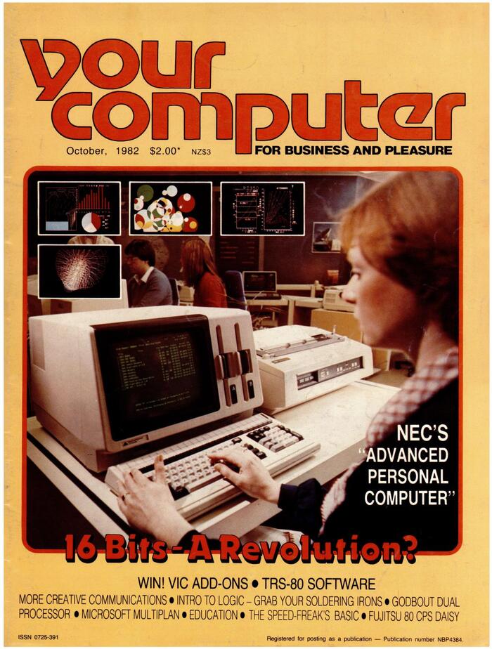
October 1982, ft. Dynamo Shadow for “16 Bits – A Revolution?”
Source: archive.org License: All Rights Reserved.
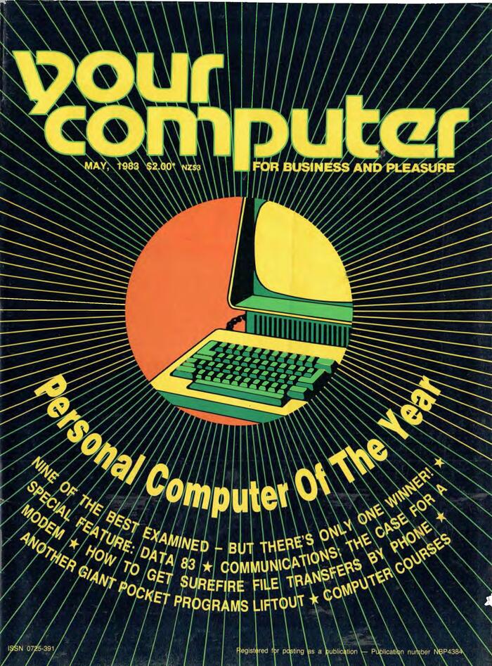
May 1983
Source: archive.org License: All Rights Reserved.
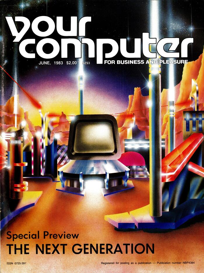
June 1983
Source: archive.org License: All Rights Reserved.
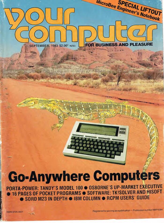
September 1983
Source: archive.org License: All Rights Reserved.
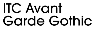
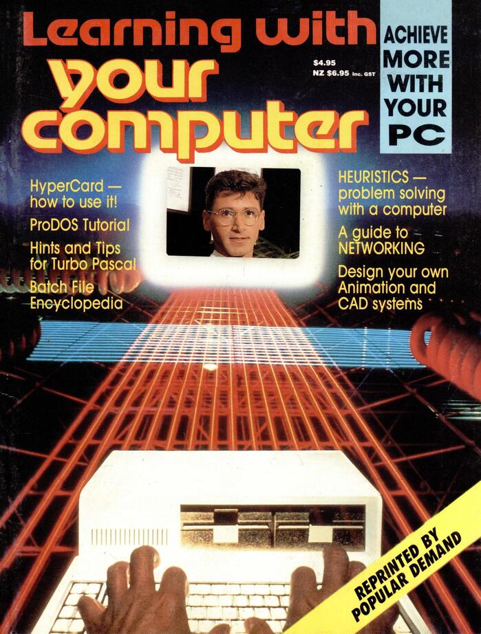
“Learning With Your Computer” special issue, 1986, with a shaded logo version and ITC Avant Garde Gothic
Source: archive.org License: All Rights Reserved.
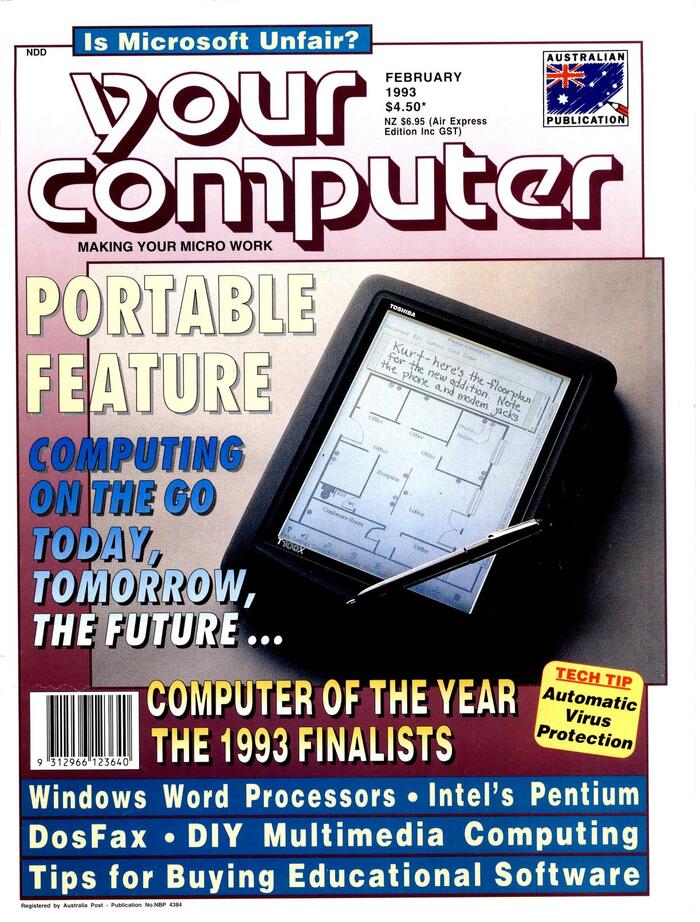
February 1993. The claim below the logo now reads “Making your micro work”.
This post was originally published at Fonts In Use