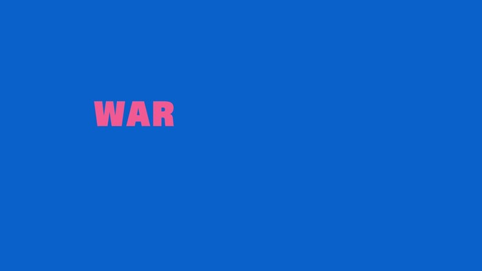
War Child UK – Font Family poster project

Source: villagegreen.studio Village Green. License: All Rights Reserved.


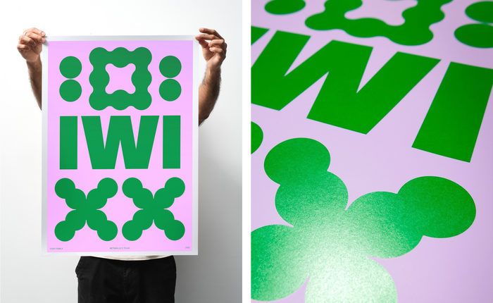
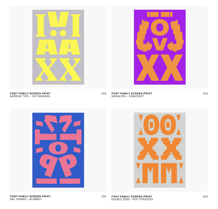
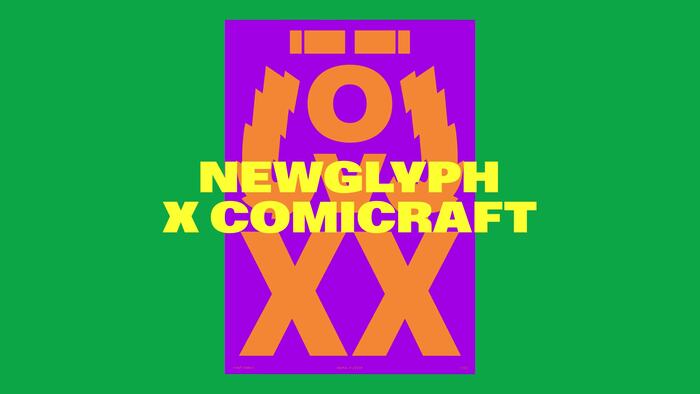
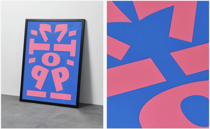
Village Green has designed five typographic posters pairing fonts donated from ten different font foundries to raise funds for War Child UK. The posters are available as limited edition screen prints.
The participating foundries are Dinamo, Narrow Type, Newglyph, Maxitype, Tup Wanders, PFA-Typefaces, D0UBLE ZER0, Comicraft, Blambot, and Rellence (prev. Ultra Kuhl).
From The Brand Identity:
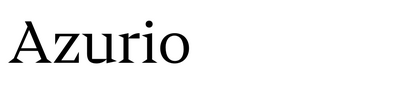
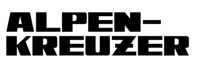
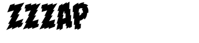
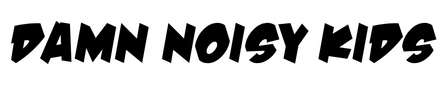
The Font Family project pairs two foundries on each B2 poster, creating bold compositions that loosely suggest human figures. It’s a playful concept that works on multiple levels – these typographic ‘people’ become a family of sorts, just as the foundries, printers and designers collaborating on the project form their own creative community. All profits from the screen-printed editions go to War Child UK.
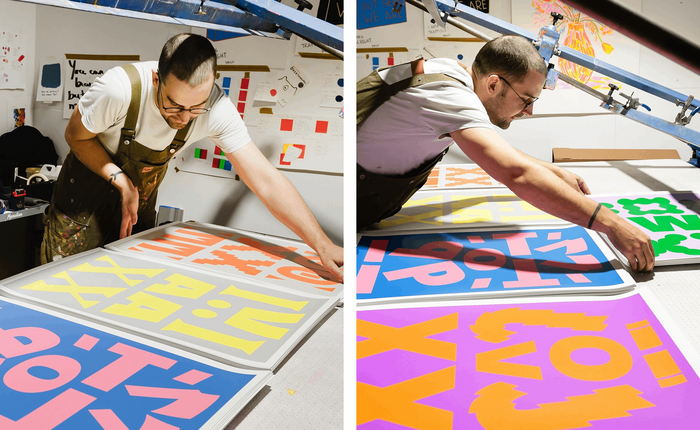
The technical side shaped the creative decisions from the start. Working with Ricky at Mesh & Blade in east London, the team designed specifically for screen printing’s strengths and limitations. The bold, colourful characteristics were perfect for the process, but it meant thinking differently about colour separation and registration. “We were also keen to get away from our desks and have conversations about finishes, stocks and inks,” Fearn explains. “From a technical perspective, we kept things relatively bold and minimal with high contrast and simplified colour layers, which ensured the designs translated cleanly and consistently at scale.” That hands-on approach reflects something larger about the project’s philosophy. In a world where remote work and digital-first thinking dominate, there’s something refreshing about a project that brings people together around physical processes and shared goals.
Source: villagegreen.studio Village Green. License: All Rights Reserved.
Source: villagegreen.studio Village Green. License: All Rights Reserved.
Screen printing at Mesh & Blade
Village Green. License: All Rights Reserved.
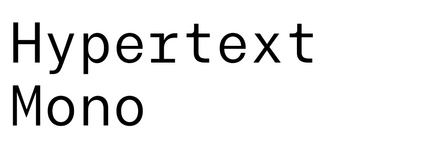
Azurio and Alpenkreuzer / Baikal and Zzzap / ABC Gravity and Damn Noisy Kids / 00 Hypertext Mono and Meilen
Source: villagegreen.studio Village Green. License: All Rights Reserved.

Source: villagegreen.studio Village Green. License: All Rights Reserved.
Source: villagegreen.studio Village Green. License: All Rights Reserved.
Village Green. License: All Rights Reserved.
This post was originally published at Fonts In Use