Mujosh
Source: weronikarafa.com Grafa. License: All Rights Reserved.



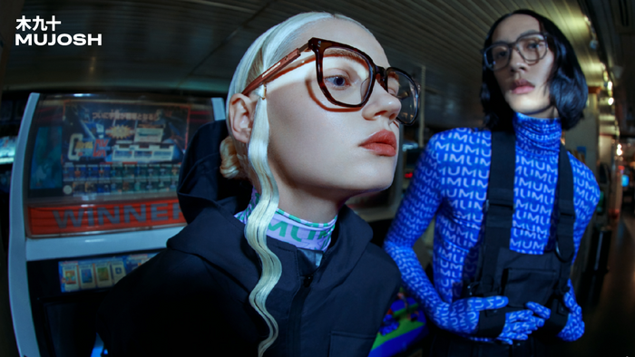
Mujosh is a Chinese eyewear brand operating at the intersection of retail, fashion and culture. Grafa partnered with the brand to redesign its identity and reposition it for a new generation of consumers, moving away from its existing visual language towards something sharper, more expressive and culturally attuned.
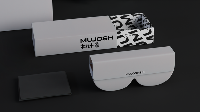
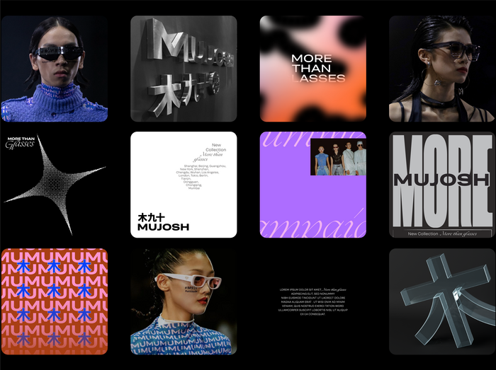
The project centred around redefining Mujosh’s presence through a more reduced and confident system. Rather than creating disruption for the sake of novelty, the ambition was to retain recognisability while introducing a stronger point of view. The refreshed identity shifts the brand into a more contemporary space: one that feels less transactional and more editorial and self-assured.
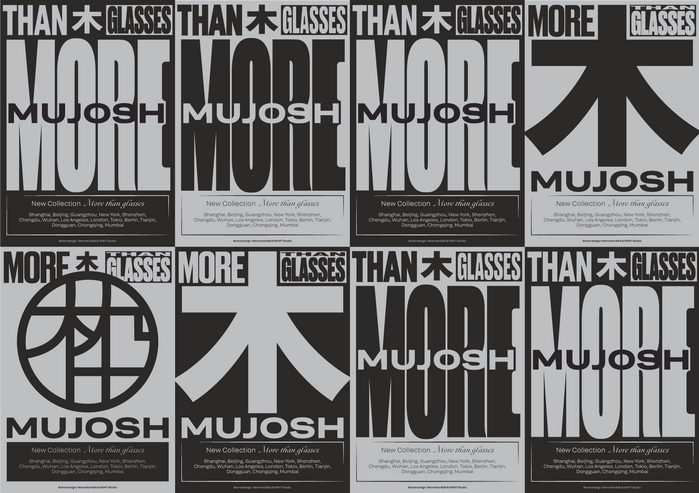
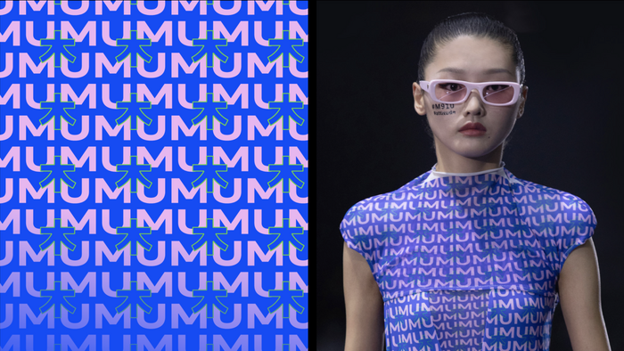
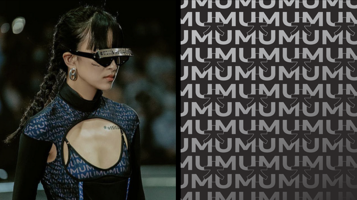
Typography became one of the defining elements of the new identity. Built around Grtsk, the system uses the typeface’s balance of neutrality and character to create a visual language that feels precise yet expressive. Its flexibility allowed the brand to move fluidly between product communication, image-led moments and even patterns. More than a functional layer, typography became a central tool for shaping recognition and giving Mujosh a stronger voice.

Source: weronikarafa.com Grafa. License: All Rights Reserved.
Source: weronikarafa.com Grafa. License: All Rights Reserved.
Source: weronikarafa.com Grafa. License: All Rights Reserved.
Source: weronikarafa.com Grafa. License: All Rights Reserved.
Source: weronikarafa.com Grafa. License: All Rights Reserved.
Source: weronikarafa.com Grafa. License: All Rights Reserved.
This post was originally published at Fonts In Use