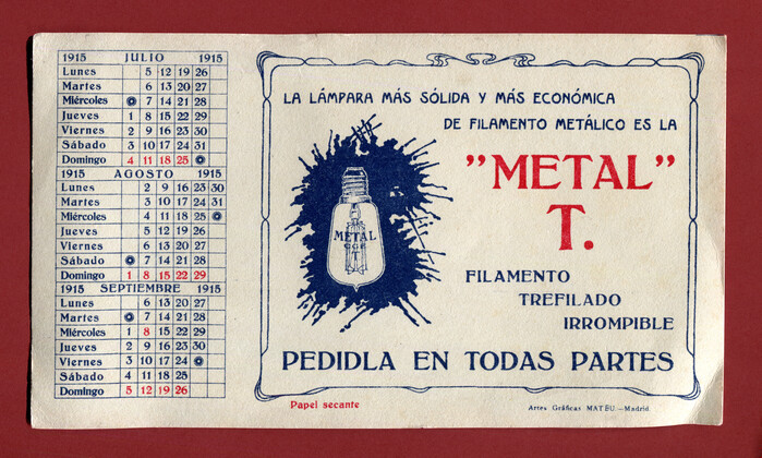
Metal T. promotional calendar
Source: www.flickr.com Uploaded to Flickr by altpapiersammler and tagged with “kleukensantiqua” and “künstlergrotesk”. License: All Rights Reserved.
Sheet from a Spanish calendar for the year 1915, with an advert for a light bulb. The text reads (translated):
The most solid and most economical metal filament lamp is the ‘Metal’ T. / Unbreakable drawn filament / Ask for it everywhere.
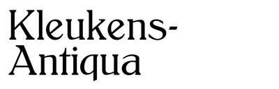
Both typefaces have roots in Germany. Kleukens-Antiqua is a so-called Künstlerschrift (“artist’s typeface”), first cast by Bauer in 1910 after drawings by Friedrich W. Kleukens and named after its author. It’s here used in the halbfett (bold) weight.
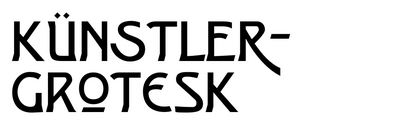
The all-caps Jugendstil sans used for the two lines at the top is Künstler-Grotesk from 1901, also from Bauer. An “artist’s grotesk” in name, it’s in fact an anonymous design created in-house. The type probably originated at Neufville, Bauer’s subsidiary in Barcelona.
This post was originally published at Fonts In Use