StillBitter Lemonade Co.

Source: hayleylim.com Hayley Lim. License: All Rights Reserved.

Designer Hayley Lim taps into the expressive tension of Faust (designed by Bouk Ra and released by Type Department) to craft the visual identity for StillBitter Lemonade Co., a brand that leans into contrast – tart yet elegant, bold yet refined. Faust’s razor-sharp serifs and exaggerated curves lend the brand a sense of cultivated drama, perfectly echoing the product’s name and attitude.
Used across packaging and brand assets, Faust brings high contrast and an air of irreverent sophistication. The typeface balances between ornamental and functional, delivering standout shelf presence while maintaining readability – ideal for a modern beverage brand that wants to feel both niche and premium.
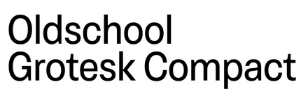
In the hands of Lim, Faust becomes more than a type choice – it’s a statement of flavor, edge, and aesthetic bite. The accompanying sans is Kilotype’s Oldschool Grotesk Compact.

Source: hayleylim.com Hayley Lim. License: All Rights Reserved.

Source: hayleylim.com Hayley Lim. License: All Rights Reserved.

Source: hayleylim.com Hayley Lim. License: All Rights Reserved.

Source: hayleylim.com Hayley Lim. License: All Rights Reserved.
This post was originally published at Fonts In Use