New Paltz, New Paltz by Mike Powell (Double Negative
Nick Greer + Double Negative. License: All Rights Reserved.
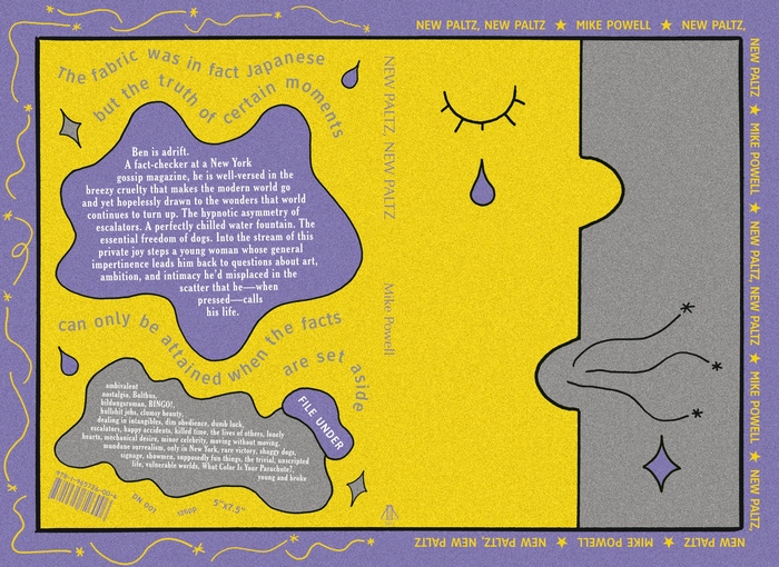
Outer cover of New Paltz, New Paltz


New Paltz, New Paltz by Mike Powell is the first book published by Double Negative. It’s a restless bildungsroman set in New York City concerned with everyday life, its frustrations and joys alike. The book is short and bittersweet, inspired by poetry as much as prose, especially the frank absurdism of writers like Charles Portis and James Tate. The style is simple but wonky, full of false starts and anti-climaxes—“clumsy beauty,” the book calls it.
The design is a response to this and the many touchpoints shared by author and designer: Keith Shore’s blobby illustration, Lorraine Louie’s yuppie surrealism, Susan Kare’s iconic desktop logos, Andy Warhol’s jazz album covers, and New York City parking signs, which inform the selection of ClearviewHwy and Highway Gothic.
The colors—a dirty purple, yellow, and gray—come directly from the book’s language: the “dim yellow lighting” of a dive bar, “a purple-gray mastiff” at the dog park, and the “yellow and purple flowers” a landscape architecture firm had planted in a city park to try to rewild the city with native plans, giving it a “calculated wilderness laid out in the middle of the city, like an apology for everything we had built around it,” which of course includes the numerous grays of concretes and buildings.

Nick Greer + Double Negative. License: All Rights Reserved.
Outer front cover of New Paltz, New Paltz
Nick Greer + Double Negative. License: All Rights Reserved.
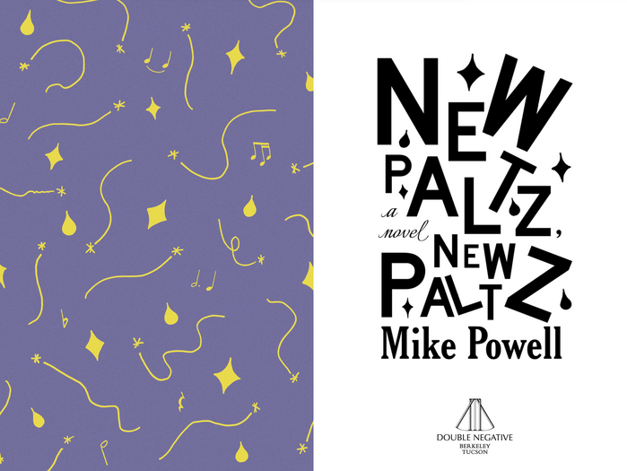
Interior cover spread for New Paltz, New Paltz
Nick Greer + Double Negative. License: All Rights Reserved.
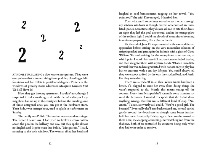
Interior spread for New Paltz, New Paltz
This post was originally published at Fonts In Use