Imagens e teatralidade na narrativa de Roberto Bolaño by Sara Rojo
Published June 25, 2025
By FontsInUse
Contributed by Vitor Carvalho
Source: vitorcarvalho.com Nino Andrés. License: All Rights Reserved.

Source: vitorcarvalho.com Nino Andrés. License: All Rights Reserved.
Source: vitorcarvalho.com Nino Andrés. License: All Rights Reserved.
Source: vitorcarvalho.com Nino Andrés. License: All Rights Reserved.
Source: vitorcarvalho.com Nino Andrés. License: All Rights Reserved.
Source: vitorcarvalho.com Nino Andrés. License: All Rights Reserved.
Source: vitorcarvalho.com Nino Andrés. License: All Rights Reserved.
Source: vitorcarvalho.com Nino Andrés. License: All Rights Reserved.
Source: vitorcarvalho.com Nino Andrés. License: All Rights Reserved.
Source: vitorcarvalho.com Nino Andrés. License: All Rights Reserved.
Source: vitorcarvalho.com Nino Andrés. License: All Rights Reserved.
This post was originally published at Fonts In Use
Source: vitorcarvalho.com Nino Andrés. License: All Rights Reserved.
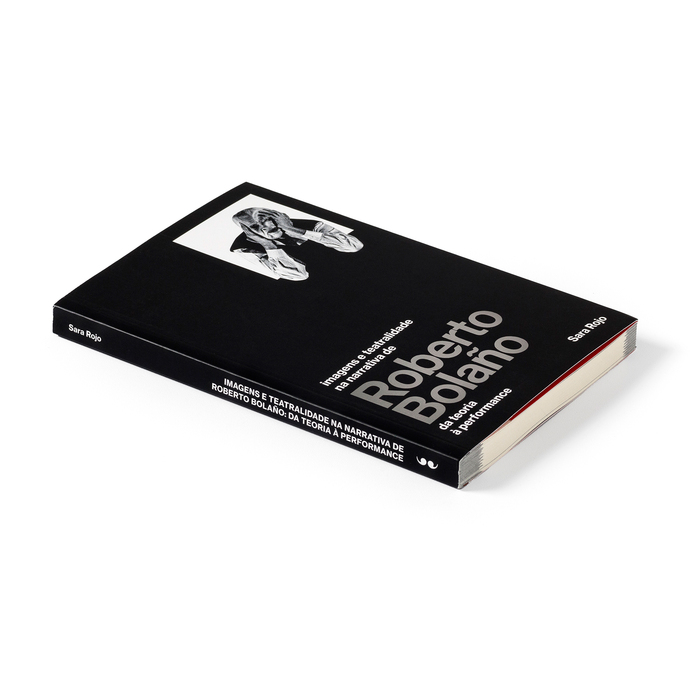
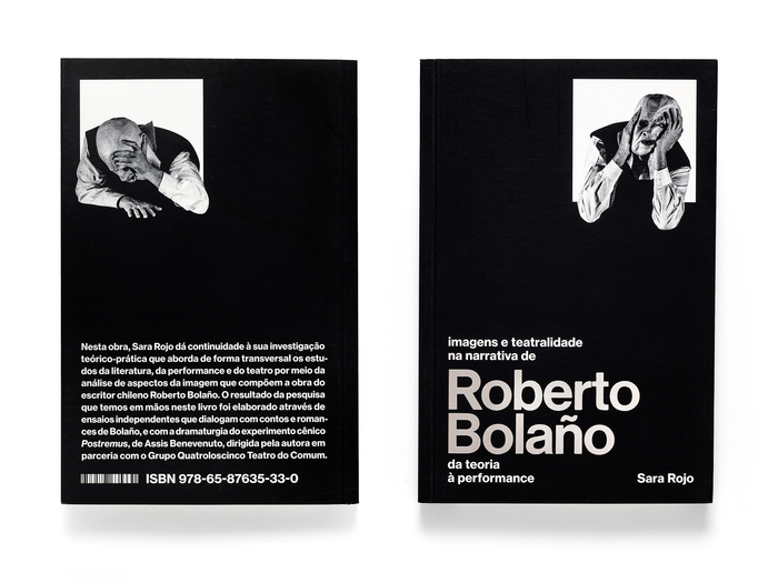
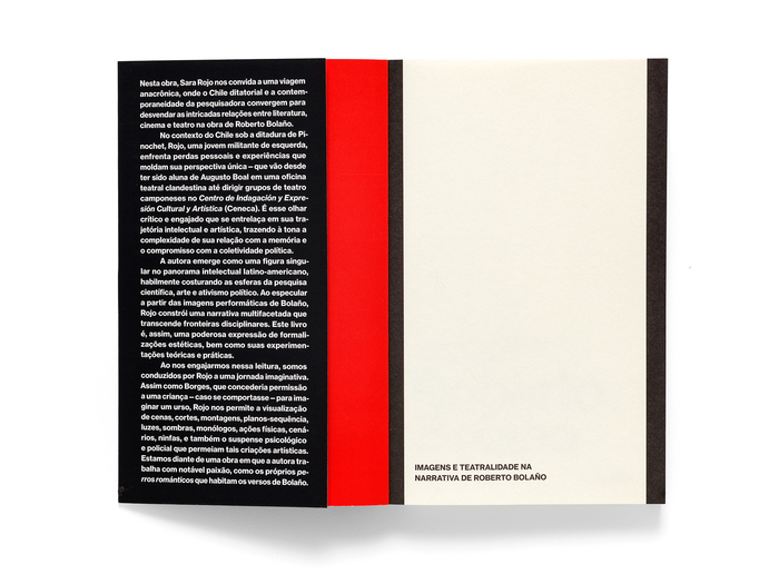
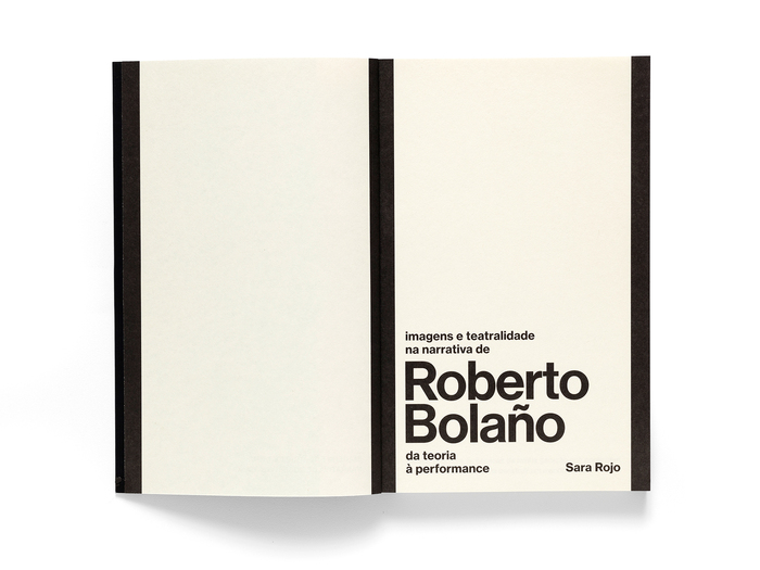
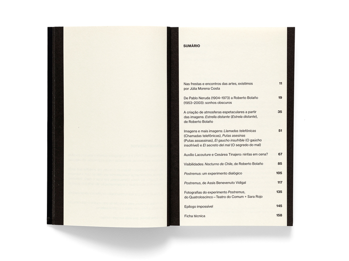
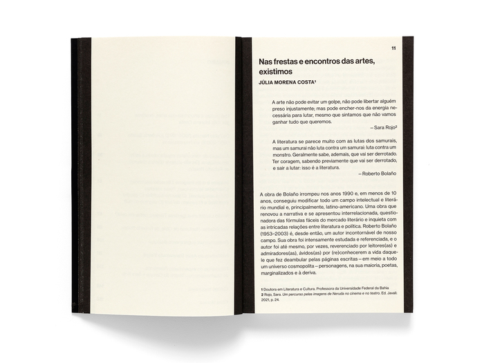
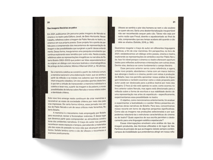
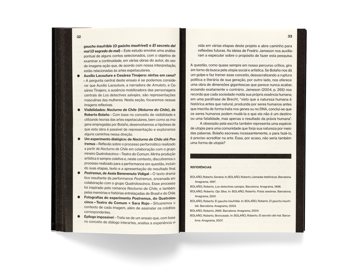
In Sara Rojo’s book about Roberto Bolaño, dark blocks of text and a typographic structure marked by vertical and horizontal rules give the pages an almost oppressive sobriety. The title in silver foil on the cover symbolizes Bolaño’s ability to create light, even in the cruelest of contexts.
Neue Haas Grotesk is used throughout.
Source: vitorcarvalho.com Nino Andrés. License: All Rights Reserved.
Source: vitorcarvalho.com Nino Andrés. License: All Rights Reserved.
Source: vitorcarvalho.com Nino Andrés. License: All Rights Reserved.
Source: vitorcarvalho.com Nino Andrés. License: All Rights Reserved.
Source: vitorcarvalho.com Nino Andrés. License: All Rights Reserved.
Source: vitorcarvalho.com Nino Andrés. License: All Rights Reserved.
Source: vitorcarvalho.com Nino Andrés. License: All Rights Reserved.
Source: vitorcarvalho.com Nino Andrés. License: All Rights Reserved.
Source: vitorcarvalho.com Nino Andrés. License: All Rights Reserved.
Source: vitorcarvalho.com Nino Andrés. License: All Rights Reserved.
This post was originally published at Fonts In Use
Read full story.
WRITTEN BY
FontsInUse
An independent archive of typography.