Meltö
License: All Rights Reserved.




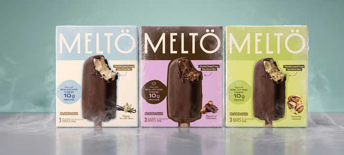
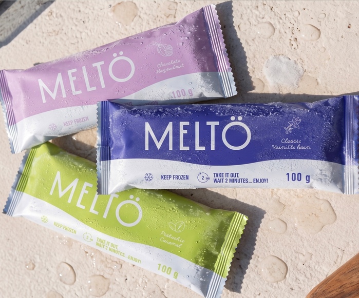
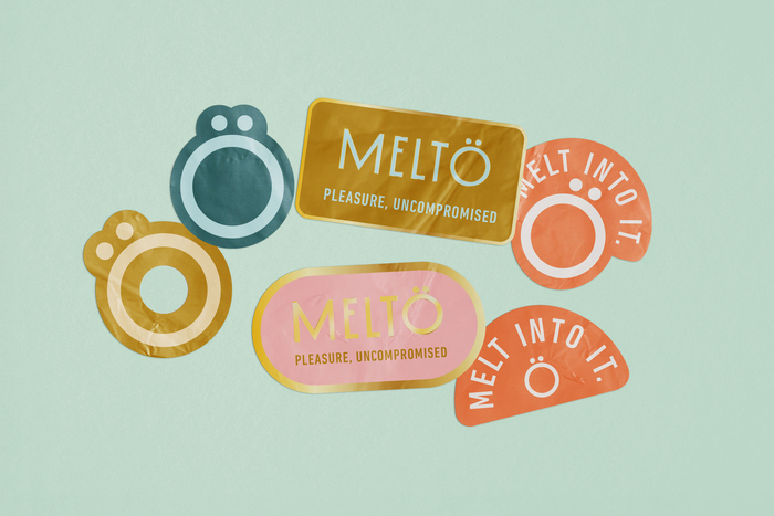
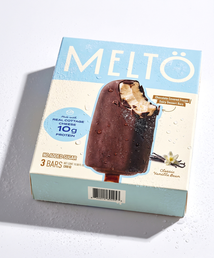
Meltö is an ice cream brand developed by two entrepreneurial women passionate about chocolate and indulgent desserts. The brand focuses on conscious consumers looking for multifunctional desserts. In this case, with a high protein content – ideal for people watching their diet.
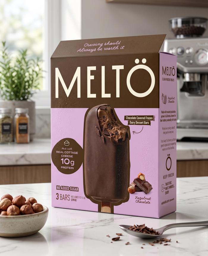
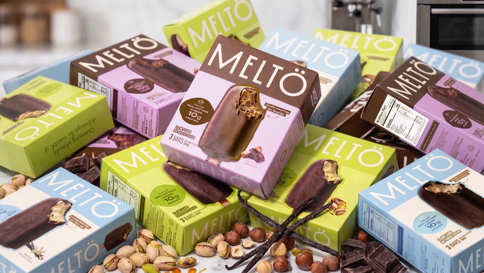
A solid, clear, and aspirational identity was developed for the brand. We designed color blocks and clear typography fitting the packaging format. I wanted to avoid clichés of overly complex or playful typography. For this product category, I believe the future lies in minimalism, but to the point of being visible and recognizable. We eliminated the clichés of diet products and used typefaces that were legible at both large and small scales, such as DIN Next for the overall body of the project. The logo is based on Monterio.
License: All Rights Reserved.
License: All Rights Reserved.
License: All Rights Reserved.
License: All Rights Reserved.

License: All Rights Reserved.
License: All Rights Reserved.
License: All Rights Reserved.
This post was originally published at Fonts In Use