Mateus Arruda Architecture
Source: www.behance.net License: All Rights Reserved.

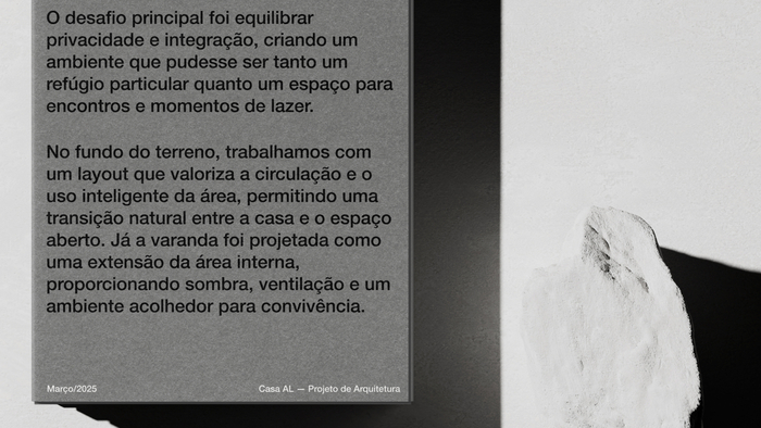
The rebranding of Mateus Arruda Arquitetura came about with the aim of consolidating the studio as a regional reference in high-end residences. As an architect and teacher, Mateus has more than 17 years of experience working in other renowned offices before founding his own company. Today, he leads a studio that delivers complete, tailor-made projects – with total attention to deadlines, costs and details that make a difference to the result.
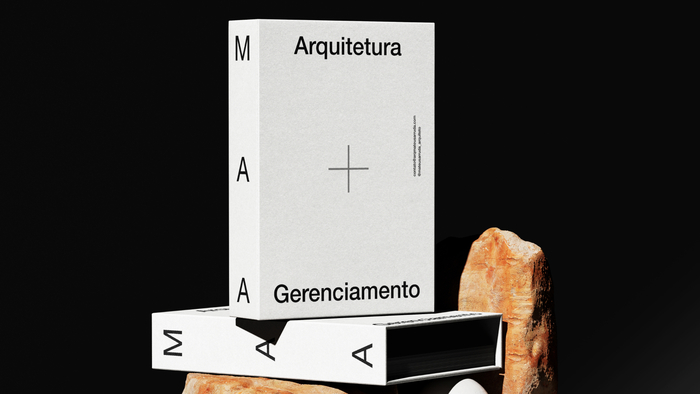
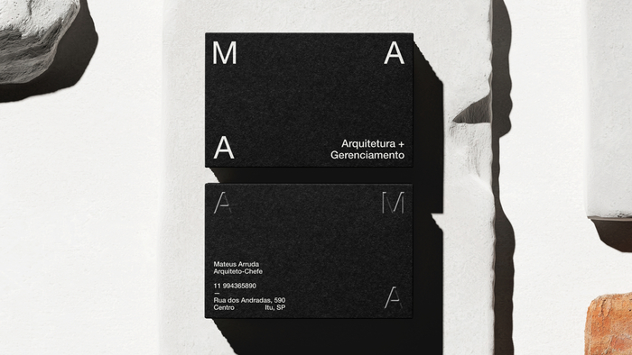
The new visual identity is based on the abbreviation MAA, which has now become the brand’s main signature. The symbol communicates precision, method and trust, three of the firm's central pillars. The choice of a minimalist palette, with black and white as the base, reinforces this mature and technical positioning, while earthy tones and grays evoke the connection with the work, the territory and natural materials.
Source: www.behance.net License: All Rights Reserved.

Source: www.behance.net License: All Rights Reserved.

Source: www.behance.net License: All Rights Reserved.

Source: www.behance.net License: All Rights Reserved.
Source: www.behance.net License: All Rights Reserved.
This post was originally published at Fonts In Use