City Atlas by Amalia Barboza

Source: www.are.na Photo: Manuel Wesely. Manuel Wesely. License: All Rights Reserved.


City Atlas is a book that immediately recalls the travel-guide format: narrow, oblong, with rounded corners that fit easily in the hand. Much like Architectural Roots (Dell Upton, 1986), which inspired its conception, the book uses the atlas form to reflect on architectures shaped by migration. But City Atlas is not a conventional atlas. Instead, it collects stories, spaces, and signs of migrant work.
The project began between 2015 and 2019 in Saarbrücken, where Prof. Amalia Barboza, teaching at Saarland University, observed how the city could be read through its restaurants, shops, and other businesses built and run by migrants. The resulting book combines ethnographic observation with a visual archive and reflections on the ways people design their working environments, from the choice of a name to the decoration of an interior, often shaped by memories of home.
While its subject matter is serious—the visibility of migrant labor in a climate of political tension—the book also carries a sense of curiosity and openness. The photographs and short texts encourage the reader to linger on details: the signage of a shop, the decoration of an interior, the choice of a business name. These fragments, when seen together, form a panorama of urban life shaped by migration. Like a true atlas, it asks its readers to move across borders and cultures.
For the cover and appendix, large-scale lettering uses New Alphabet by Wim Crouwel (The Foundry). It is a constructed alphabet for stories of constructed spaces.
The main part of the book is set in Pantasia by Wei Huang (Counter Forms).
OPS Past Perfect by Our Polite Society is used for essay headlines and pagination, while the essay body copy itself is set in Times, providing a classical and neutral grounding.
All reconstructed shop logos use Suisse Int’l by Swiss Typefaces. This provides a unifying framework, standardizing disparate designs into a coherent visual register.
The book design guides the reader gradually. A short introduction eases the entry, followed by a recurring graphic motif: the shape of a boarding pass, signaling the themes of travel and migration. Text sections are interwoven with photographic sections, establishing a rhythm between narration and image.
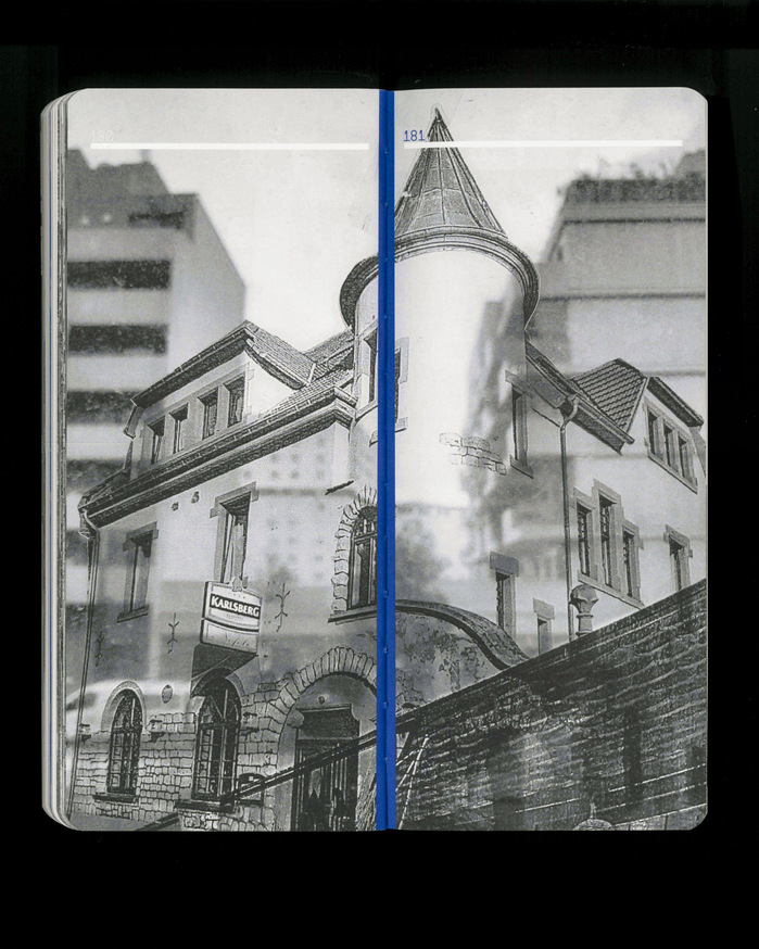
The photographic work, all produced by Prof. Amalia Barboza, explores the same foil collages in three ways. First, they appear as framed images. Then the same foils are projected using an overhead projector, creating ephemeral, layered visuals. Finally, the foils are collaged onto window glass, merging printed architecture with the actual cityscape.
The layout is bilingual: all German text is printed in black, while all English text appears in Pantone 287 dark blue, giving the two languages distinct visual identities.
The essays follow a classical book-typography style, in contrast to the main section of 35 shop portraits, which are set in monospaced Pantasia. Within this grid, quotations are treated specially: they appear 1.5 times larger and shifted on the baseline, breaking the rigidity of the mono system while maintaining the grid. To avoid collisions of ascenders and descenders, additional baseline shifts are applied—these sections are “unicased.”
City Atlas was produced by Quatroprint in Brno, Czech Republic. The book is printed in two-color UV offset and comprises 228 pages on slightly transparent, thin paper (Munken Polar Rough 90 g), giving the volume a delicate, tactile quality. The binding is a Swiss-style sewn structure with blue thread and an open spine, allowing the book to lie flat.
The cover is made from cardboard with a partial UV glossy coating, designed to evoke the texture of passport cloth, reinforcing the themes of travel and migration. The corners are rounded.
The book invites readers to engage with cities as layered spaces of culture, labor, and imagination, offering a rich experience that extends far beyond its pages.

Source: www.are.na Photo: Manuel Wesely. Manuel Wesely. License: All Rights Reserved.

Source: www.are.na Photo: Manuel Wesely. Manuel Wesely. License: All Rights Reserved.

Source: www.are.na Photo: Manuel Wesely. Manuel Wesely. License: All Rights Reserved.

Source: www.are.na Photo: Manuel Wesely. Manuel Wesely. License: All Rights Reserved.

Source: www.are.na Photo: Manuel Wesely. Manuel Wesely. License: All Rights Reserved.

Source: www.are.na Photo: Manuel Wesely. Manuel Wesely. License: All Rights Reserved.

Source: www.are.na Photo: Manuel Wesely. Manuel Wesely. License: All Rights Reserved.

Source: www.are.na Photo: Manuel Wesely. Manuel Wesely. License: All Rights Reserved.

Source: www.are.na Photo: Manuel Wesely. Manuel Wesely. License: All Rights Reserved.

Source: www.are.na Photo: Manuel Wesely. Manuel Wesely. License: All Rights Reserved.
Source: www.are.na Photo: Manuel Wesely. Manuel Wesely. License: All Rights Reserved.

Source: www.are.na Photo: Manuel Wesely. Manuel Wesely. License: All Rights Reserved.
Source: www.are.na Photo: Manuel Wesely. Manuel Wesely. License: All Rights Reserved.

Source: www.are.na Photo: Manuel Wesely. Manuel Wesely. License: All Rights Reserved.
This post was originally published at Fonts In Use