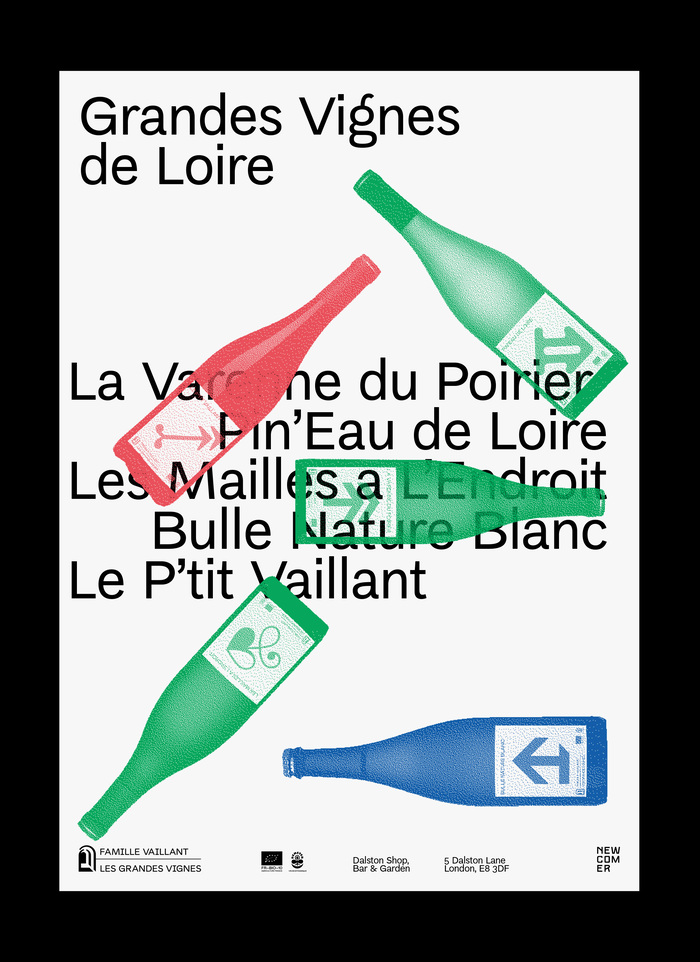
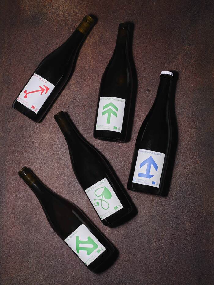
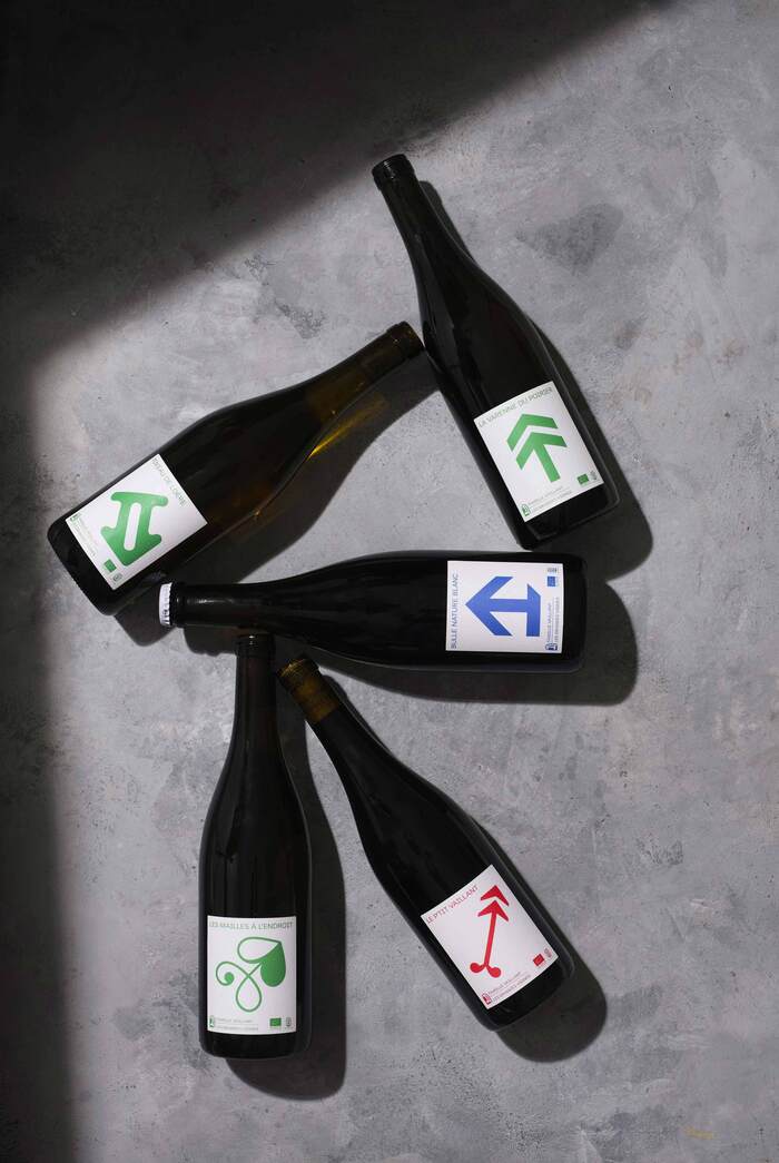
Les Grandes Vignes series of wine labels

Jodi Hinds. License: All Rights Reserved.


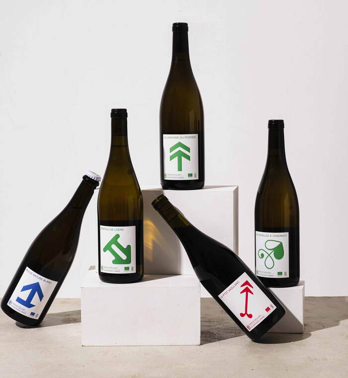
Arrows from Di grotesk, Maria, Janus, New Zelek, Tor grotesk and Heneczek were used in the Les Grandes Vignes labelling system.
The Vaillant family, proprietors of Les Grandes Vignes, have been using organic and biodynamic approaches to wine-making since the 17th century. To reflect this avant-garde vigneron spirit, Gunter Piekarski designed a fresh new series of labels for their unique portfolio of wines.
Project description by the design studio:
By mapping the vast terroir surrounding the chai, we created a grid and used this to plot five distinctive typographic arrows borrowed from our friends at threedotstype.com. Each of the arrows points in its own direction, representing how the vineyards are spread across the estate landscape. They are colour-coded, too: green for white, blue for sparkling and red, of course, for red. Despite being idiosyncratic, the arrows form part of a system of signs that signify the collective spirit of the project.
Jodi Hinds. License: All Rights Reserved.
Jodi Hinds. License: All Rights Reserved.

Jodi Hinds. License: All Rights Reserved.
Jodi Hinds. License: All Rights Reserved.
Jodi Hinds. License: All Rights Reserved.
This post was originally published at Fonts In Use