L’éperdu website
Source: editions-leperdu.fr License: All Rights Reserved.



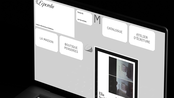
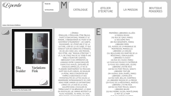
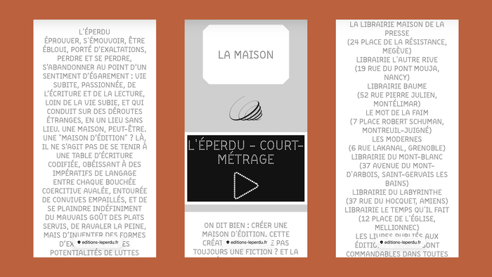
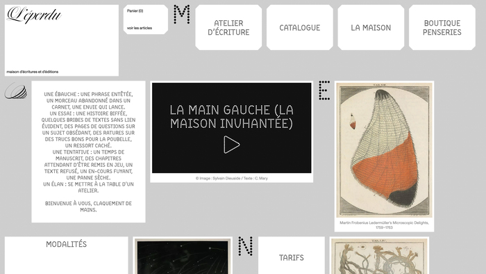
L’éperdu is a Parisian publishing house founded in 2024. Its website was designed to reflect the poetic spirit of the books it publishes, featuring BDot as its primary typeface.
From the website:
L’éperdu’s roots stem from clear choices: placing the writer’s work at the heart of the publishing house, opening its doors to unknown authors, making books affordable, printing in France, paying close attention to the work of every contributor and their working conditions, embracing a new model for book distribution, opening the publishing house to visual artists, taking the time to develop projects, and providing a space for research.
L’éperdu’s website plays an essential role in this framework, serving as a space for presentation, discovery (of books, visual works, and fiction), encounters, networking, and book sales.
The sans serif is ABC Monument Grotesk and the logo could be either an unidentified script typeface, or lettering.
Source: editions-leperdu.fr License: All Rights Reserved.
Source: editions-leperdu.fr License: All Rights Reserved.
Source: editions-leperdu.fr License: All Rights Reserved.

Source: editions-leperdu.fr License: All Rights Reserved.
This post was originally published at Fonts In Use