Karasek wine labels
Published May 6, 2026
By FontsInUse
Contributed by David Einwaller
Source: www.instagram.com Stella Rollny Kucher. License: All Rights Reserved.

Stella Rollny Kucher. License: All Rights Reserved.
Stella Rollny Kucher. License: All Rights Reserved.
Stella Rollny Kucher. License: All Rights Reserved.
Source: www.instagram.com Stella Rollny Kucher. License: All Rights Reserved.
Stella Rollny Kucher. License: All Rights Reserved.
Source: www.instagram.com Stella Rollny Kucher. License: All Rights Reserved.
This post was originally published at Fonts In Use
Source: www.instagram.com Stella Rollny Kucher. License: All Rights Reserved.
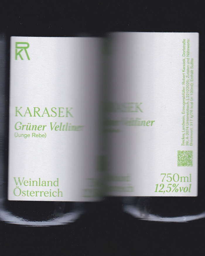
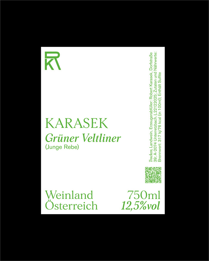
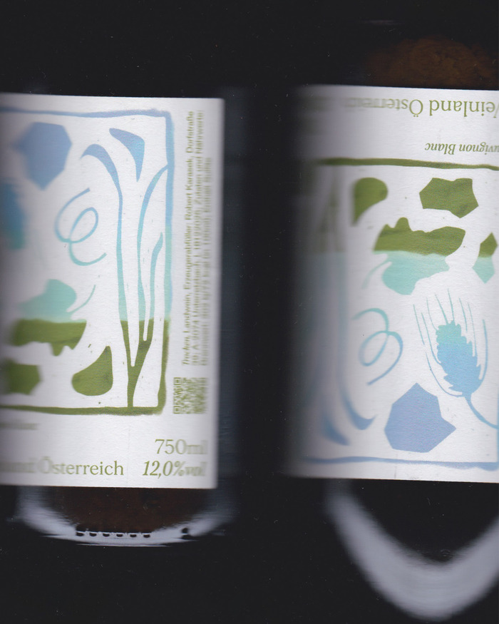
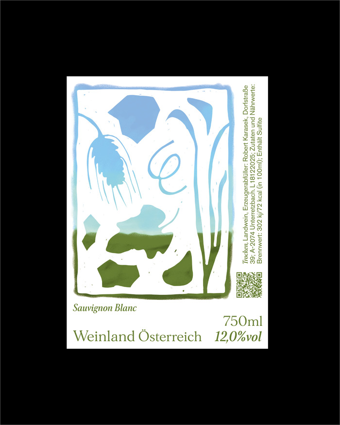
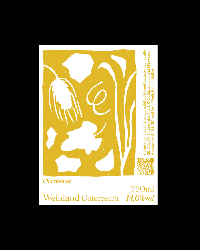
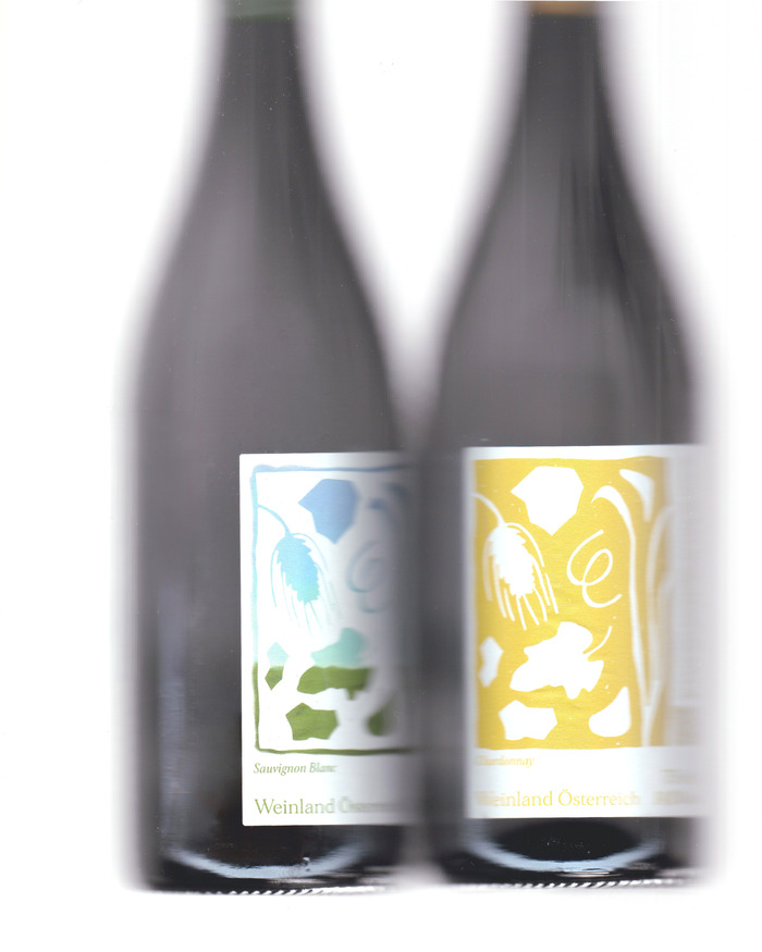
Karasek is an Austrian winery whose labels combine expressive illustration with a restrained typographic system. The main information is set in Morion, whose sharp, high-contrast serif forms give the labels a precise, contemporary presence across winery name, varietals, and key descriptors. Supporting details are set in Akzidenz Grotesk, providing a neutral counterpoint and handling dense information efficiently, particularly in the narrow vertical column. The pairing creates a clear hierarchy that balances character and readability.
Stella Rollny Kucher. License: All Rights Reserved.
Stella Rollny Kucher. License: All Rights Reserved.
Stella Rollny Kucher. License: All Rights Reserved.
Source: www.instagram.com Stella Rollny Kucher. License: All Rights Reserved.
Stella Rollny Kucher. License: All Rights Reserved.
Source: www.instagram.com Stella Rollny Kucher. License: All Rights Reserved.
This post was originally published at Fonts In Use
Read full story.
WRITTEN BY
FontsInUse
An independent archive of typography.