Hermit Crabs
License: All Rights Reserved.

Hermit Crabs was independently published in 2025 by Hyper Pension, a Seoul-based creative studio and artist-run imprint.
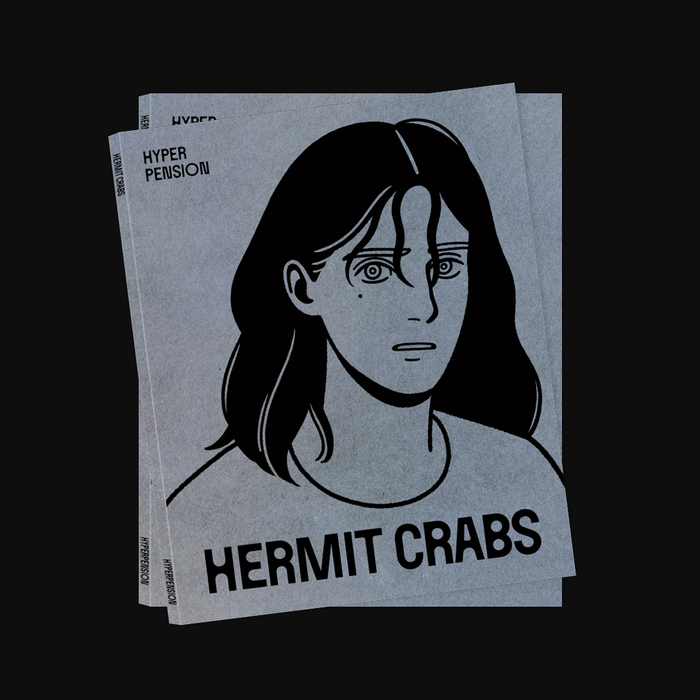
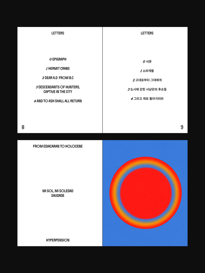
Hermit Crabs is a graphic elegy for the sense of life that has faded within modern civilization. The book is printed on three types of paper, two Pantone spot colors, yellow and black inks. The cover paper has a concrete-like texture. At first glance, the book appears restrained, almost somber.
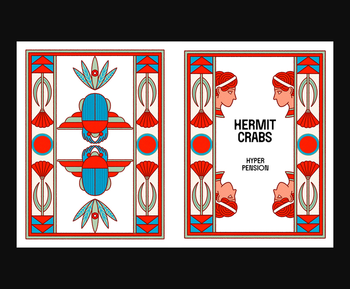
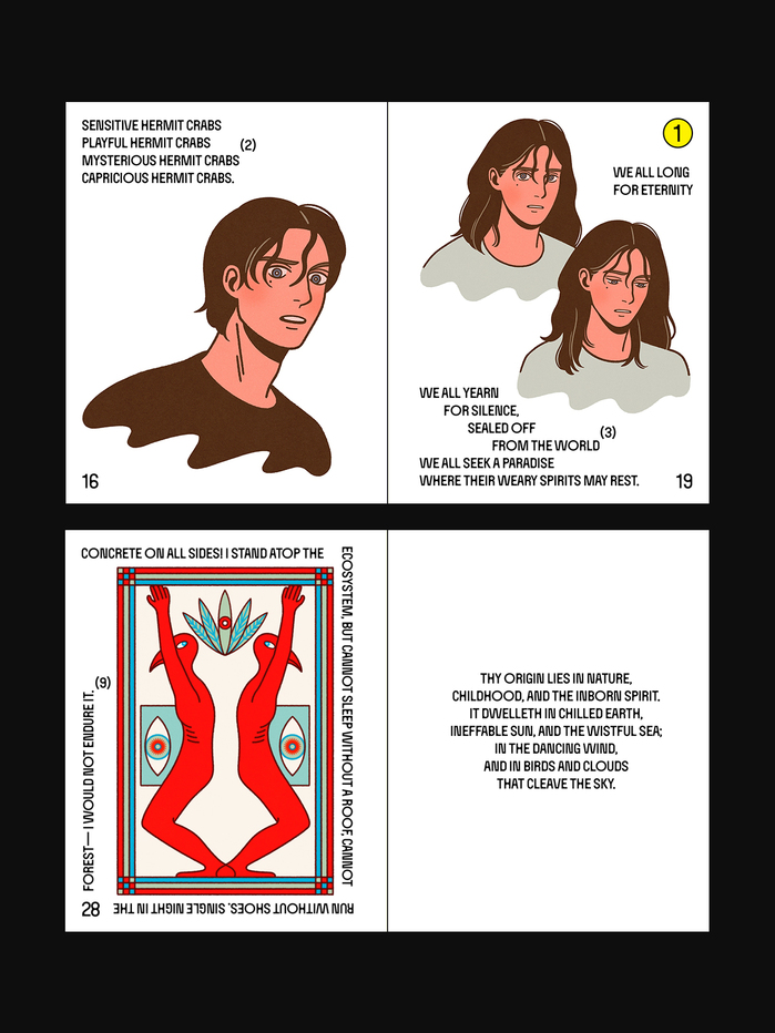
Inside, however, the tone shifts. Fluorescent yellow paper and two Pantone inks – the red of a blazing sun and the blue of a distant sea – bring a sharper energy to the interior.
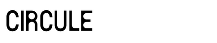
Circule by Zerozoro Studio is used throughout the body text and title. It is built on a set of tensions: a sturdy skeleton, angular contours, and rounded inner spaces. In the title, I added extra strokes to give the letterforms a more robust presence.
The name of the typeface also condenses the book’s philosophy. Life circulates. Particles, carbon, water, joy, and grief move through cycles. In the end, everything returns to the earth.
Additional typefaces used include Sandoll Clair Sans and – not shown in the images – HAL Timezone and Neue Haas Grotesk.
The book has 56 pages and measures 160×210 mm. It was first presented at Unlimited Edition, the Seoul Art Book Fair, in 2025.
License: All Rights Reserved.
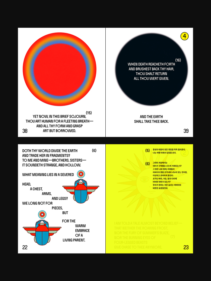
Photo: Hyper Pension. License: All Rights Reserved.
License: All Rights Reserved.
License: All Rights Reserved.
This post was originally published at Fonts In Use