GQ Mexico magazine covers (2020–2022)
Source: www.gq.com.mx GQ Mexico. License: All Rights Reserved.


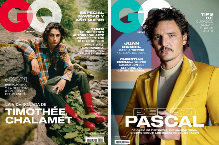
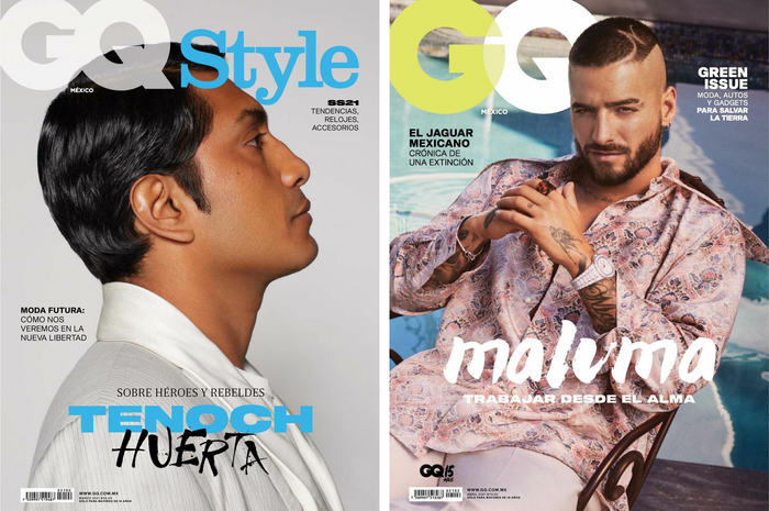
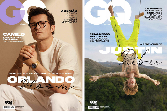
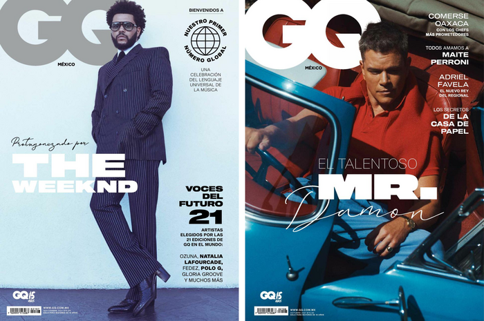
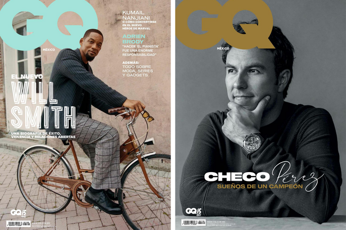
In 2020–2022, GQ Mexico embraced typographic restraint, allowing simplicity to take center stage. For each cover, dynamic photos were paired with mostly sans serif fonts, occasionally punctuated by a hand-lettered or outlined word or phrase.
For the coverlines, the magazine used Sequel Sans Extended by OGJ Type. The designers took full advantage of its wide stance, flat terminals, and range of styles. Each use feels cinematic, often stretching across images or enjoying interplay with a hand-lettered word or phrase.
Supporting this was Suisse Int’l from Swiss Typefaces. Its versatile, clear construction lends structure and balance to the authoritative presence of Sequel Sans Extended. Together, the two typefaces created a harmonious hierarchy: one expansive and deliberate, the other understated and precise.
Some of the covers pair Sequel Sans with Broadway Lights by Red Ink. Secondary fonts used include Breve News by DSType.
Ana Cecilia Aviléz served as Head of Design, with creative direction from Priscila Casañas.
Source: www.gq.com.mx GQ Mexico. License: All Rights Reserved.
Source: www.gq.com.mx GQ Mexico. License: All Rights Reserved.
Source: www.gq.com.mx GQ Mexico. License: All Rights Reserved.
Source: www.gq.com.mx GQ Mexico. License: All Rights Reserved.
This post was originally published at Fonts In Use