Mowno music magazine
Source: www.sebastienlordez.com Sébastien Lordez. License: All Rights Reserved.


Sébastien Lordez selected Arteria Compress for the layout of Mowno, a “noisy and passionate magazine” published by the specialists in new music, from indie rock pop to hip-hop and electro.
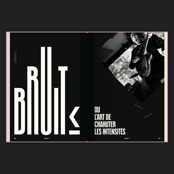
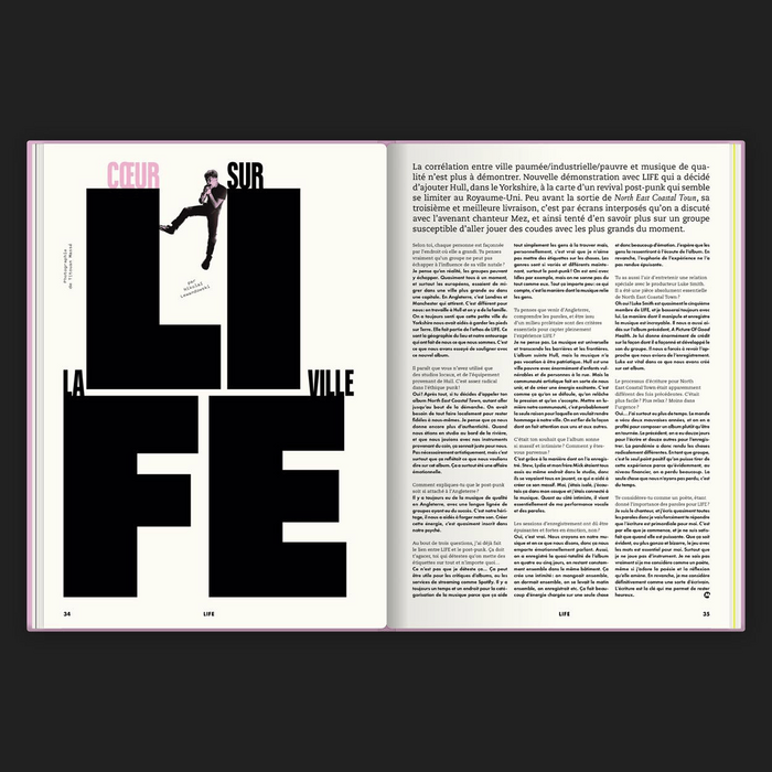
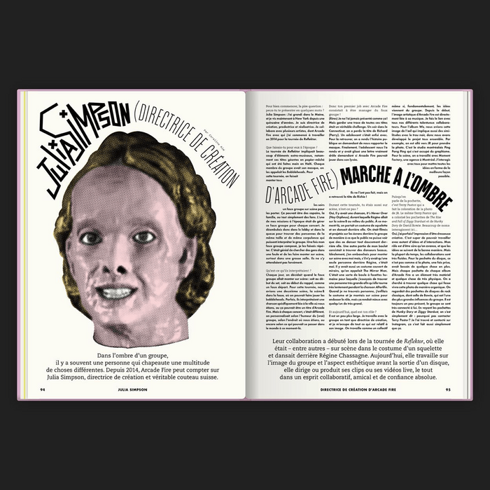
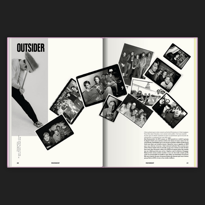
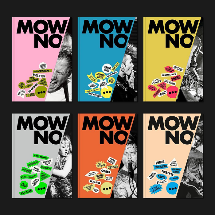
His design combines different typefaces including Futura, PMN Caecilia (paired with an unidentified italic) and Arteria. We like the typographic treatment of the cover on which the vignettes-stickers announce the summary of the issue. But also, of course, when Arteria is used in large sizes in the introductory double spreads. We spot a wood type appeal in the way the typeface is used, which was a major influence in the design of Arteria.
We asked Sébastien to tell us more about his choice and art direction:
Regarding the recently purchased Arteria, I have been using it for more than a year for all the article headlines in the independent music magazine Mowno, and sometimes for the names of the groups. At times also for the article highlights. I licensed the fonts because I initially used Arteria via Adobe Fonts but experienced activation problems. As I’m travelling, I preferred the security of having the files on my computer.
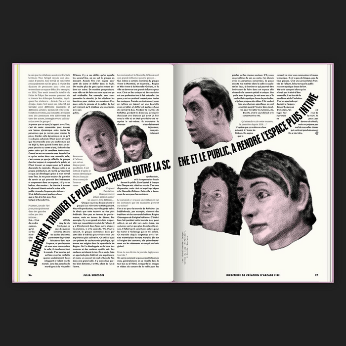
I use more than a dozen different typefaces for titling, in a “fanzine” spirit. The recurrence of these titles invariably composed in Arteria Compressed Extra Bold creates a common thread and contributes to creating an identity. This brings back a little order, and allows follies elsewhere. I was looking for a narrow typeface, very black, like the small dark rooms, that marks the page, that has a lot of aplomb but with a subtlety in the design that has a certain character. It was love at first sight when I saw a Typofonderie post on Instagram with this typeface. The R caught my eye with its slightly venty jamb, the curves of the tail of the Q, the high transverse of the G. Everything is beautiful when set in Arteria, I love it.
Source: www.sebastienlordez.com Sébastien Lordez. License: All Rights Reserved.
Source: www.sebastienlordez.com Sébastien Lordez. License: All Rights Reserved.
Source: www.sebastienlordez.com Sébastien Lordez. License: All Rights Reserved.
Source: www.sebastienlordez.com Sébastien Lordez. License: All Rights Reserved.
Source: www.sebastienlordez.com Sébastien Lordez. License: All Rights Reserved.
This post was originally published at Fonts In Use