Golden
Source: www.ohmy.studio OHMY Studio. License: All Rights Reserved.

Golden is a talent consultancy for the creative and marketing industries, connecting brilliant people with roles at culture-conscious companies. Founded by Kate, who brings deep industry knowledge and a belief that work should feel better, Golden is on a mission to make working life more meaningful.
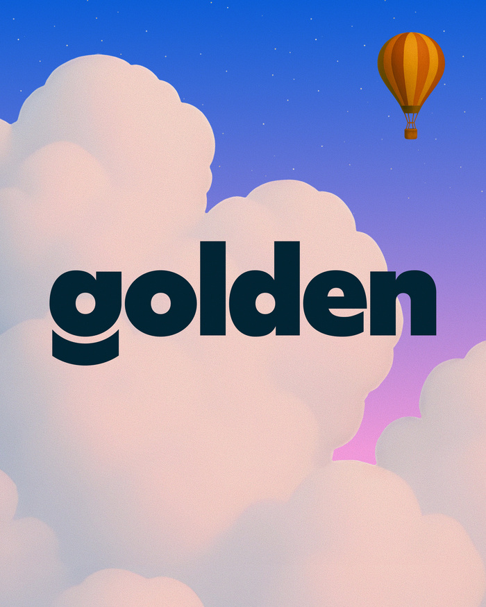
OHMY built a brand and website around the idea of making life golden, a visual expression of what it feels like to find the right fit. Illustrated worlds, warm colours, and playful details create a sense of joy and optimism, while the website itself guides people with clarity and care.
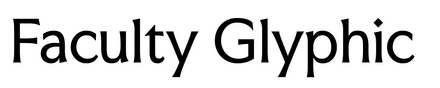
Typography plays a big role here. The wordmark uses a customised version of Neurath by René Bieder: beautifully open letterforms, full of character, especially in heavier weights. It feels approachable, the typographic equivalent of a kind face. We extended its use to titles for the same reason. For body copy, we paired Neurath with Faculty Glyphic, designed by Koto and freely available on Google Fonts, which brings just the right amount of character while balancing nicely with Neurath.
The result is a distinct and uplifting identity that reflects Golden’s purpose: helping people thrive by making the world of work feel brighter, fairer, and full of potential.

Source: www.ohmy.studio OHMY Studio. License: All Rights Reserved.

Source: www.ohmy.studio OHMY Studio. License: All Rights Reserved.

Source: www.ohmy.studio OHMY Studio. License: All Rights Reserved.

Source: www.ohmy.studio OHMY Studio. License: All Rights Reserved.

Source: www.ohmy.studio OHMY Studio. License: All Rights Reserved.

Source: www.ohmy.studio OHMY Studio. License: All Rights Reserved.

Source: www.ohmy.studio OHMY Studio. License: All Rights Reserved.

Source: www.ohmy.studio OHMY Studio. License: All Rights Reserved.

Source: www.ohmy.studio OHMY Studio. License: All Rights Reserved.

Source: www.ohmy.studio OHMY Studio. License: All Rights Reserved.

Source: www.ohmy.studio OHMY Studio. License: All Rights Reserved.

Source: www.ohmy.studio OHMY Studio. License: All Rights Reserved.
This post was originally published at Fonts In Use