Zorg van de Zaak
Source: www.revoltestudio.nl Revolte. License: All Rights Reserved.


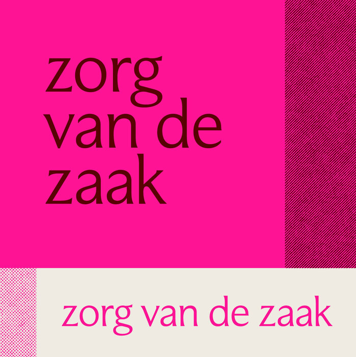
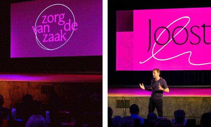
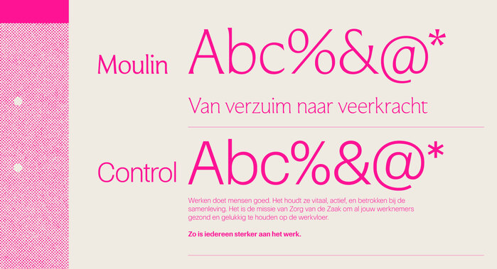
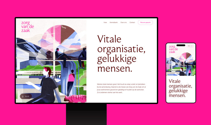
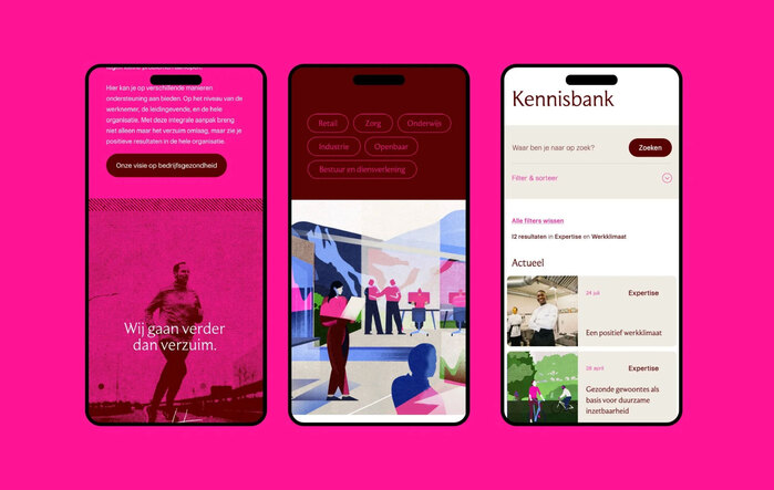
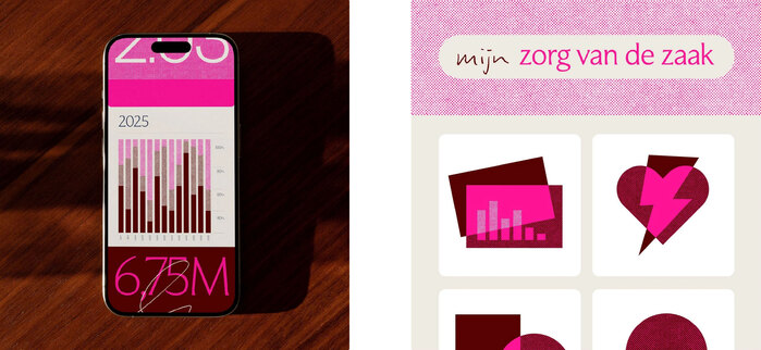
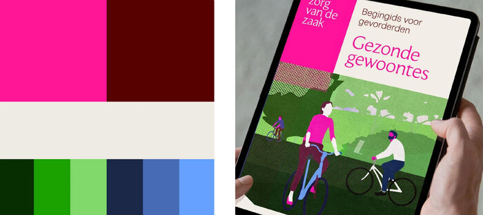
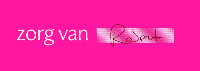
Zorg van de Zaak is one of the Netherland’s largest occupational health services. The rebranding of the identity has been done by Dutch studio Revolte. They chose Moulin and Control by Commercial Type as the typefaces.
From the studio’s website:
Revolte was tasked to completely rebuild the brand. We preserved the brand equity by retaining the name, main slogan and the primary color. In the strategy meetings we decided that with the new focus on larger organisation the brand should present as a bit more refined, elegant, but still approachable. It should give an editorial feel: a well put together quarterly magazine for a distinct audience, instead of a daily paper for the masses.
Illustrator: Katarzyna Surman
Copywriters: Firma Fluks
Web developer: Diffuse
Photography: Jeroen Berends
Motion graphics: Max Philippi
Source: www.revoltestudio.nl Revolte. License: All Rights Reserved.
Source: www.revoltestudio.nl Revolte. License: All Rights Reserved.
Source: www.revoltestudio.nl Revolte. License: All Rights Reserved.
Source: www.revoltestudio.nl Revolte. License: All Rights Reserved.
Source: www.revoltestudio.nl Revolte. License: All Rights Reserved.
Source: www.revoltestudio.nl Revolte. License: All Rights Reserved.

Source: www.revoltestudio.nl Revolte. License: All Rights Reserved.

Source: www.revoltestudio.nl Revolte. License: All Rights Reserved.
Source: www.revoltestudio.nl Revolte. License: All Rights Reserved.
This post was originally published at Fonts In Use