Flip
Published June 11, 2025
By FontsInUse
Contributed by NaN
Source: www.drink-flip.com License: All Rights Reserved.

Source: www.drink-flip.com License: All Rights Reserved.
Source: www.drink-flip.com License: All Rights Reserved.
Source: www.drink-flip.com License: All Rights Reserved.
Source: www.drink-flip.com License: All Rights Reserved.

Source: www.drink-flip.com License: All Rights Reserved.

Source: www.drink-flip.com License: All Rights Reserved.

Source: www.drink-flip.com License: All Rights Reserved.

Source: www.drink-flip.com ©2025, AD-REM. License: All Rights Reserved.
This post was originally published at Fonts In Use
Source: www.drink-flip.com License: All Rights Reserved.
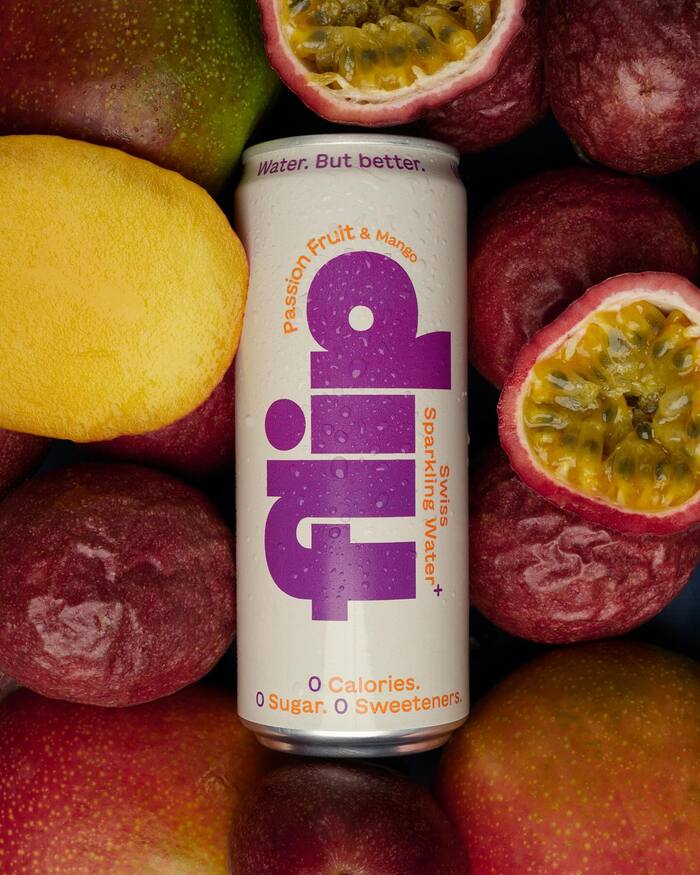
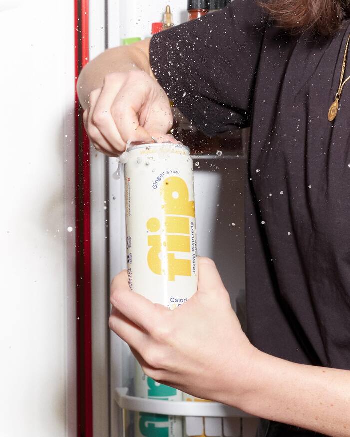
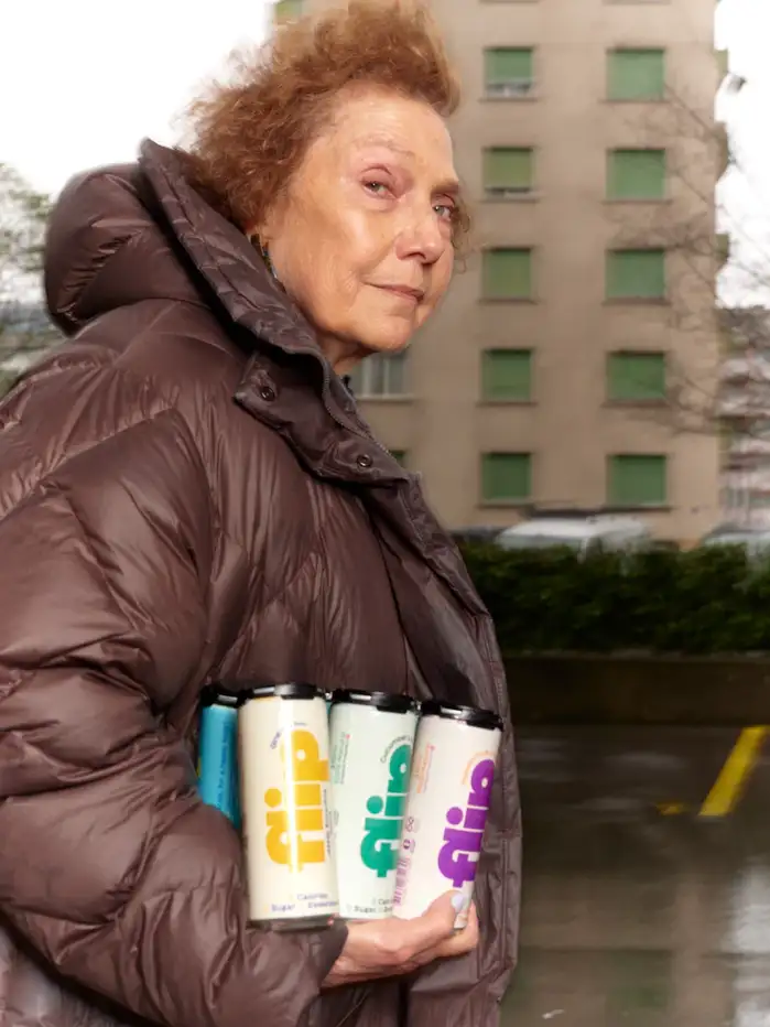
Flip is a newly-born brand of canned flavored waters, made in Switzerland. It adopts a fun, “I’m not a soda” communication directed towards soda-addicted / water-bored adults.
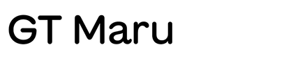
The logo sports NaN Fiasco in its blackest weight, showing the /fl ligature with its misaligned stem. The font is also re-used for headlines, in all caps, on their website. GT Maru is used everywhere else, in its medium weight. The duo of the black glitchy geometric sans and slightly-bold rounded sans make for a very friendly typographic palette, almost childish and leaning in the direction of the candy company Haribo. But the use of a subtle colour palette and of flat colors brings the language back to a more serious and adult realm.
Source: www.drink-flip.com License: All Rights Reserved.
Source: www.drink-flip.com License: All Rights Reserved.
Source: www.drink-flip.com License: All Rights Reserved.
Source: www.drink-flip.com License: All Rights Reserved.
Source: www.drink-flip.com License: All Rights Reserved.
Source: www.drink-flip.com License: All Rights Reserved.
Source: www.drink-flip.com License: All Rights Reserved.
Source: www.drink-flip.com ©2025, AD-REM. License: All Rights Reserved.
This post was originally published at Fonts In Use
Read full story.
WRITTEN BY
FontsInUse
An independent archive of typography.