Estudio Soroche
Published December 29, 2023
By FontsInUse
Contributed by Mario Julian Gutierrez
Source: www.instagram.com License: All Rights Reserved.


Source: www.instagram.com License: All Rights Reserved.
Source: www.instagram.com License: All Rights Reserved.
Source: www.instagram.com License: All Rights Reserved.
Source: www.instagram.com License: All Rights Reserved.

Source: www.instagram.com License: All Rights Reserved.
Source: www.instagram.com License: All Rights Reserved.
This post was originally published at Fonts In Use
Source: www.instagram.com License: All Rights Reserved.
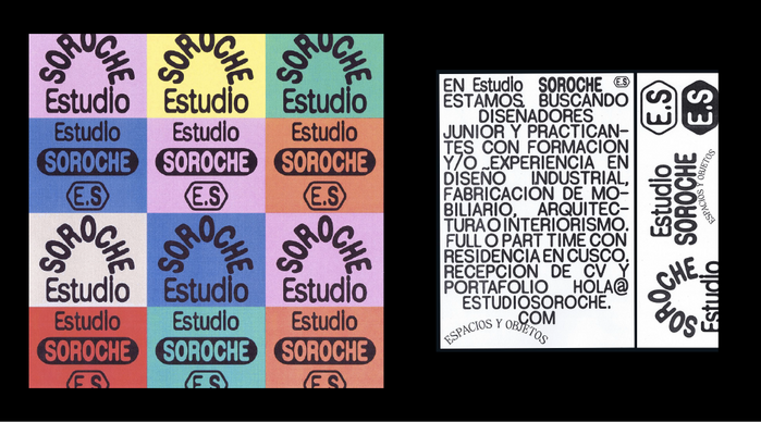
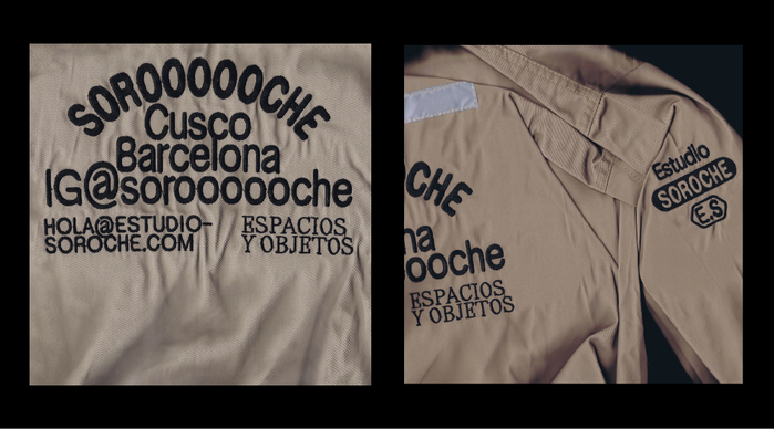
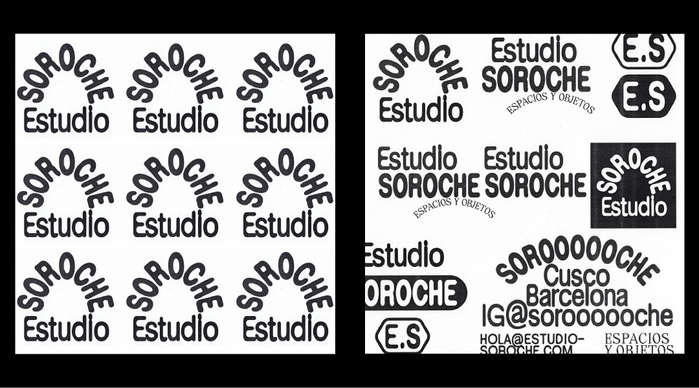
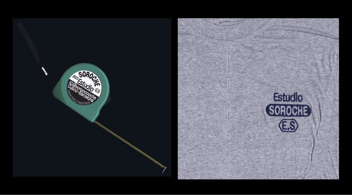
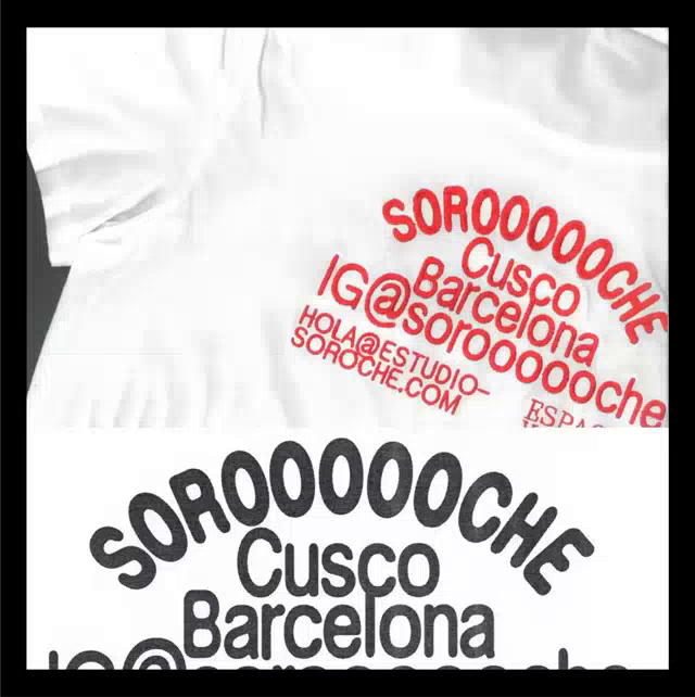
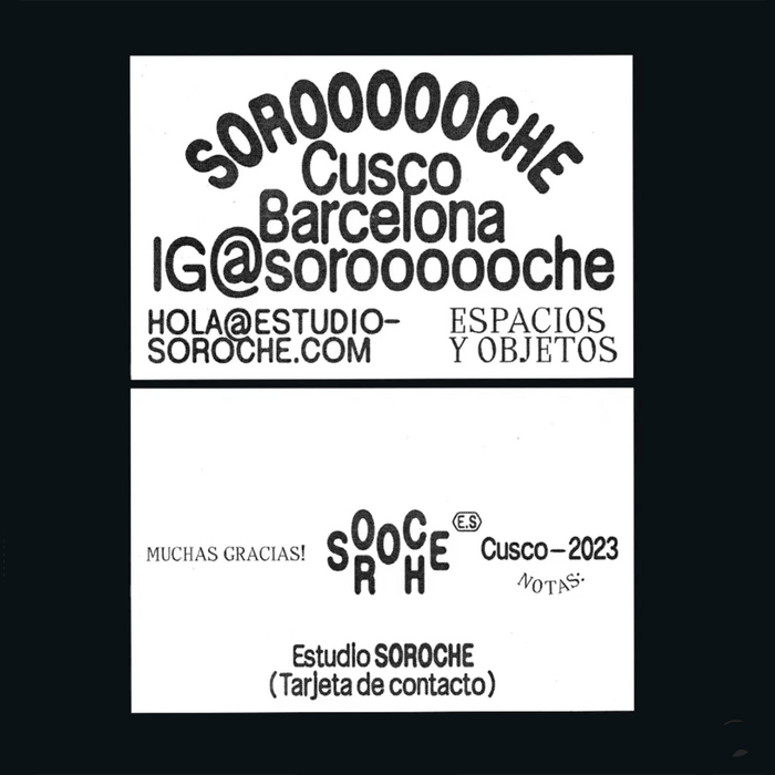
Estudio Soroche was founded by space and object designers Claire and Fran when they moved to Peru two years ago. Their visual identity was designed and art directed by Paula de Álvaro:
I developed the graphic identity of Estudio Soroche starting from graphic references that contextualize the studio and the style of posters that I found in the streets of Cusco when I travelled to this city. Focusing on the compositions, colours, typographies and techniques they use to make these posters, many times by hand, creating irregular and imperfect letters and layouts. The typeface Serial B Blur (by Dum Dum Studio) and its imperfections matched this idea and concept.
Serial B Blur is supported with a version of Clarel Serif used in all caps.
Source: www.instagram.com License: All Rights Reserved.
Source: www.instagram.com License: All Rights Reserved.
Source: www.instagram.com License: All Rights Reserved.
Source: www.instagram.com License: All Rights Reserved.
Source: www.instagram.com License: All Rights Reserved.
Source: www.instagram.com License: All Rights Reserved.
This post was originally published at Fonts In Use
Read full story.
WRITTEN BY
FontsInUse
An independent archive of typography.
More from FontsInUse