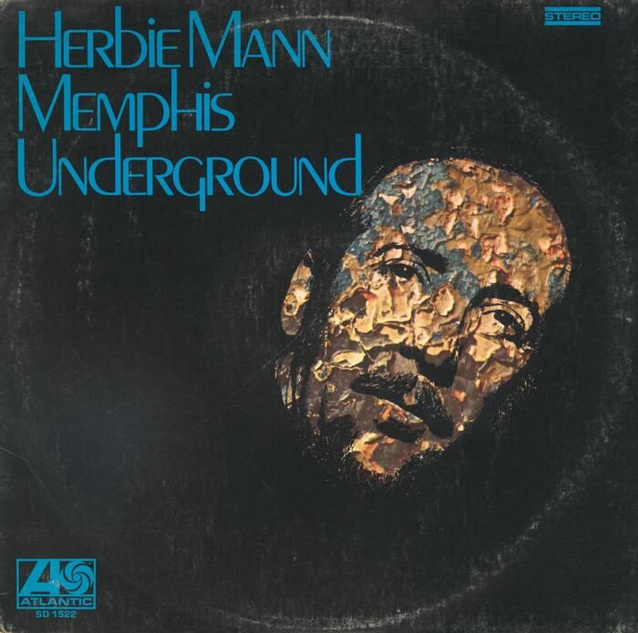
Herbie Mann – Memphis Underground album art

Source: archive.org Internet Archive. License: All Rights Reserved.


The introduction of phototypesetting and dry transfer lettering in the mid-20th century made it possible to set type tighter than it was previously possible. Commonly associated with the 1970s, such TNT (tight-not-touching) letterspacing was already in full swing in the 1960s. Here’s a prime example for this technique from 1969, featuring Peignot on the cover of an album by Herbie Mann, with Roy Ayers, Larry Coryell and Sonny Sharrock.
Cassandre’s groundbreaking 1930s design famously exhibits a lowercase that mixes small capital forms with minuscule ones. Cassandre realized the importance of ascenders and descenders for a distinct word silhouette: in addition to letterforms like b d f k l p y that come with extenders anyway, he also gave h an elongated left stem. The small-cap lowercase glyphs aren’t just scaled-down capitals: some of them are rounder, as one can see in the M/m in this use. Peignot would look better with less tight spacing that takes into account the rhythm of internal and external whitespace.
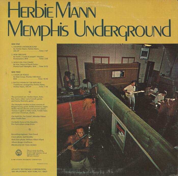
Sleeve design by The Graffiteria, with photography by Joel Brodsky and William Albert Allard.

Source: archive.org Internet Archive. License: All Rights Reserved.
The text on the back cover is set in Optima.
This post was originally published at Fonts In Use