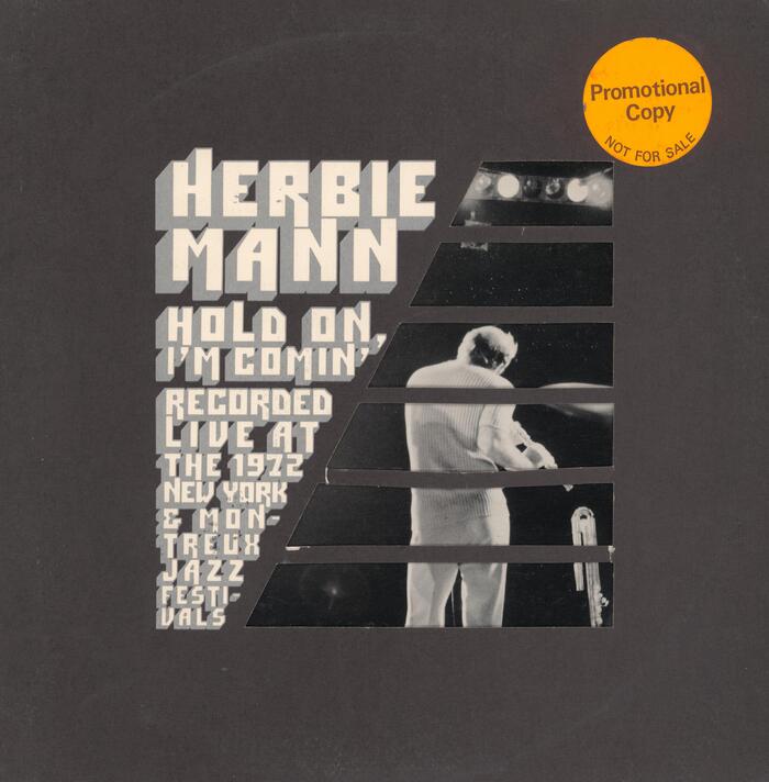
Herbie Mann – Hold On, I’m Comin’ album art
Source: archive.org Internet Archive. License: All Rights Reserved.


Since the late 1960s, designer and art director Paula Bisacca (b. 1945) worked on more than two-hundred record covers. For this Herbie Mann album recorded live at the 1972 New York (Newport) and Montreux Jazz Festivals, she used a whole lot of ITC Pioneer.
The shaded blocky letterforms from the 1970 typeface by Ronné Bonder and Tom Carnase are set in lines of decreasing size, much like in a “waterfall” type specimen, and feature several of the extending alternate glyphs. The lines are arranged in a wedge shape that complements an upside-down counterpart comprised of six stripes. Filled with photography by Katsuji Abe (1929–2008), the latter resembles the leaning A in the Atlantic Records logo.
The diagonal theme is continued for the list of the personnel and the track list on the back cover, where ITC Pioneer is combined with Eurostile Bold Condensed. The left part of the gatefold echoes the diagonally divided square, now with black stripes on the left and typography in both weights of Trade Gothic Extended on the right.

Source: archive.org Internet Archive. License: All Rights Reserved.

Source: archive.org Internet Archive. License: All Rights Reserved.
This post was originally published at Fonts In Use