Ensemble
Source: polytechnic.works License: All Rights Reserved.
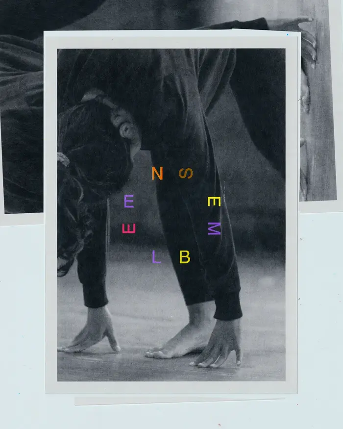
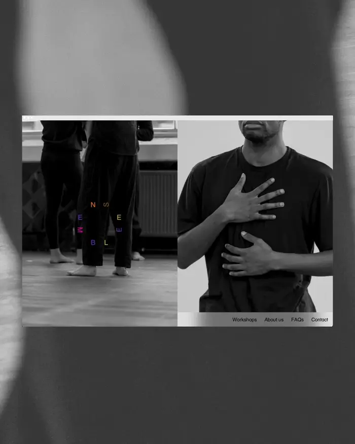
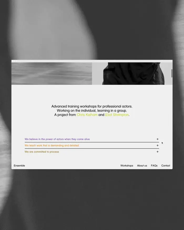
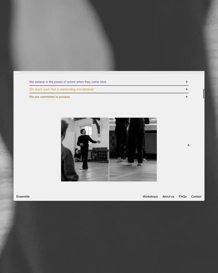
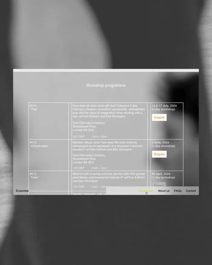
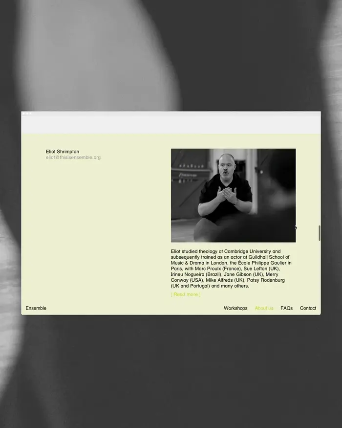
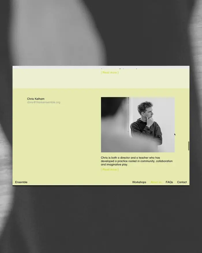
Visual identity and website for Ensemble workshops, whose training foregrounds working on the individual by learning in a group.
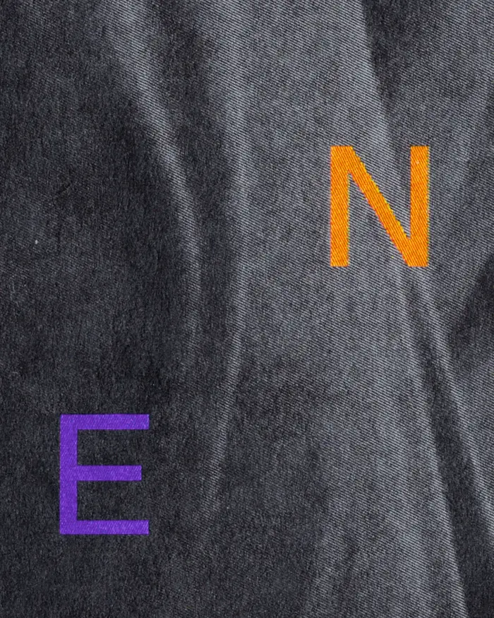
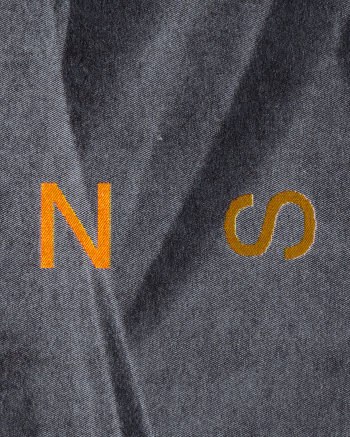
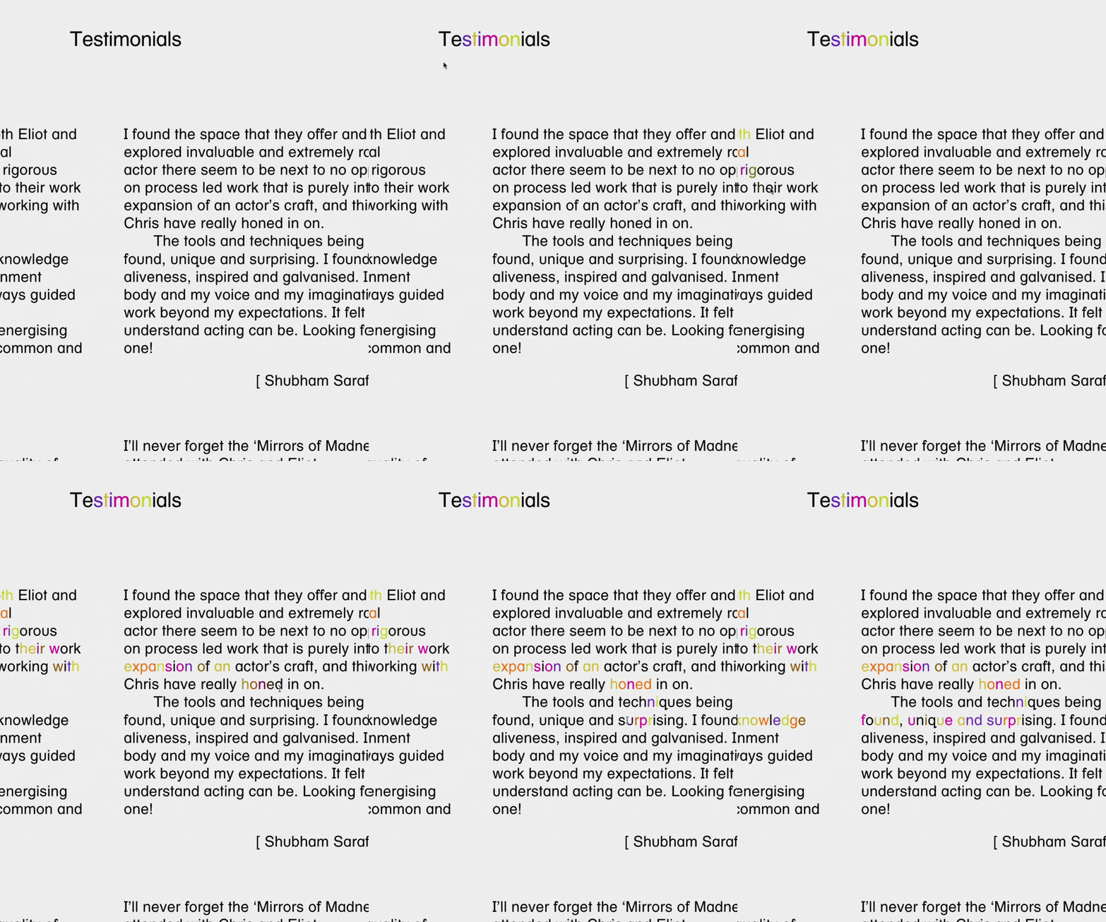
The wordmark mirrors this premise, emphasising the individual letters within a dynamic collective form. The central clearing this arrangement creates in turn reflects the space Ensemble provides actors to develop, fail, explore and experiment, free of judgement.
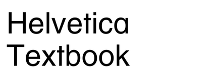
The visual identity is built around this playful, protean wordmark, which is set in Helvetica Textbook. Chosen for its distinctly pedagogical feel with its alternate numberset, slabbed uppercase I and J, and single-storey a. Schoolbook/educational typefaces seem to be a quite thin subcategory within neo-grotesque sans serifs.
Photography by Sam Bush and film content from Bird in Hand.
Source: polytechnic.works License: All Rights Reserved.
Source: polytechnic.works License: All Rights Reserved.
Source: polytechnic.works License: All Rights Reserved.
Source: polytechnic.works License: All Rights Reserved.
Source: polytechnic.works License: All Rights Reserved.
Source: polytechnic.works License: All Rights Reserved.
Source: polytechnic.works License: All Rights Reserved.
Source: polytechnic.works License: All Rights Reserved.
Source: polytechnic.works License: All Rights Reserved.
This post was originally published at Fonts In Use