Concept Barre

Codea Studio. License: All Rights Reserved.


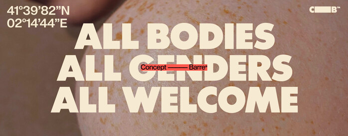
Concept Barre is a dance school in Barcelona that offers ballet, functional training and Pilates classes. The website is designed by Codea Studio, a creative agency based in Barcelona. Codea Studio specializes in brand creation, communication and advertising campaigns and works specifically with brands that go against convention. This progressive thinking is also reflected in Concept Barre, which positions itself as an LGBTQIA+ friendly studio – a place where all bodies and genders are welcome.
A central element of the website is the clear communication of the studio’s core beliefs and key messages. Its focus lies on self-confidence, the balance between fitness and leisure and a strong philosophy of inclusivity. These values are not only reflected in the content, but also in the design of the website.
Concept Barre’s modern and minimalist brand aesthetic is particularly evident in the typography. Headings are highlighted with capital letters, while body text is written in simple and accessible language to maximize readability. Two sans serif fonts are used, which are characterized by clarity and legibility.
LL Supreme is a reinterpretation of Paul Renner’s classic geometric typeface, Futura. However, it is not simply a revival, but rather an evolution of the original concept. The typeface was designed by Norwegian Arve Båtevik and released by Swiss foundry Lineto in 2020.
The basic idea of Futura is also embedded in LL Supreme: the possibility of creating a distinctive, fully functional, yet sophisticated typeface using only pure geometry. Thanks to this consistent design, LL Supreme combines clarity, precision, and modern aesthetics.
In addition to the basic weights, there are also graphically accentuated options such as Jumbo and Choupette. The styles have been drawn independently, giving each weight its own identity. Concept Barre uses LL Supreme Display Jumbo.
Lay Grotesk is a modern interpretation of classic grotesque typefaces such as Helvetica a.k.a. Neue Haas Grotesk, with an emphasis on a simple, neutral, and elegant appearance. The designer, Massimiliano Vitti, is part of the Italian graphic design studio Due Studio.
A key aspect of Lay Grotesk is its increased contrast and slightly reduced point width, which improves legibility at small sizes and creates a compact, dense text effect. At larger sizes, its geometric character is more pronounced, with clear, straight terminals.
The mix of soft and rigid elements makes Lay Grotesk versatile – from book design and corporate identity to posters and digital applications. With a total of 791 glyphs and five weights from Regular to Black, it offers a wide range of design possibilities.
Codea Studio. License: All Rights Reserved.

Source: conceptbarre.com Codea Studio. License: All Rights Reserved.

Source: conceptbarre.com Codea Studio. License: All Rights Reserved.

Source: conceptbarre.com Codea Studio. License: All Rights Reserved.
This post was originally published at Fonts In Use