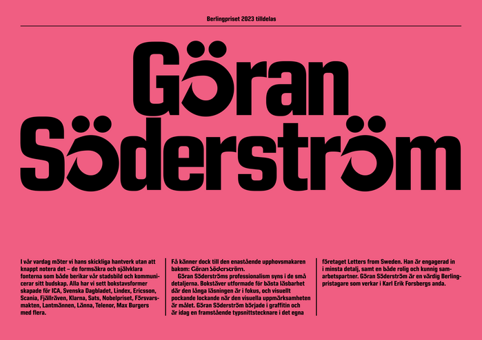
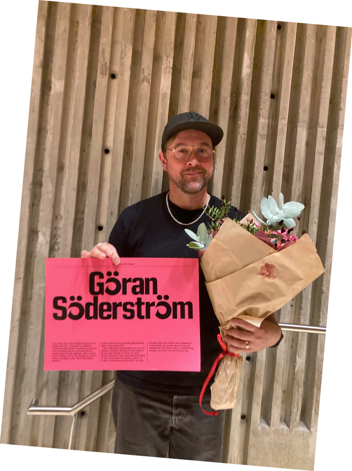
Berling Prize diploma 2023
License: All Rights Reserved.
In 2023, Göran Söderstöm was awarded Berlingpriset, the only Swedish award to a person adding to the culture of typography. The previous winner designs the invitation and diploma for the current year’s recipient – that year it was me, Peter Ström.
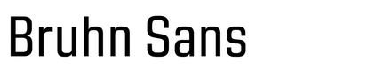
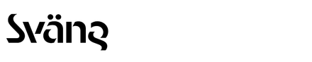
The diploma is set using Peter Bruhn’s Bruhn Sans and Göran’s own Sväng. From the text I wrote to Göran complementing the diploma on its typeface selections:
Dear Göran,
A huge congratulations on the Berling Prize! An award that is indisputable – there is hardly any typeface designer who has meant more for Swedish typography in the past decade than you.
I would like to take this opportunity to share a bit about the design of your diploma, which I had the honor to typeset.
My first contact with you was through our late friend – and perhaps mentor – Peter Bruhn. Peter and I both worked at the web agency Abel & Baker in the late 1990s. The ten-year age gap between us seemed enormous to me as a 20-year-old at the time, and the fact that Peter was soon to have children felt incredibly… grown-up. He therefore became known as “Dad Bruhn,” a title that also served as a role for us at Konst & Teknik when it came to typeface design. We always knew we could ask him about serious typography questions that only a Dad could answer.
I know that you were close friends with Peter, so when I was asked to design your diploma, it felt natural to use Peter’s typeface. The typeface in question – Bruhn Sans – was, moreover, finalized by you after his passing and was the only one of his typefaces that I still have access to, making it an obvious choice. It also feels important to, in some way, include Peter in the Berling context; he was ahead of his time and never received the recognition he deserved in my opinion.
The replacement of the letters å, ä, and ö in your Sväng typeface is less about Peter Bruhn and more about the experience of having those letters in one’s surname – something you and I share. During the early days of digitization, I often had to swap my Ö for one from another typeface because it was missing from the font files. This is something you have been instrumental in changing with your contributions to Swedish typeface design and digital innovation. And thus, the diploma turned out a bit more visually playful as a result.
From a Ström to a Söderström, with the spirit of another Peter watching over us,
Peter Ström, September 2023
License: All Rights Reserved.
This post was originally published at Fonts In Use