NorthMed visual identity
License: All Rights Reserved.


NorthMed is paving the way for the Arab community in the digital health industry. It strives to be a highly influential organization in the Arab world, bringing together top-notch professionals from medicine and technology. The organization operates the NorthMed Innovation Center, hosting events, courses, and meetings related to digital health and medical technology.
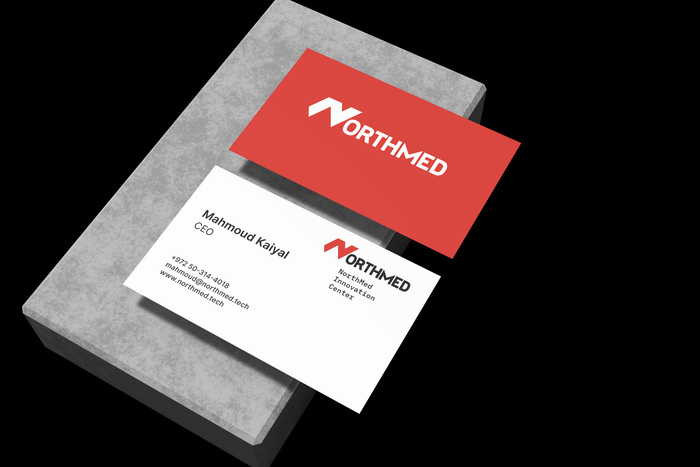
Developing a strong brand identity for NorthMed was a real challenge. Despite their integrated activities and relevance, the only visual asset they had was their logo. They wanted to keep it while building an entire brand identity, including various collateral designs for both print and digital mediums.
I deconstructed and reimagined the brand’s concept and evolved into more than just a logo. It became a vision, a foundational structure for a cohesive identity system, including a set of twelve custom icons and a flexible framework for dynamic sub-logos, tailored to different sections of NorthMed’s ecosystem.
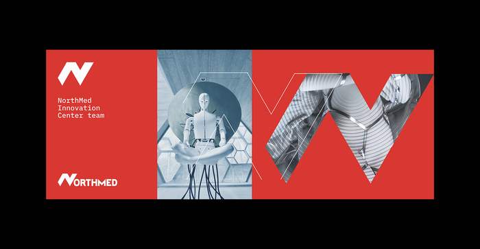
The brand identity was further reinforced by integrating medical and tech imagery, aligning with the client’s innovative mission. Elements of the logo were repurposed as subtle accents and teasers throughout the presentation, creating a seamless visual language. The primary colour palette was carefully applied to enhance brand coherence, ensuring a strong, unified presence across all mediums.

License: All Rights Reserved.
License: All Rights Reserved.

License: All Rights Reserved.

License: All Rights Reserved.
This post was originally published at Fonts In Use