Sound & Colour
Published March 12, 2025
By FontsInUse
Contributed by Rick Raby

Source: themodernworld.co.uk Photo: Rick Raby.


Source: themodernworld.co.uk Photo: Rick Raby.

Source: themodernworld.co.uk Photo: Rick Raby.

Source: themodernworld.co.uk Photo: Rick Raby.

Source: themodernworld.co.uk Photo: Rick Raby.
Source: themodernworld.co.uk Photo: Rick Raby.
This post was originally published at Fonts In Use
Source: themodernworld.co.uk Photo: Rick Raby.
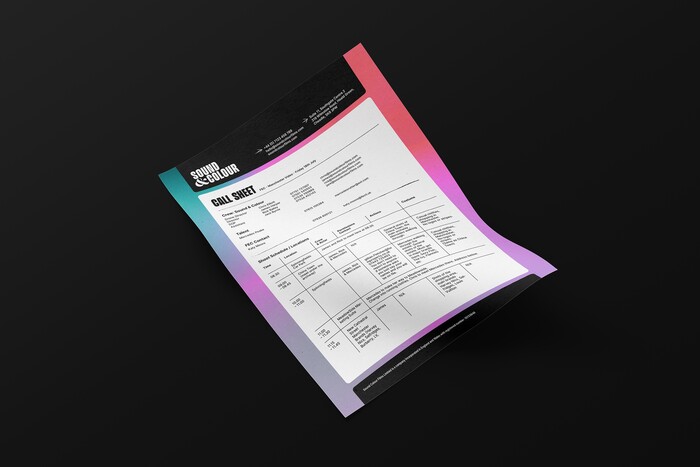
In a world where anyone can create content, Sound & Colour stands out by prioritising storytelling and collaboration to produce powerful, perfectly captured work that connects brands and audiences. Their striking visual identity features bold gradients, versatile design elements, and nods to traditional craftsmanship – reflecting their creative flair, commitment to shared ideas, and the value of creative expression.
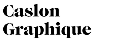
Beni and Inter are used throughout the identity. The other listed fonts are exclusively used for their ampersands.
Source: themodernworld.co.uk Photo: Rick Raby.
Source: themodernworld.co.uk Photo: Rick Raby.
Source: themodernworld.co.uk Photo: Rick Raby.
Source: themodernworld.co.uk Photo: Rick Raby.
Source: themodernworld.co.uk Photo: Rick Raby.
This post was originally published at Fonts In Use
Read full story.
WRITTEN BY
FontsInUse
An independent archive of typography.