Redkroft Lab
Source: redkroftlab.com License: All Rights Reserved.

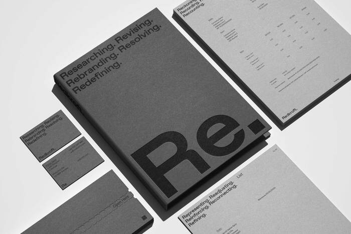
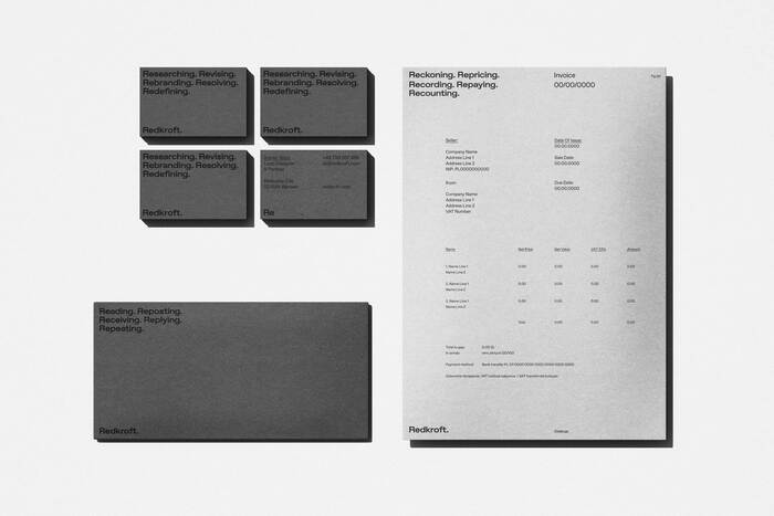
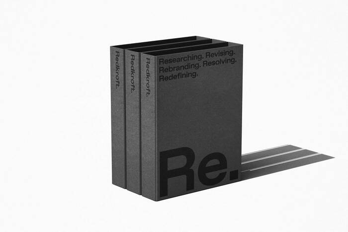
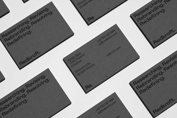
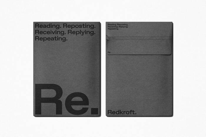
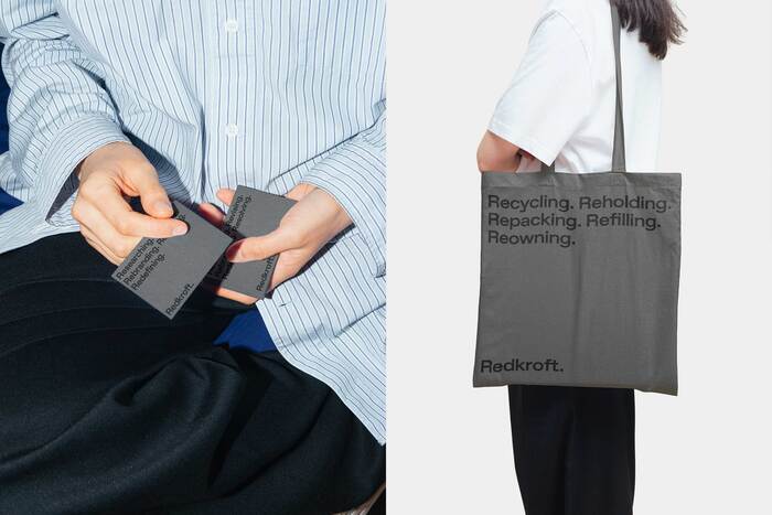
In creating Redkroft’s visual identity, we focused on stripping everything back to the essentials: words beginning with “Re.” Our approach was simple yet deliberate. We wanted the language itself to be the design, letting words like Revising, Rebranding, Resolving, and Redefining encapsulate Redkroft’s core philosophy without any excess.
By centering the design on “Re,” we aimed to echo the studio’s process—one of continual refinement, constant re-evaluation, and purposeful evolution. There’s no need for embellishments here; just type, thoughtfully placed, allowing each term to reflect Redkroft’s intent. It’s an identity that is as clear and direct as the work we deliver.
Our goal was to create a rhythm within the repetition. Each “Re” word is a reminder of the studio’s ongoing commitment to rethink and reinvent branding. This is an identity that doesn’t shout—it resonates, embodying Redkroft’s ethos with subtlety and strength.
Source: redkroftlab.com License: All Rights Reserved.
Source: redkroftlab.com License: All Rights Reserved.
Source: redkroftlab.com License: All Rights Reserved.
Source: redkroftlab.com License: All Rights Reserved.
Source: redkroftlab.com License: All Rights Reserved.
Source: redkroftlab.com License: All Rights Reserved.

Source: redkroftlab.com License: All Rights Reserved.
Source: redkroftlab.com License: All Rights Reserved.
This post was originally published at Fonts In Use